Trading Articles
Understanding Causes Of Market Movements By Melvin E. Dickover
An evidence-based model argues that the price movement of a chart is fully explained by cycles, support & resistance, and news-driven price impulses. We can use a cognitive psychology–based hypothesis to explain why and how cycles arise. Traders would like to have a credible explanation of why the market moves the way it does. You have unsatisfying descriptions such as fear & greed or the battle of bulls & bears that give you no hint of what to do or how to trade. Explanations like profit-taking simply tell us after the fact that prices went down because people sold. I believe that these ways of thinking about the market hinder rather than help us. They explain everything but help you understand or predict nothing in particular. What is needed is an evidence-based model that explains market phenomena.
The Model
In this article I propose an evidence-based model that explains the causes of market price movement from a technical analyst’s perspective. This model, which I refer to as Mel’s Model of Market Movement, hereafter abbreviated as M²M², is designed to answer questions about why the market moves as it does; what edges are inherent in its very nature; and to provide insights that traders can use to see what is happening in the market clearly enough to trade successfully.
M²M² proposes that two important invisible structural elements exist inside a price chart. The first is a skeleton of support & resistance based on empirically located pools of supply & demand. The second is a set of cyclic moving parts. Other authors have argued that cycles exist in the market, and can be traded. M²M² argues that all price movement in the market is either cyclic or news-driven price impulses, and no further explanation of price movement is needed. The model argues that the price chart you see is the result of adding up the contributions to price movement of the individual component cycles. I will first present the observational evidence that price movement is cyclic, followed by a description of the kinds of cycles that make up a chart, and then provide an explanation for how and why cyclic motion arises.
The Evidence For Cycles
The observational evidence of cycles is gathered using spectrograms. Spectrograms depicting the cycles of a price chart are the result of doing spectral analysis on that price chart using one of a variety of mathematical techniques commonly known as Fourier analysis. The spectrograms in this article are in heatmap form, generated using the spectrum indicator found in the OmniTrader platform. The visualization of how Fourier analysis works that is shown in Figures 1–4 was created by Lucas Barbosa, and I am using screenshots from his animation for this article.
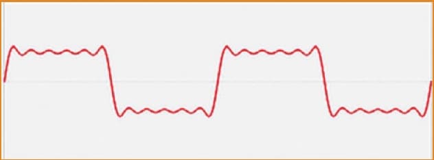
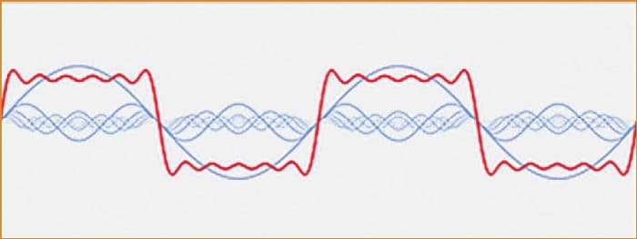
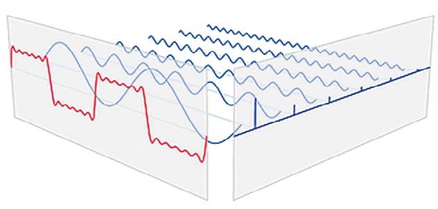
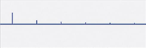
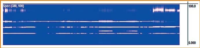
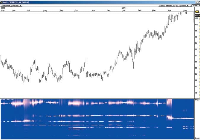
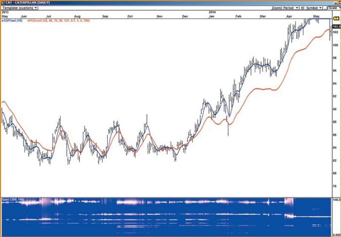
The spectrogram heatmap plots the spectrogram turned on its side, bar by bar. Each cycle that meets a minimum threshold of power is plotted, and its relative power is shown by the brightness and thickness of its white line. The vertical scale is the wave-length of the observed cycles in bars (Figure 5). In Figure 6 you see a price chart of Caterpillar Inc. (CAT) with a spectrogram displayed in the subchart.
Example Spectrograms
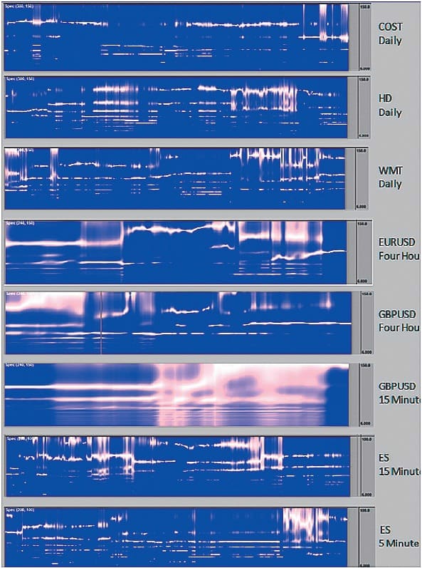
All of the spectrograms in Figure 7 show clear, long-lasting cycles. I have looked at a lot of spectrograms, and the evidence is compelling that every chart has cycles, and that cycles in the more liquid symbols—I only work with liquid symbols—tend to be relatively stable and often last for hundreds of bars. The amplitude of the cycles may vary relative to each other while not changing wavelength. The strongest cycle on the heatmap sometimes changes, and occasionally a formerly powerful cycle will not be plotted for a while if its relative power does not reach the necessary threshold to be plotted. It may again become visible later at the same wavelength as its relative power increases and meets the threshold requirement.
Reconstructing a Price Chart
John Ehlers has published a brilliant new set of technical indicators, one of which is the roofing filter. The roofing filter combines Ehlers’ decycler filter, which removes the contribution to price movement of wave-lengths longer than its cutoff wavelength, with Ehlers’ SuperSmoother filter that removes wavelengths shorter than its period. The result is a plot of the cyclic components of price in the passband of the roofing filter. By narrowing the passband to include only the wavelengths containing a specific cycle in a spectrogram, you can plot the contribution to price movement of that particular cycle, isolated from the other cycles present. I have calculated this same result using a bandpass filter to get phase and computing amplitude separately and multiplying them to create the contribution to price. This extra effort gets approximately the same result.
Suggested Books and Courses About Cycle Trading and Market Timing
If you select the three or four strongest cycles in a spectrogram, isolate their contributions to price, and add them up, you have a detrended plot of the price movements. If you add that sum to a longer-term Ehlers decycler (a low-lag moving average) and plot it on a price chart, you get an excellent reconstruction of the price chart. Figure 8 shows this done on the stock Caterpillar (CAT). The blue line is Ehlers’ 10-period SuperSmoother filter, which is the smoothed price of the chart. The red line is the price created by adding up the cycles’ contributions to price.
Based on this analysis, M²M² assumes, to a first approximation, that all price moves arise from cycles or news-driven price impulses and that further explanation is unnecessary.
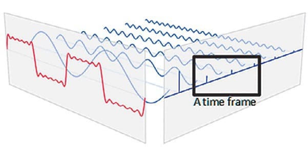
Choosing a Time Frame
When plotting a price chart, you first choose a time frame, say, daily bars. A direct consequence of this choice is that among all the cycles that comprise your market, you have selected only a few (Figure 9). Shorter wavelength cycles are invisible, summarized into the bars of the chart. Very long wavelength cycles are also out of view, affecting the chart so incrementally that you do not notice their effect. You have selected perhaps a half a dozen cycles that are strong enough to be seen in a spectrogram covering 10 to 140 bars. Choosing a time frame is equivalent to selecting some cycles.
Patterns and The Fractal Market
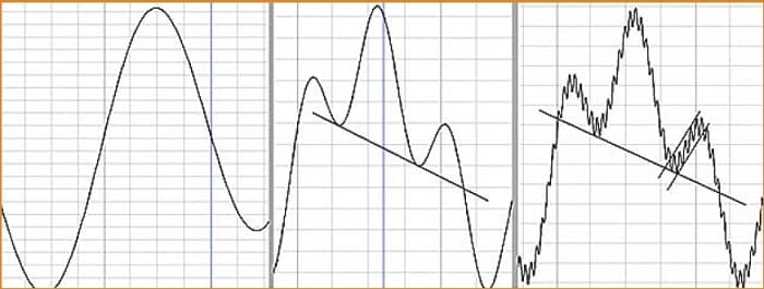
Figure 10 shows that if you start with one long cycle, and add a shorter cycle with shifted phase and smaller amplitude, you get a head & shoulders pattern (second panel.) Adding a third, even shorter cycle generates channels, flags, and other patterns, depending on the wavelength, phase, and amplitudes (third panel). I first saw this done in J.M. Hurst’s book The Profit Magic Of Stock Transaction Timing. The process is described in much more detail in MESA And Trading Market Cycles by Ehlers. Channels, double tops, head & shoulders, trading ranges, and the various consolidation patterns all arise this way. M²M² assumes that all price patterns arise from adding up the contributions of the component cycles.
A Fractal Market
No matter which time frame you pick, the price patterns you see are formed by adding up that time frame’s strongest three or four cycles. Thus, the same price patterns appear at any time frame from monthly through daily, hourly, down to one minute or tick charts. That is one reason why the market is called fractal.
Support & Resistance, Real And Apparent
In every chart, there is an invisible skeleton of support & resistance you can uncover with the relative volume and Freedom of Movement (FoM) indicators, using the process described in my April 2014 StockS & commoditieS article, “Evidence-Based Support & Resistance,” which introduced my Defended Price Lines (DPLs). DPLs are prices where resistance & support are empirically observed to exist, showing that supply & demand are not evenly distributed across price. Pools of supply & demand exist at the DPLs, creating pauses, consolidation, pullbacks, and reversals. These DPLs are the empirical skeleton upon which the cyclic moving parts operate, and together with the empirically observed cycles, form the observational evidence that M²M² rests upon.
You draw trendlines on charts for various reasons: to define support & resistance, to define patterns like channels, triangles, flags, trading ranges, broadening tops & bottoms, and so on. In fact, you are capturing some of the cyclic essence in the chart to predict reversals. Often you think of trendlines as a kind of resistance and speak of price bouncing off a trendline. In fact, for almost all of these patterns, price does not bounce off the trendline. Instead, what appears to the eye as resistance is an artifact of adding up the internal cycles. The cyclic summation turns and price begins to reverse. Cyclic turns are apparent support & resistance. Real support & resistance occurs at DPLs where volume rushes in to defend the price. Often, they do not coincide.
Two Kinds Of Cycles In The Market
Two types of cycles are present in your price chart. There exists a set of smooth background cycles that operate like the bass tones of a pipe organ—long wave-length, steady, long lasting, seemingly without beginning or end. These standing waves include the business cycle, sector rotation cycles, and seasonality. They are the background rhythm of the market, the bass section.
A second set of cycles, shorter wavelength and news event driven, are more like the plucked strings of a harp. These cycles are the tradable melody of the market. The regular stream of different kinds of financial news triggers and reinforces cycles: earnings announcements and conference calls; labor, farm, and unemployment reports; FOMC meetings; and many others. Some of these cycles are relatively stable standing waves, reinforced by recurring events in the economy and in the companies that underlie the trading symbol. An event that is never reinforced results in a cycle that dies out over time.
The effect of the news events varies from drying up most trading activity while waiting for a financial report to come out, to restarting a diminished cycle, to significant news events that start new cycles or reset expectations for existing cycles. Added up, these foreground and background tones (cycles) form the price chart.
The Background Cycles
On the left in Figure 11 is the business cycle, in this case a multiyear-long cycle that is the root of all the cycles you see. The economic sector rotation cycle on the right is intimately related to the business cycle. The business cycle and economic sector rotation mutually bring about each other through a set of relationships between parts of the economy—relationships documented in Wassily Leontief’s input/output model. Leontief received the Nobel prize in economics for quantitatively documenting in a matrix how changes in any one part of the economy affect all the other parts. For example, he showed how output from one industrial sector such as steel is input into other parts of the economy such as automobiles and construction. Each column of an input/output matrix shows the quantitative monetary relationship to all the columns representing the rest of the sectors of the economy.
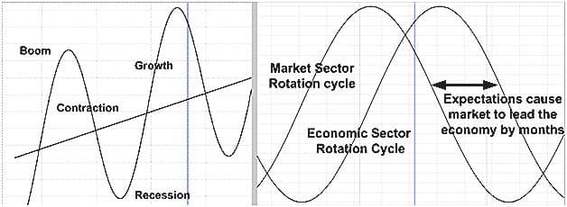
Note that the market sector rotation leads the economic sector rotation by several months. The likely cause of this is an accumulation/distribution cycle known as the Wyckoff cycle. Because large institutions understand the well-documented order of the economic sector-rotation cycle, their expectation of future price causes the market cycle to lead the sector-rotation cycle. They tend to choose stocks for investment that occupy sectors that they know will begin to rise in a few months. When a large institution selects a stock to invest in, the stock is purchased in small increments over time so as not to reveal their intention. The goal is to maintain the price around the initial consolidation price until they accumulate their desired position. Accumulation continues until the supply at the consolidation price is exhausted. Then, price breaks out, the general public of traders and investors sees it, and they jump in, causing a trend to begin. In a trend, prices rise even at moderate volume, since most believe prices will rise.
So why sell in the middle of a trend when the underlying belief is that trends will continue? Large institutions ride the trend up, while others begin to take profits as the trend hits DPLs. The resulting consolidations and pullbacks cause some to expect the trend to end. The taking of profits on the way up explains why equities rise more slowly than they fall. It is harder to find buyers on the way down than it is to find sellers on the way up.
Suggested Books and Courses About Chart Patterns

At some point, the large institutions begin to distribute their position, a little at a time, slowing the rise and causing topping patterns on the price chart. As they exit their position, expectations of further price rises diminishes, causing demand to fall above the consolidation price at the top. The confirmation bias of many investors makes them look for good news rather than bad and they tend to fall in love with high-profile equities such as gold or Apple (AAPL) and hold onto them against the evidence. Thus, the end of the trend is delayed.
Finally, changed expectations cause supply to overcome demand, and a downtrend starts. By this time, the large institutions have mostly distributed their large position and are using the money recovered in the distribution to accumulate another stock to ride up in the next sector expected to rise.
The Wyckoff cycle is the most important nonstanding wave background cycle, and it is the cause of the long trends we see in stocks. Only institutional money can drive the really long runups. These happen occasionally—not on a periodic or seasonal rhythm. In M²M², fundamentals are just one of many factors in the process of setting expectations for future prices. Fundamentals are predictive of future price only in the sense that you interpret fundamentals the same way large institutions do, and that you select the same stocks that large institutions do (they use more than fundamentals to select stocks.) For institutions, fundamentals could be predictive in the sense of a self-fulfilling prophecy, because they may buy enough shares to initiate the Wyckoff cycle and create a trend.
The Foreground Cycles
Foreground cycles are the shorter-term cycles you see and trade. There are groups of independently operating traders using many different time frames—20 days, three days, hourly, five minutes, and others. Each trader has his or her own perspective of a trend direction. Each assesses overbought, oversold, and what is too far from their perceived real price.
The cyclic behavior you see on a chart is the superposition of all those groups operating at different time frames. Weekly economic reports, first-of-the-month traders, people exiting at night and on weekends, session opening orders (MOO), session closing with brokers’ closing book, lunch-hour effect, opening price gaps, and forex markets opening at different hours are examples of the harp strings being plucked, causing cycles. Some events dry up trading at specific times (such as futures volume on five-minute charts in the runup to an FOMC report), causing cycles to pause and restart out of phase. Some events start new cycles. Unscheduled news events take some time to process and to incorporate into existing cycles.
Why Do Prices Cycle?
So far, what I have discussed has been based on empirical observation. Now I offer a hypothesis that explains the causes of the empirically observed cyclic price motion. This hypothesis rests on two assumptions. The first is that all price changes are the result of changes in the balance of supply & demand, and second, all changes in the balance of supply & demand are the result of changes in the expectations of what the price will be in the future. Or, in the words of John Maynard Keynes, “anticipating what average opinion expects the average opinion to be.” Thus, to explain price changes, it is necessary to explain why expectations change. To explain cycling, we must explain why expectations cycle. As Figure 12 shows, the proposed explanation lies in cognitive psychology.
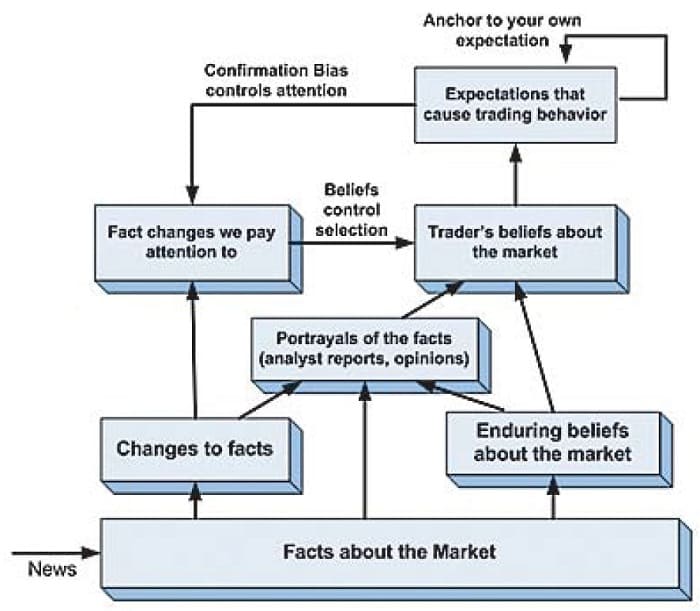
Figure 12 shows the trader’s mental process that generates changes in expectations that cause supply & demand to change. Three ideas form the basis of the chart: expectations, and two findings of cognitive psychology—anchoring and confirmation bias. If you are interested in more detailed descriptions of cognitive psychology or are interested in understanding how decision-making works, I recommend that you read Daniel Kahneman’s Thinking, Fast And Slow, the book that I draw upon for examples.
A trader’s decision-making is based on the trader’s expectations about what the market is likely to do. The anchoring effect is one of the more robust findings in cognitive psychology. Anchoring occurs when people consider a particular value for an unknown quantity before estimating that quantity. The effect is that estimates stay close to the original number that people considered (the anchor) even if it was random non-sense, such as a random number from a wheel of fortune. In one of Kahneman’s experiments, he spun a wheel of fortune with numbers from 1 to 100 in front of a group, fixed so it would stop at either 10 or 65, and asked them to write down the number. Then he asked, “Is the percentage of African nations among UN members larger or smaller than the number you just wrote? What is your best guess of the percentage of African nations in the UN?” The estimates of those who saw 10 and 65 are 25% and 45%, respectively. The meaningless number on the wheel had a strong effect on the estimates. Traders unconsciously anchor on various prices (support & resistance levels, price extremes) and perceived trend direction, and that has a significant effect on how markets work.
The amplitude of cycles acts as a consensus measure of traders’ expectations.
Confirmation bias is the subconscious ten-dency for people to seek evidence to confirm their existing beliefs rather than evidence to refute them. The rules of science require us to test hypotheses by seeking evidence to refute. People, including scientists and traders, naturally and unconsciously do the opposite. This is among the reasons scientists use double-blind tests in experiments. Nature seems to tend toward minds that operate with a set of stable beliefs, and has evolved a default strategy to confirm rather than refute existing beliefs. Unfortunately, this leads traders who acquire false beliefs about the market to search for evidence to support the false belief and ignore, reject, or not look for evidence that refutes the belief.
As shown in Figure 12, a trader’s beliefs about the market controls what changes in the market draw the trader’s attention and what changes are ignored. The figure also shows that once an expectation of market behavior is formed, the trader anchors to it, and in doing so, triggers the confirmation bias to thereafter select for evidence that confirms his belief is true. Out of the stream of facts and opinions about the market available to the trader, what is deemed relevant and controls the expenditure of our most important resource—our attention—is our beliefs and expectations.
Note that in this model, emotions such as fear and greed are not causes of market movement so much as they are reactions to market movements that force rapid, surprising changes in expectations. The emotions may amplify our reactions, but doesn’t cause them. Believing that fear causes price movement is akin to believing fever causes influenza. As for the battle of the bulls & bears, do you buy stocks because you expect them to rise, or because you want to get in a fight with the bears and drive price up?
This is all the psychology required to explain cyclic price movement. Other authors may argue that different aspects of cognitive psychology would provide a better explanation. However, I am confident that the explanation lies in cognitive psychology, and that the cognitive psychology explanation that I propose is testable.
Background Cycles Condition How Traders Think About The Market
The everpresent context of background cycles condition investors and traders to think of the market as cyclic. Business cycle projections (expectations) cause participants in various industries to change their estimate of demand and their corresponding investments and hiring. This is why the business cycle causes economic sector rotation. And the business cycle is just the economic sectors all added up, so it causes the business cycle.
Forming a Foreground Cycling Response
News causes a price impulse by causing a rapid and surprising change in expectations. Traders react to a news event and come to a revised expectation of what the news means to future prices, then act accordingly to buy or short or flat the market. The revised expectation is formed in the context of the current trend, which traders expect to continue, unless the news is so significant in the contrary direction that a reversal is expected. Traders subconsciously anchor their expectations to the direction of the current market trend. As a result of trader reaction, price is pushed in the direction they expect. At some point, participants begin to believe the move has gone about as far as it is likely to go, and they begin taking profits, driving the price in the opposite direction. Since price is now going countertrend, traders expect it to reverse and begin taking profits and reversing their positions. Then the cycle is off and running. This move back toward the trend is also interpreted as confirming the trend (confirmation bias).
Traders expect price to be cyclic and use oscillators to indicate overbought or oversold levels. They also use indicators such as Bollinger bands to see the cyclic extremes. The indicators lead traders to reach a consensus on the amplitude of the cycle—the phase is keyed to the periodic news events. These cyclic expectations are a natural result of the way people assimilate and make decisions on information. There are delays in the process, with some people acting quickly, others waiting to see what the crowd is doing, and some having to delay until an existing bias is overcome. A system with lagged decision-making and feedback will naturally and automatically generate cycles. To see this effect vividly in another domain, play the Beer Game, a board game that depicts the production and distribution of beer. Watch cycles arise in a four-element supply chain, contrary to the best efforts of the players. When decision lag time makes expectations out of sync with the pricing auction, cycles result.
DPLs constrain the amplitude of cycles. There are pools of supply & demand that keep prices from moving past these defended prices without first absorbing the pool. The resulting consolidations may constrain or determine shorter-term cycles’ amplitude by changing expectations due to observed price behavior at those DPLs.
Time frame plays a large part in how much importance traders place on a particular bit of news. For example, the Federal Open Market Committee (FOMC) report is crucial to futures daytraders. Volume dries up in the hours before the report is released, and the short-term trading cycles may disappear. The report release causes a price impulse, and it takes an hour or so for the news to be assimilated and new short-term cycles to be reestablished. People trading the long sector-rotation cycle generally ignore this news.
There are groups of traders operating in many different time frames, including monthly, weekly, daily, hourly, and down to five minutes or less. Each of these groups composed of members operating independently have their charts that focus on the swings within a trend in their time frame. Each group looks at similar indicators (volatility measures, Bollinger bands, trend indicators, and overbought/oversold indicators) and they come to a consensus as to what the true price is and the slope of their local trend. Nearly all believe that more than two standard deviations away is too far, so their expectations, conditioned by their indicators, begin to define cycle amplitude in their time frame. Thus, the amplitude of cycles acts as a consensus measure of traders’ expectations.
Rational Or Not?
There are at least four important competing perspectives that purport to explain the market. Those who believe in the efficient market hypothesis (EMH) and random walk argue that an efficient market means share prices always incorporate all relevant information and thus always trade at fair value, so the sale of overpriced stocks or purchase of underpriced stocks is impossible. Therefore, it is impossible to beat the risk-adjusted rate of return without gambling with large risk.
Both the fundamental trader and technical trader assume that EMH does not limit them and that their edges can beat the risk-adjusted rate of return by assuming only moderate risk. The fundamental approach is based, at its root, on the idea that equities have a discoverable intrinsic value and that the market, contrary to the EMH, misprices some equities compared to that intrinsic value. The risk-adjusted rate of return can be beaten by investing in mispriced equities. If the market was efficient and the fundamental analyst’s ways of computing intrinsic price was accurate, intrinsic value would never say a security was mispriced. If fundamentals were the underlying cause of price movement, there would never be a price bubble. Yet experience shows that fundamental analysis offers a tradable edge.
The technical approach, at its root, assumes, with the EMH, that all equities are always correctly priced based on the information available, including intrinsic value, and that (contrary to the EMH) price changes are due to trends and sentiment. M²M² explains why the technicians can assume that the EMH does not apply to technical trading, at least in the shorter term. The market is made of cycles and support & resistance levels that support prediction; the market is not random. The cognitive psychology underpinnings of M²M² are consistent with the fourth perspective, the behavioral economics approach. Pioneered by Kahneman, behavioral economics builds on the notion that it is an irrational man, not a rational one, that is the basis of economics.
My next article will continue by examining the technical analysis consequences of price charts whose most essential information—the skeleton of support & resistance and the cyclic moving parts—is invisible to the eye. It will describe the technology needed to see clearly inside the chart, how applying the concepts of M²M² change technical analysis, and the insights about the market and trading that result. The goal is to use the model to find edges that inhere in the nature of the market, that is, those the trader understands due to the market model and will not go away unless the fundamental nature of the market changes.
Mel Dickover has been an active trader for about 15 years, focusing on technical analysis. He is an active member of his local Society of Market Technicians. A retired system designer and builder, he holds a bachelor’s of science in physics from Purdue University and a master’s of science in physics from Trinity College. He has programmed several indicators in OmniLanguage script, including the Defending Price Line (DPL) and the Freedom of Movement (FoM), both of which he has trademarked.