Trading Articles
Forex Chart Patterns, Indicators and Elliott Wave Analysis
In this article, We’ll look at some of the more common chart patterns, moving averages, indicators, and Elliott wave theory. I’ll continue examining technical analysis by looking at some other tools that can be useful when trading the forex markets.
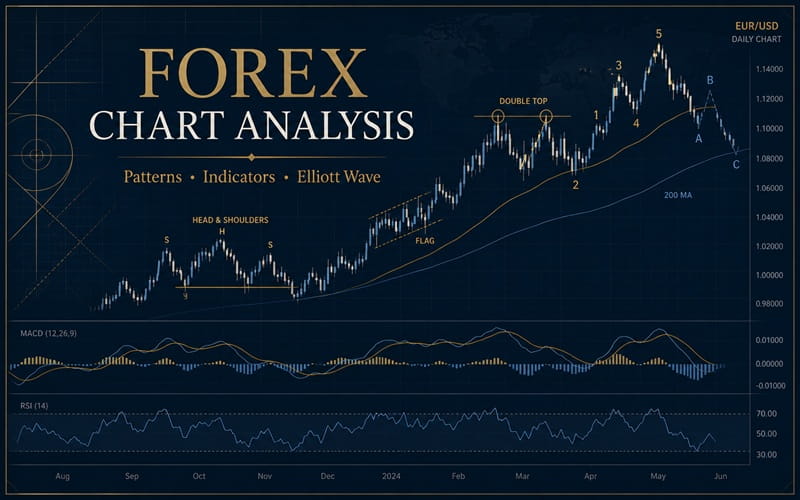
Double Tops & Bottoms
The first patterns I’ll consider are double tops & double bottoms (Figures 1a & 1b). These patterns share similar characteristics with the head & shoulders pattern. The double top is a bearish signal, formed when a currency pair hits a resistance level, fails to break through, and attempts to break it again. After the second failure, the price falls. The point to which the price falls between these two peaks is the neckline. While it might look like a support line, it really isn’t much of one—something that becomes clear after the currency falls from its second peak and blows right through the neckline.
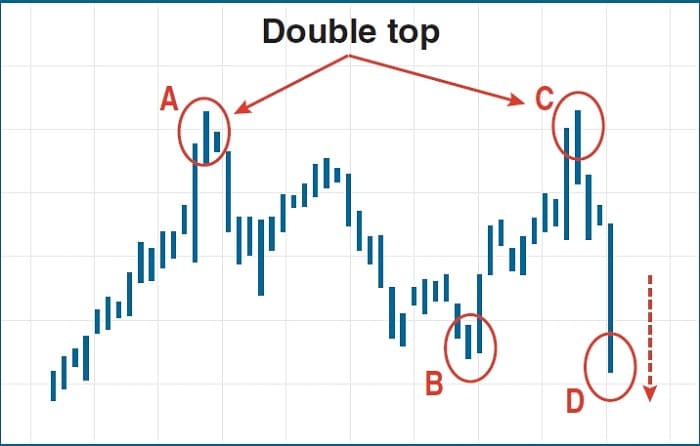
There are a couple of ways to identify a true double top. One is that it should form after a long-term upward trend; if the price has been bouncing around, don’t think you’re seeing a double top. The other is that the second peak should be lower (or at most, equal to) the first peak—remember, this pattern is a sign of bullishness petering out, and the fall from the first peak should have made some traders shy away. The obvious way to trade the double top is to short the currency at the second peak. You should see a decline in which the fall from the neckline is at least equal to the distance from the second peak to the neckline.
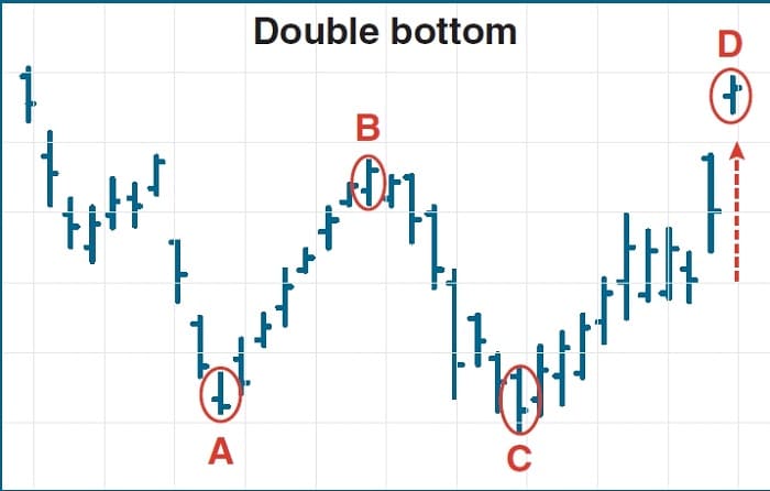
The double bottom is the opposite of the double top. It is a bullish signal, and it should come after a long-term downward trend. The neckline is a resistance level, and the bottoms occur at a support level. Just as with the double top, once the currency breaks above the neckline, it should rise at least as much as the distance from the support level to the neckline.
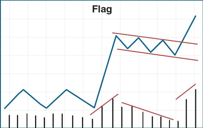
Pennants & Flags
Pennant patterns form in forex just as they do in equity trading, and the principles are the same. Pennants may be bullish, bearish, or symmetrical. Drawing support & resistance lines along a sideways price movement forms the outline of the pennant (Figure 2).
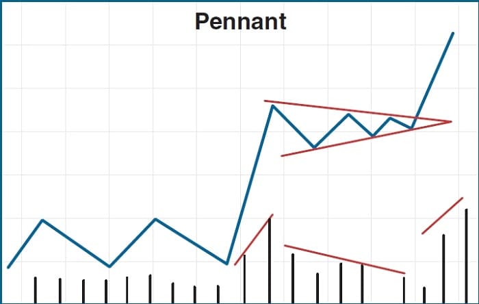
The bullish pennant has a generally horizontal (flat) top, which is the resistance line, but an upward-sloping bottom, which is the support line. A succession of roughly equal highs but higher lows shows growing price strength that eventually results in an up-ward break. The bearish pennant is just the opposite: the support line is level but the resistance line slopes downward, showing successively lower highs and weakening price support that is finally followed by a downward break.
The symmetrical pennant is tricky; in this pattern, the support & resistance lines slope in opposite directions toward convergence. This shows the price moving in a narrower and narrower range. This suggests that the currency pair can head in either direction and that you should wait for a definite break either above the resistance or below the support to determine the direction of your trade. (If a pennant fails to form completely, by the way, it is known as a wedge—but the wedge is a failed pattern, not an indicator itself, so this was just a vocabulary lesson.)
The flag pattern (Figure 3) differs from the pennant in that the support & resistance lines are parallel, although they can be generally horizontal or slope either up or down. Whether a flag is bearish or bullish is determined not by the slope of the trendlines, but rather by what the currency was doing prior to forming the flag. The pattern represents a period of consolidation during prolonged movement either upward or downward, so you can expect that the currency will continue in the direction it was headed when the flag was created. As with the pennant, wait for a break past the appropriate resistance line before trading.
Head & Shoulders
Head & shoulders patterns can be found in forex charts. Like the double top and double bottom, it is a reversal pattern, with the normal head & shoulders being bearish. The head & shoulders pattern has three peaks instead of two but also has a neckline (Figure 4). The second (middle) peak is the highest, forming the head, and the first and third peaks (the shoulders) should be roughly equal in height, though sometimes the right shoulder will be lower than the left as traders start to sour on the currency.
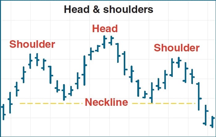
The inverse head & shoulders merely turns this pattern on its head (no pun intended) and is a bullish reversal pattern. In either case, you should place your trade just above the neckline after the right shoulder forms in anticipation of the breakout.
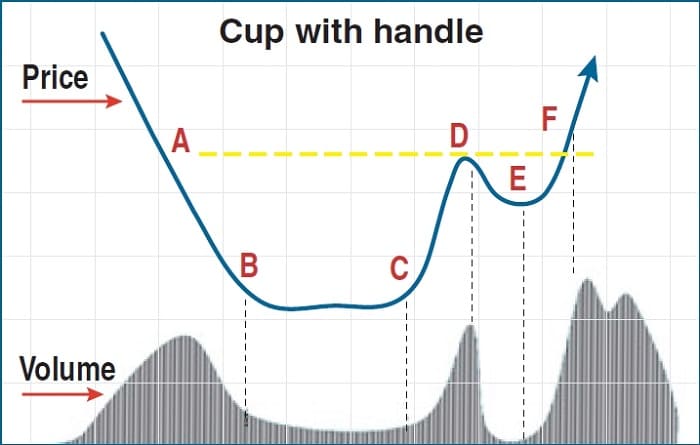
Cup With Handle
The cup with handle is a bullish continuation pattern that tends to be a little longer in forming than other patterns (Figure 5). The currency price will slowly decline, bottom, and then turn upward again, forming the curved cup of the pattern. During the upturn, the currency will pause and consolidate, moving sideways or even downward slightly in a flag that forms the handle. Once the handle is formed, the price will break out of the channel and continue upward. The rounder the cup is, the more reliable the pattern—you’re not looking for a V-shaped rebound here.
Triple Tops & Bottoms
The triple top & bottom works just like its double top & bottom cousin, except that the triple variety is a much stronger signal. The reason is that while it is uncommon to see a double top or bottom bounce off the support or resistance a second time to form a triple, it is downright rare for a triple to do so. However, the potential for triple tops and bottoms to occur is also the reason to wait for a break past the neckline before trading a double top or bottom.
Moving Averages
As with equity trading, the moving average is a key tool for currency trading. A moving average is nothing more than the average of all prices within a certain number of trading sessions—the lookback. A 20-day moving average, for example, is the average price of a currency over the last 20 days (okay, technically it’s trading sessions, not days). Each day’s moving average is plotted and connected to form a line chart. The longer the lookback, the smoother the line will be, since it dilutes daily price movements in the plot.
Advanced Books and Courses on Technical Analysis


The calculation of this sort of moving average is straightforward—that’s why it is technically a simple moving average (SMA). However, another version—the exponential moving average (EMA)—places greater weight on more recent prices in calculating the average. The result is that an EMA with the same lookback as an SMA will respond more quickly to changes in price direction. The EMA reduces the impact of older information. Common moving average lookbacks are 10 days (two weeks’ worth of trading sessions) and 13 weeks (one quarter). Another common setting is 25, which on a weekly chart is almost half a year. For long-term charts, 50, 100, and 200 periods are good settings; 50 works for daily and weekly charts since it shows just short of two months or one year.
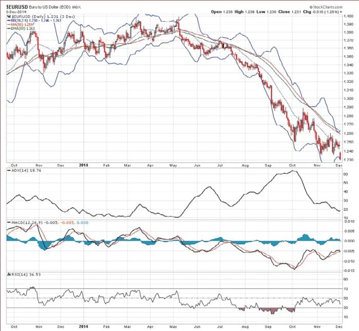
Moving averages show price trends, and since currencies tend to return to their long-term average price, the moving average will show you whether the currency is currently undervalued or overvalued (that is, it is currently trading below or above the average price). However, a single moving average is not reliable enough as an indicator to use for trading purposes. That’s why at least two should be used, one fast (that is, short-term) and one slow (long-term). Then you can look for crosses—points at which shorter-term moving averages cross above or below a longer-term average. Such crosses can be good indicators or confirmations of other patterns. On the daily chart of the EURUSD in Figure 6 you’ll see that the 50-period SMA (red) and EMA (green) overlaid on the price chart move closely.
Techincal Indicators
Technical indicators serve to reveal volatility (that is, the degree and speed of price changes), momentum (the strength of a price trend), and the points at which to trade, whether buying or selling. This is an incredibly broad field, so we will hit just the high points here. First is the moving average convergence/divergence—usually just abbreviated as MACD (and aren’t you glad?). Similar to moving average crosses, the MACD shows crosses and the strength of the divergence. The default setting on most trading platforms is the 12-26-9, which uses 12- and 26-day SMAs. The third setting represents a nine-day average of the difference between the 12 and 26 SMAs, which is what is actually plotted.
The relative strength index (RSI) is a measure of trader sentiment and ranges from zero to 100. Values below 30 are considered to indicate an oversold condition, meaning the currency in question should soon move up. Conversely, values above 70 show that the currency is overbought and due for a correction. These are generally accepted values, and setting more stringent criteria—say, at 15 and 85—makes the signals stronger (but will also produce fewer signals).
Trading the RSI by itself has limitations—mostly on the frequency of available trades, which will leave you sitting out of the market much of the time—but it has great value as a confirmation signal. For example, if you are waiting for the right time to exit a position, RSI values will show you whether there is still definite buying or selling sentiment in the market at the moment. Once the RSI crosses 50, you can see that the trend is about to reverse and that you should exit your position.
The average directional index (ADX) says nothing about currency direction except whether it has one or not. In other words, the ADX indicates whether the currency is trending in one direction or another or merely moving sideways. Some trading platforms use a scale from zero to 100; others use zero to 50. A low ADX reading (below the midpoint, whether that is 50 or 25) is a sign of a sideways movement; once the ADX rises above the midpoint, the currency is about to move in a definite direction. Clearly, the ADX is used to confirm other signals.
Technical indicators serve to reveal volatility, momentum, and the points at which to trade, whether buying or selling.
Bollinger Bands appear as three moving average lines on a chart. The upper band represents the approximate level of resistance, the lower band represents support, and the middle band represents the average of the two. When a currency is moving sideways, the Bollinger Bands will contract—that is, the distance between the support & resistance lines will narrow. Once the currency heads in one direction or another, the Bollinger Bands will widen.
You can also think of the width of the Bollinger Bands as indicative of volatility, since volatility is after all partly a function of the range of price swings. Typically, periods of high volatility will follow periods of quiet, and Bollinger Bands will show this. In the daily chart of the EURUSD in Figure 6, you see examples of the MACD, RSI, ADX, and Bollinger Bands.
Elliott Wave Theory
The Elliott wave has been around for a long time—a lot longer than forex trading has been done by individual investors, in fact, since Elliott wave dates to the 1920s. The man who described (and named) it, Ralph Nelson Elliott, derived it from his study of psychology and theorized that human behavior is predictably cyclic. Since then, Elliott wave theory has been applied to financial markets on the belief that it can be used to predict price movements.
The foundation of Elliott wave theory is a 5-3 wave cycle (Figure 7), with the first five waves called impulse waves and the next three called corrective waves. As you might guess from the names, the theory predicts action (the impulse waves) and reaction (the corrective waves). For financial charts, the impulse waves are numbered 1 to 5 (on each peak and trough), and the corrective waves are labeled A to C. Of course, the trick when studying a price chart is to figure out where to start labeling. Fortunately, there are some basic rules that will help you get this right.
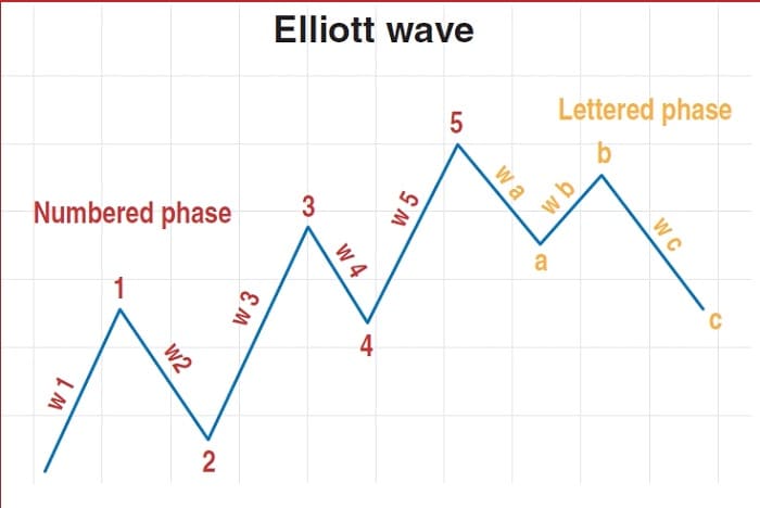
First, wave 2 (a down wave) can’t go any lower than the start (the lowest point) of wave 1. Next, wave 3 (an up wave) can’t be the shortest wave up. (As you might guess, waves 1, 3, and 5 will be the up waves.) Finally, wave 4 can’t overlap with wave 1—that means wave 4’s lowest point has to be higher than wave 1’s highest point. Not to complicate your life, but the last rule isn’t hard and fast, though it does hold about 90% of the time. Usually, when it’s broken, it happens in very volatile markets.
The great thing is that if you can correctly identify an Elliott wave pattern, you’ve got the ability to predict future price movement. That opens up plenty of trading opportunities. For example, you can go long on the wave 4 pullback in anticipation of the wave 5 up, or go short once wave 5 completes.
- Imran Mukati is the Managing Director of fixed income securities at Fairbridge Capital Markets, Inc.