Trading Articles
Highs and Tight Flags By Thomas Bulkowski
Does the high & tight flag work as well as some say? Find out here. I have spent 30 years playing the markets. During that time, I have written several books including two encyclopedias covering 166 price patterns from chart patterns to event patterns to candlesticks, but one pattern outperforms the rest: the high & tight flag. New research indicates that this chart pattern may not live up to expectations. Let’s take a closer look.
What Is It?
The high & tight flag was popularized by William O’Neil in his book, How To Make Money In Stocks. He mentions several identifying characteristics, but I let the pattern’s performance statistics tell me what is or is not important. We agree that a substantial price rise should occur quickly: a move of at least 90% (nearly a double) within about two months. The flag portion of the high and tight flag (Htf) need not look like a flag at all. In fact, many Htfs sport a loose collection of price movement that doesn’t resemble any recognizable pattern. What you are looking for is a consolidation region near where price doubles.
For example, Figure 1 shows what a high & tight flag looks like. Price begins its climb from a low of 1.86 on January 23, 2009 (point A), and reaches a high of 3.78 on March 25, 2009 (point B), or a 103% move in 42 trading days, which is also the maximum time I allow. After price doubles, it consolidates, dropping back to a low at C of 2.92, for a drop of 23% in about a week. This Htf has a nice flag pattern. That means once the stock reaches the flagpole top, price trends downward following two parallel lines, resembling a flag on a pole. I show that on Figure 1 outlined in blue.
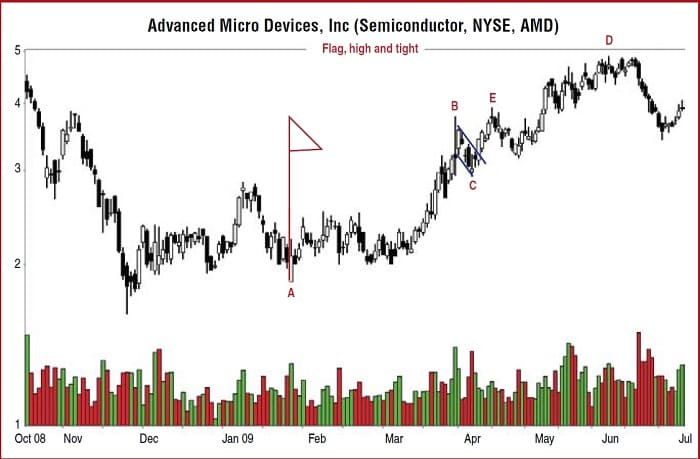
After this consolidation pattern completes, price moves up, but not in a straight line. Rather, it takes its time, eventually reaching a high of 4.90, for a gain of 29%. Following that, price drops more than 30%, signaling the end of the trend. The theory behind the Htf is that price will stage a large upward move (hundreds of percent) after the breakout. However, based on my trading experience, the move usually falls well short of that goal. If a stock can climb 50%, then I The theory behind the Htf is that price will stage a large upward move (hundreds of percent) after the breakout. However, based on my trading experience, the move usually falls well short of that goal. If a stock can climb 50%, then I consider it an outstanding performer. Often, I see price rise 10% to 15% and then roll over and die.
Is That All There Is?
A 29% gain in Advanced Micro Devices (Amd) doesn’t sound like much, does it, especially for the best-performing chart pattern? In my Encyclopedia Of Chart Patterns, I measured the gains from 253 Htfs in a bull market and found that the average rise was a huge 69%. That measures from the breakout price (highest peak in the pattern) to the ultimate high, which is the highest peak before price drops at least 20% (a trend change). That 69% gain was better than all other chart patterns. It is also unrealistic because it represents 253 perfect trades. The rise in a bear market was a respectable 42%. Would new research, with additional samples, dramatically change the performance results? Yes, as we will see.
Methods
I spent several days cataloging 2,588 Htf patterns using a database of 1,018 stocks from January 1995 to May 2009. Not all stocks covered the entire period. I removed Htfs from stocks trading below $1 because they are more likely to go bankrupt or be delisted from the major exchanges. I also removed stocks that made Htfs in one day due to large price swings or data errors.
To determine where the flagpole ended (point B in Figure 1), I looked for the stock to rise by at least 90% in 42 price bars. I kept searching for the top of the flagpole by whether it made a higher high the next day and so on until it stopped making higher highs. The highest high marked the flagpole top. The flag portion of the Htf was the time between the flag-pole top (B) and price staging a breakout (E), which is defined as a penny above the flagpole’s top. Price dropping below the low at the start of the Htf (A) was deemed a failure.
Is the high & tight flag a deal or a dud? The answer depends.
Once price climbed above the flagpole top, the race to the summit began. It ended when price reached the ultimate high, which is the highest high before price tumbled by at least 20% (measured high to low) or closed below the flag low. The flag low is the lowest low that occurs between the flagpole top and the breakout.
Results
Here are some of the results I uncovered:
- The height of the flag averaged 26% of the breakout price. Placing a stop below the flag low sometimes meant taking a huge loss.
- During the search for the ultimate high, 18% closed below the flag low (stopping the search for the ultimate high), suffering an average loss of 10%, but 61% of the remaining stocks found the ultimate high.
- For those Htfs with upward breakouts, the average rise was just 27%. Thus, the 29% gain posted by Amd in Figure 1 is actually good.
- Of the Htfs, 14% failed, meaning the stock dropped below the start of the flagpole.
- The remaining 7% came from stocks that ran out of data (the Htfs were too recent or they stopped trading) and their results were not used.
Suggested Books By Thomas N. Bulkowski

Before you compare the average 27% rise with the 69% bull market result found earlier, please recognize that I did not separate the results into bull and bear markets for this study. In fact, I was looking for patterns in the 2008 bear market to test a theory about why Htfs failed so often. Thus, any comparison with the earlier result is an apples-and-oranges evaluation. The new study, on a percentage basis, has 34.4% of samples coming from a bear market, but the earlier book study only used 17.5%. A fairer comparison uses the 42% average rise from a bear market. In other words, the combined new bull+bear market results (27% rise) falls well short of the old study’s 42% average rise in a pure bear market.
Flag
O’Neil has flag guidelines that say price should drop no more than 10% to 20% during formation of the flag and move sideways between three and five weeks. My analysis shows that the best performance comes from flags that retrace between 10% and 34% and have durations between 10 and 29 calendar days.
Failures
When traders investigate chart patterns, they want to know how often they work and how often they fail. I did a frequency distribution of the percentage rise to the ultimate high as a representation of the failure rate. I found that 19% of the Htfs showed price rising after the breakout by no more than 5%. When you combine the 14% failure rate from Htfs having downward breakouts with this new finding, we discover that the failure rate is a massive 33%.
If you want to make at least 10% on your money, then the combined failure climbs to 48%. Nearly half of the Htfs will fail to rise at least 10% after the breakout! Over two-thirds (68%) will fail to show rises averaging at least 20%. As bad as those numbers are, to a trader who knows the probabilities it says that you must wait for price to rise above the flagpole top. Doing so eliminates 14% of the failures. Even so, the failure rates are huge, at 19%, 34%, and 45% for patterns that fail to rise at least 5%, 10%, and 15%, respectively. Again, these numbers are pessimistic because of the blend of bull and bear market results.
Inbound Trend Slope
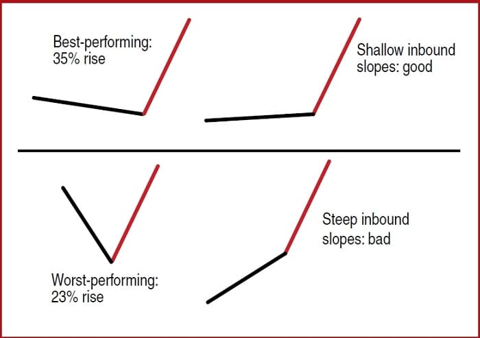
The reason I decided to reopen the study of Htfs was that I noted a number of stocks doubling in price after the late 2008 market plunge and then failing to move higher. I wanted to find out why and focused on the slope of the price trend leading to the start of the Htf. Figure 2 shows the results. I measured the slope of the inbound price trend using linear regression. One measured the trend over one month and the other used two months before the start of the Htf. Then I separated the results into up or down slopes and shallow or steep slopes.
When price slopes upward leading into the Htf, price rises further after the breakout than if prices were sloping downward. The post-breakout performance differences using the one-month slope are just 28% to 26% average rise, but the two-month slope shows a wider range: 30% versus 24%. In other words, when price trends upward during the two months leading to the start of the Htf, the post-breakout rise measures an average of 30%.
Figure 2 shows the slope of the inbound trend (black line) and the Htf (red line). I found that stocks with a relatively flat slope leading to the start of the Htf resulted in post-breakout gains of 33% compared to gains of just 24% when the slope was not flat. The top half of Figure 2 shows Htfs springing from flat bases and the bottom shows them with steep inbound price trends. You will want to avoid trading those with steep inbound trends, either upward or downward. Instead, shop for those with a relatively flat inbound slope for the best performance.
Of the four combinations pictured, the shallow inbound downward trend (upper left of Figure 2) measured using one month of closing price data resulted in an average rise of 35% after the breakout. The worst combination comes from a one-month steep slope leading to the Htf. Those showed gains of just 23% after the breakout. Those V-type moves were the ones I saw in 2008. They often led to disaster.
Closing Position
Research using more samples has uncovered variations in the high & tight flag that helps predict future performance. Look for shallow up (best using two months of closing price data) or down (best using one month of data) price trends leading to the start of the high & tight flag. Then, price should nearly double in about two months or less. Following that, a flag that retraces between 10% and 34% in less than a month leads to good post-breakout performance.
The new research also says that the high & tight flag does not perform nearly as well as in the earlier, smaller study. In fact, just 6% of the patterns showed price doubling after an upward breakout. However, the new study combined bull and bear market results, so that understates bull market performance.
Finally, is the high & tight flag a good deal or a dud? The answer depends on how well your trade works out. For more information on the new study, visit my website at http://thepatternsite.com/HTFStudy.html.
Thomas Bulkowski is a private investor with 30 years of experience and considered by some to be a leading expert on chart patterns. He is the author of several books, the most recent of which is Encyclopedia Of Candlestick Charts. His website and blog has 500 pages of free information dedicated to price pattern research and can be found at www.ThePatternSite.com.
Thanks for the great article on the high tight flag pattern.
It seems this chart pattern is quite rare, even in bull markets. However, it’s certainly worth scanning for, as I have found it to be on the most profitable chart patterns.