Trading Articles
Pump Up The Volume By Todd Krueger

Here’s how you can use Wyckoff volume analysis to trade the forex markets. It is a nearly universal belief among forex traders that volume analysis techniques cannot be utilized in their market analysis. This belief exists because spot forex does not trade on a centralized exchange and so no actual traded volume figures are available for traders to analyze. Volume analysis in the forex markets is not only possible to perform, but it in fact provides a great edge that enables the trader to properly read the chart to determine where supply/demand imbalances are occurring in real time. These areas of imbalance create sizable market moves that the trader can take advantage of by trading in the path of least resistance. For the volume analysis, I will be sharing techniques pioneered by Richard D. Wyckoff more than 100 years ago; these methods have withstood the test of time and are very powerful when used correctly.
Wyckoff Volume
First, let’s discuss this issue of receiving volume figures to work with. While it is true that actual traded volume figures are not available to us as traders, we still have a means to achieve the same desired effect. In the place of actual volume, we will instead use tick-based volume. Most traders believe that tick volume has little merit as a replacement for actual traded volume figures. The underlying reason this is such a widely held belief is that most traders have never had proper volume analysis training. Without the necessary background to understand volume in all of its available forms, it is easy to hold this mistaken belief. I often use the analogy to the once–broadly held belief that the world was flat and if sailors ventured too far out in the sea, they would fall off the edge of the Earth. Centuries ago, this belief was held as fact. It was not until the world gained a greater understanding of science and the three-dimensional world that allowed them to understand the truth.
Richard Wyckoff pioneered the study of price/volume relationships in the early 1900s. He discovered that large professional trading interests, sometimes referred to as smart money, leave footprints of their trading interests on the price chart. They trade with such large size that they can’t hide their activity from a trained chart reader who can see the price/volume patterns that they leave on the chart.
It’s a good idea to clarify what tick volume represents on the price chart. The best way to understand the concept of tick volume is to view it as the amount of trading activity occurring at a given price level. When there is little tick volume we know that there is little trading activity at that price and time. Conversely, when there is a large amount of trading activity it will appear as a large amount of tick volume that is being recorded at that particular price and time. While it is true that tick volume measurements can’t differentiate between trade activities being recorded with one contract vs. 1,000 contracts, what it does tell us is equally important. We can still see when there is a large amount of trading activity at the current price and time, or when there is not.
Upthrust
Wyckoff volume analysis applies to all variations of price and volume patterns, but for this article I will concentrate on defining one particular pattern called an upthrust. The upthrust is considered a sign of weakness and occurs when the current candle has a higher high than the previous candle’s high. This current candle must close on or near its low. Once you identify an upthrust, you then look at how much trading activity took place on that pattern. The amount of activity (whether it is actual volume or tick volume) alerts the trained volume analyst to possible imbalances of supply/demand that are developing, which will then cause the price to move. When demand exceeds supply, the price must move higher. When supply exceeds demand, the price must move lower.
The trading from the smart money creates these supply/demand imbalances in the markets, and once the retail trader is trained to detect these areas on their charts, they can trade in harmony with the smart money. It is also important to be aware of levels on the chart where we expect the smart money to become active. They will generally initiate their activity, especially for price reversals, at levels of support and resistance. Being able to accurately identify areas of support and resistance is therefore critical to finding and trading these areas of supply/demand imbalances.
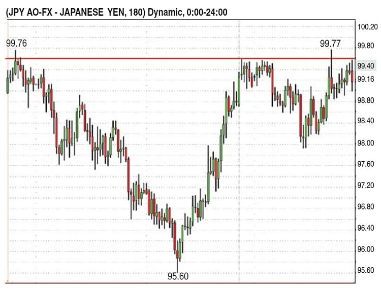
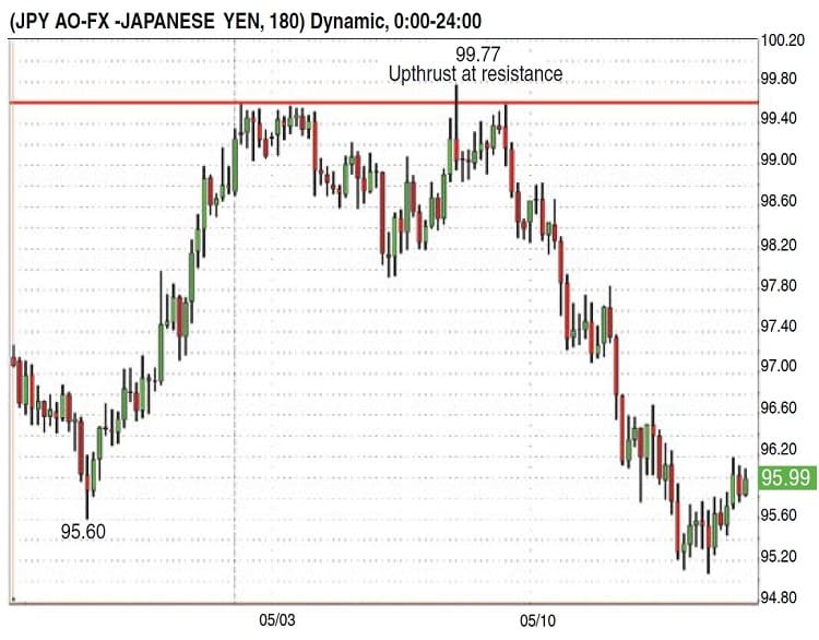
Look at the 180-minute chart in Figure 1 of the cross-rate between the US dollar and the Japanese yen. The thick red horizontal line represents a strong resistance area. When price is approaching areas of resistance, you are looking to see if supply will be dumped on the market by the large professional traders. Conversely, as price approaches a support area, you are initially looking to see if demand is coming into the market at those price levels. As stated earlier, I use Wyckoff volume analysis techniques to determine when or if this is occurring. On Figure 1, it is important that you recognize the resistance line and the high and low prices on the chart. The low occurred at 95.60 and there was a double top at 99.76/99.77. This will become important as we look at Figure 2.
Note the candle that the arrow is pointing to in Figure 2. This is an upthrust at resistance. You can see that the high of this candle is not only higher than the high of the previous candle; it is higher than the resistance line as well. You need to also remember the previous high of 99.76 in Figure 1 and recognize that the Usd/Jpy made a new high by one pip at 99.77. As you look at this upthrust, note the huge amount of trading activity that occurred on this candle. It is the largest amount of activity on the chart. This information is critically important as you gain an understanding of the psychology behind the upthrust pattern. You can imagine the number of traders who already established a short position since the resistance level was not violated before this upthrust. The logical place for their stop is somewhere above the resistance line.
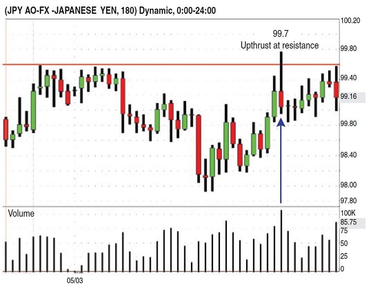
As the price moves above the resistance line, you would expect several types of trades to occur. First, the shorts have to cover their positions by placing a long trade to offset their now-losing short position. Second, the breakout traders establish new long positions as price moves above resistance and they expect price to continue higher. In both instances, this opens a window of opportunity for the smart money to find plenty of willing buyers, which allows them the opportunity to sell into this frenzy of long trades hitting the market at this critical price zone.
Suggested Books and Courses About The Wyckoff Methods


With all of these long trades hitting the market at once, their massive selling will not drive the price down too quickly and alert the public to their selling the market short. This is now an inflection point on your chart, as this area now represents where there was a transfer of ownership from the smart money to the unsuspecting traders. The smart money is now net short and the price will have a difficult time rising as supply has now swamped the market. Wyckoff techniques reveal that a sudden or abnormal increase in trading activity that appears after a sizable move has already occurred usually indicates the end or the coming end to that move. We have had a price move of 417 pips from the low of 95.60 to the high of 99.77, and then we have an abnormal increase in trading activity with the price closing near its low. This pattern shows that supply was put on the market and that it overwhelmed the demand it was selling into. As the smart money is now short, there is not enough demand coming into the market from the uninformed public to advance the price any higher, and the price must fall.
As you look at Figure 3, you can see the quick decline that occurred after the supply imbalance at resistance. It actually fell back to where the big up move began, and as a trained chart reader, you are looking to identify if demand will appear from the smart money.
Supply/Demand Balance
All freely traded markets work on the laws of supply and demand. When an imbalance of supply and demand occurs, the price must trade in the direction of this imbalance. These imbalances are created from the result of the large professional trading interests and their massive positions. To trade profitably, they must execute their trades and establish their positions without the public becoming aware of what is happening.
When there is a large amount of trading activity, regard-less if it is measured with actual traded volume or tick volume, we know that these large professional traders have to be involved along with the public. We know this because these are the areas on a price chart where the smart money can hide their trading intentions and initiate their positions. These windows of opportunity can occur on report days such as nonfarm pay-rolls, news-related events, and shifts in fundamentals to name just a few, but it pays to watch your valid support and resistance areas to detect any unusual or abnormal trading activity as these are ideal areas to watch the smart money in action. It is important to point out that not all volume climaxes will be as easy to read as this example, but with a new eye toward the importance of volume analysis along with some practice, I am sure that you will begin to identify when these high-volume upthrusts are occurring on your charts at home.
Todd Krueger is a professional trader, educator, and an expert in Wyckoff volume analysis techniques. He is the founding president of Traders Code, LLc, which provides professional trading tools and education to the retail trader.