Trading Articles
The Buffett Indicator: Using Market Cap-to-GDP to Analyze Stock Market Valuation
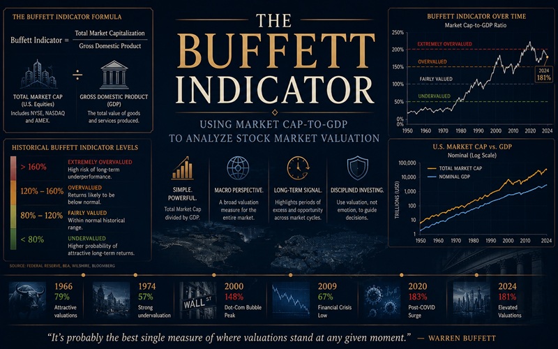
When it comes to investing, the Oracle of Omaha usually plays his cards close to his chest. But here is one favorite indicator that he’s been willing to share. In an article I wrote a year ago titled “Warren’s Best Valuation Measure,” I discussed a macro indicator that Buffett uses to help him decide when stocks are over or undervalued. But after a close look at the data in the article, it was obvious that further research and observation was necessary. According to a 2001 Fortune Magazine article (“Warren Buffett On The Stock Market”), Buffett considers US total stock market capitalization to GDP to be “probably the best single measure of where valuations stand at any given moment.”
He had used this ratio at least in part to issue an overall stock market top warning in a speech given in September 1999 (reported on in a November 1999 Fortune Magazine article, “Mr. Buffett On The Stock Market”) and again in January 2009 to start buying stocks again (“Buffett’s Metric Says It’s Time To Buy,” Fortune Magazine). But determining exactly how useful it is as a leading macro technical stock market indicator requires a much closer examination of the charts and data.
In Search Of A Lead
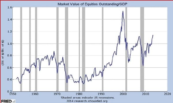
Since the mid-1990s, buying stocks when total stock market capitalization (TSMC) accelerated above 0.8 (80%) of gross domestic product (GDP) has proven to be a profitable signal all three times. Since the dawn of the new millennium, the indicator has so far generated two major buy signals—first in April 2003 when it crossed above the 0.8 threshold, and then when it did so again in July 2009 (Figure 1).
That is certainly not a statistically significant amount of data, except to say that those who bought a basket of US stocks at those times with the stomach to tough it out for the long haul (as Buffett did, for instance) would have been well rewarded.
It should also be noted that when TSMC to GDP surged above 0.80 in 1995, it was only the second time in history, except this time it just kept going past the previous all-time high of 0.87 set in 1968. But rather than reverse at this point like it had in the past, it sliced through 1.00 in January 1998 and kept going higher even after Buffett’s bearish warning in July 1999 when TSMC/GDP hit 1.205. It would take another six months for it to ultimately peak at 1.535 in January 2000, which meant that the total (paper) value of US stocks had hit the unprecedented level of 154% of GDP. But by this time, investors like Buffett were long gone (assuming that he had acted on the signal).
The indicator has value especially when used with a linear regression line to indicate when valuations are nearing extreme levels.
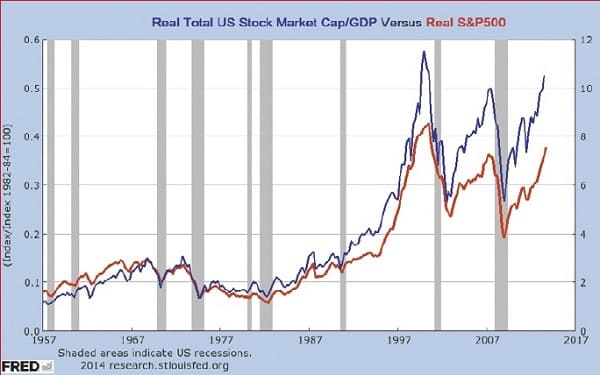
In Figure 2 you see the relationship between TSMC/GDP and the S&P 500 index. After adjusting for inflation (by dividing both by the consumer price index), the two metrics were more closely aligned, thereby creating a clearer picture of the correlation between them. Unfortunately, adjusting for inflation also caused the lead between TSMC/GDP (blue line) and the S&P 500 index (red line) to disappear in a number of signals. As an aside, Figure 2 also shows the significant depressive effect inflation has had on stock market prices since 2000 compared to the non-inflation-adjusted chart in Figure 3.
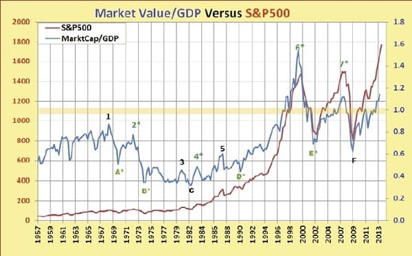
But the overriding question remained: What sort of reliable, advance warning did TSMC/GDP peaks and troughs provide the visual stock trader or investor? As Figure 3 shows, a total of seven peaks and six troughs were analyzed by comparing TSMC/GDP with the S&P 500 index (SPX) data values. What is immediately obvious on the right side of the chart is that TSMC/GDP has fluctuated above and below a value of 1 (100% of GDP) since 1995. At the peaks at point 1 in October 1968, point 3 (October 1980), and point 5 (July 1987), TSMC/GDP and SPX selling peaks occurred simultaneously, while at peak 2 (January 1973), peak 4 (April 1983), peak 6 (January 2000), and peak 7 (July 2007), TSMC/GDP peaks provided advance sell warnings. Advance buy signals were generated at point A (April 1970), point B (July 1974), point D (July 1990 ), and point E (July 2002), while signals at C (April 1982) and F (January 2009) were more or less coincident with S&P 500 lows.
In other words, buy & sell signals on the SPX generated by the TSMC/GDP ratio, while interesting, hadn’t proven to be over-whelmingly reliable from a technical standpoint. Did Buffett use the data another way?
Advanced Books and Courses on Investing & Wealth Strategies


Data Discovery
What if we were to break the data into smaller chunks and examine them in greater detail? Toward that goal, I divided the data from Figures 1 to 3 into three parts of similar length (see Figure 4). Note that in the first (1957–1974) and third periods (1995–2013), the dashed blue linear regression line is more or less horizontal. Only in the middle period from 1975 to 1994 is it upward sloping.
The goal in parsing the data is to choose periods in which the linear regression line is positioned roughly equidistant between high and low values, thereby creating an approximate over and undervalue center line. The periods chosen are approximately 18 years long, which is the length of the average major stock market cycle according to Kerry Balenthiran in his book The 17.6 Year Stock Market Cycle. Breaking the periods into smaller chunks allows a more detailed analysis and makes it much easier to see leading versus coincident (or lagging) signals on a chart.
The first three TSMC/GDP lows (1957, 1960, and 1962) occurred ahead of SPX lows by anywhere from one to three quarters, according to the data. Lows in 1966 and 1969–197 0 also led the SPX. The TSMC/GDP peak in 1960–1961 led the SPX by two quarters, but the peaks in 1965 and 1968 provided no advance warning. Finally, the TSMC/GDP peak in 1972 led the SPX by one quarter, as did the low in 1974.
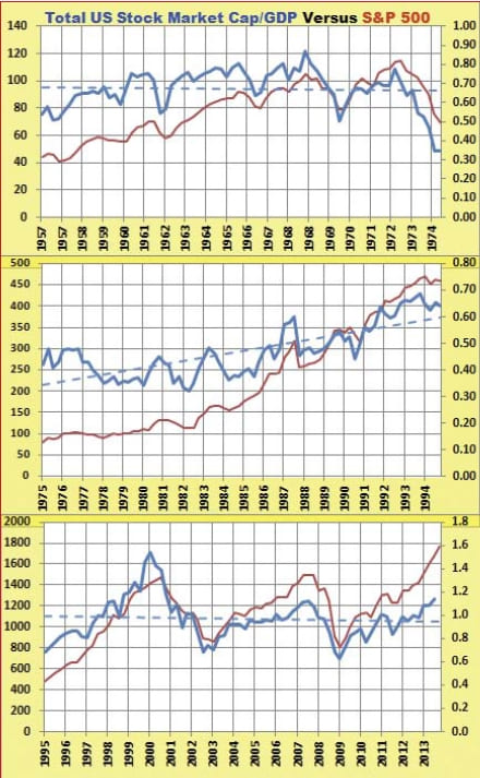
As you can see, signals were not as visible on the chart for the middle period (1974–1994) due to the different slopes of the two lines; stocks were on more of a tear after the biggest bull market in history began in 1982, whereas the TSMC/GDP was wavering (see the middle chart in Figure 4). Although high and low TSMC/GDP signals up to 1983 were coincident with the SPX, the peak in 1983, the low in 1990, and the peak in 1993 led the index.
In the last period (1995–2013), the TSMC/GDP peak in 2000 occurring ahead of the SPX (by two quarters) is clearly visible in the lower chart in Figure 4, as is the low in 2002, which also led by two quarters. TSMC/GDP also warned ahead of a peak by one quarter in 2007, but the 2009 trough was coincident with the SPX low.
Probing The Valuation Future
There are two challenges with this indicator. The first is the low number of signals, and the second is the quarterly TSMC to GDP data that is produced by the Federal Reserve and published more than six months after the fact. On the positive side, this indicator has value especially when used with a linear regression line to indicate when valuations are nearing extreme levels. What is perhaps most intriguing about the TSMC to GDP indicator is that it shows that fundamental/economic data beyond the purview of most traders and technically based investors has value as an indicator. And although this indicator shows promise, much more research should be done.
The takeaway is that some of the tools that long-term investors like Warren Buffett have come to rely on can provide value to their shorter-term counterparts, who can gain useful insights about when stock prices are getting toppy or approaching an important bottom.
- Matt Blackman is a full-time technical and financial writer and trader. He produces corporate and financial newsletters, and assists clients in getting published in the mainstream media.