Trading Articles
Regression Channel Analysis: Defining Price Trends with Linear Regression
Beginning investors are continually told to “trade with the trend” or “the trend is your friend.” That’s because once a securiry enters an established trend it tends to persist in that direction as more investors realize it is moving a certain way and get on board. George Soros (a great investor) has observed another reason that price trends persist which he calls “reflexivity.” His intriguing point is that a company’s increasing stock prices are helpful to the company in a number of ways and so the company becomes more successful, making the stock price go up farther. Soros calls this a positive feedback loop. Interesting idea, isn’t it? Makes you want to spot the trend as early as possible. Exactly how you can you do this is the subject of this book.
THE PROBLEM WITH PRICE TRENDS
The common methods of defining price trends all have serious flaws. Anyone with an interest in buying or selling securities of any kind has to decide if the security’s price is moving the right way. Sometimes it is obvious. Usually there are naturally occuring contrary movements that can be very confusing. Is it possible to see what others can’t see? Is there a way to observe the “hidden strata” beneath the obvious market terrain? Can one predict turning points? Before we tackle these questions, let’s start with a short review of traditional methods of price trend analysis.
WHAT IS A PRICE TREND?
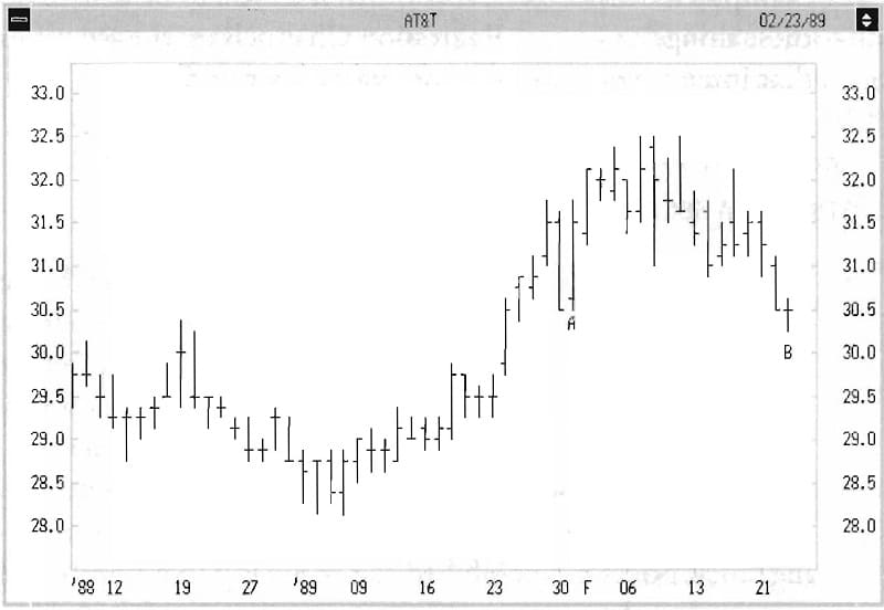
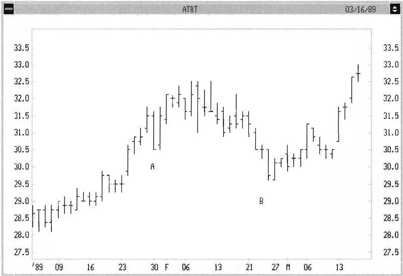
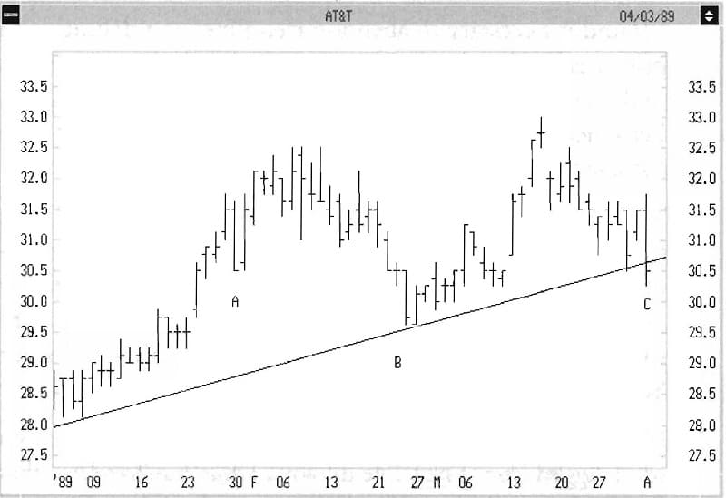
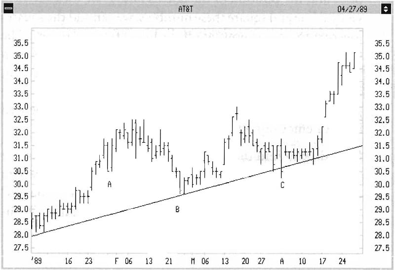
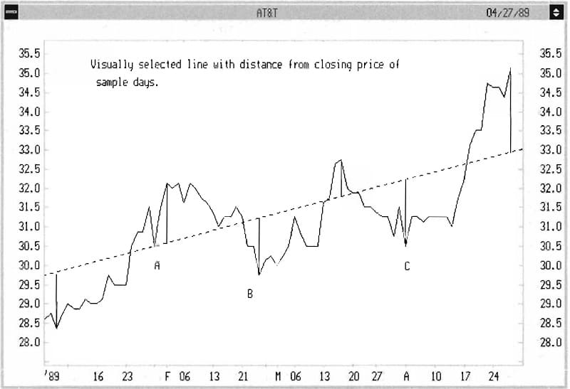
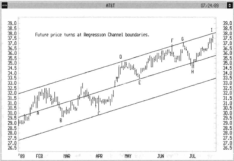
One definition of an uptrend is a series of higher highs and higher lows. As price goes up in a strong wave, the ripples on that wave fulfill this definition. In Figure 1.1, we see AT&T moving up in this way. However, at B there is a new low that is lower than A, so by this definition the trend is over. Yet in Figure 1.2, the stock moves much higher. Obviously, the uptrend was not really over. More useful than the above definition, and one of the basics of technical analysis, is drawing a trendline.
CREATING A TRENDLINE
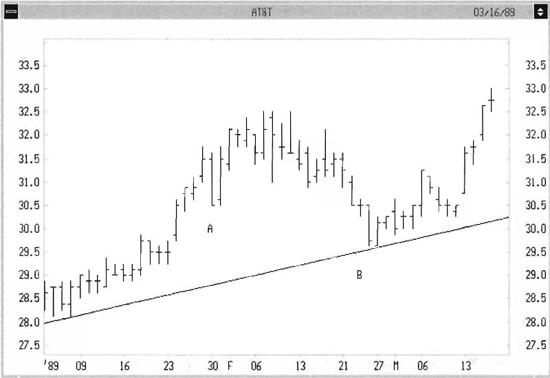
If we believe an uptrend is in place, a trendline is drawn on the bottom of prices to help determine where to set protective stop losses or determine when the trend is over. (The opposite is true in a downtrend.) This is done by connecting two of the lowest lows, and extending the line forward (see Figure 1.3). If price challenges but doesn’t break this line (this is called “finding support” in technical analysis technology), the trendline is confirmed.
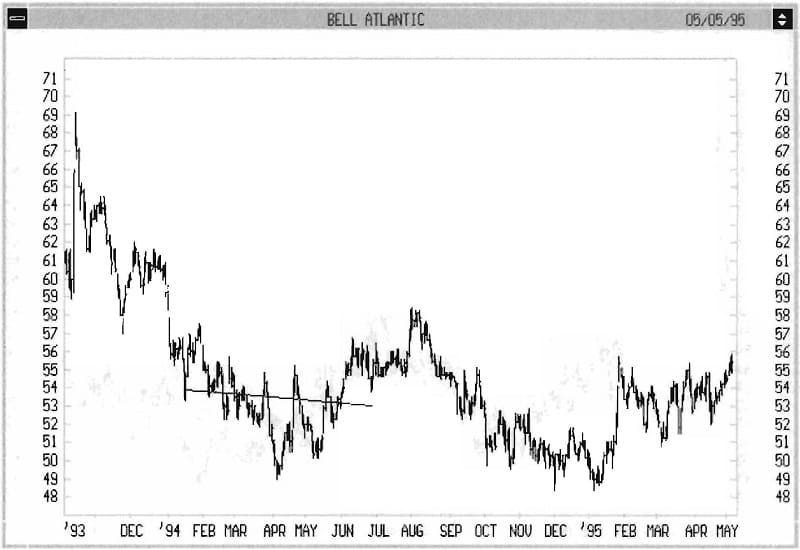
Confirmed simply means that we believe in the trendline enough that if prices fall below it we are concerned that the trend is over (see Figure 1.4). The opposite is true in a downtrend. If no line can be made connecting three lower lows or higher highs, a “Trading Range” may be present, meaning no trend except sideways. In this case, we often draw a horizontal line at the highest high at the top of the range, and the lowest low on the bottom of the range. If price exceeds either, we may be seeing a “breakout” to a new trend.
These methods are helpful but not fundamentally valid. That is, there is no strong theoretical reason why these lines should define price trends. In actual practice, they subject you to a lot of wrong decisions (see Figure 1.5). Here again, the error is that the trendline break suggested the uptrend was over, but price continued much higher. It was my frustration with these errors that led to the Regression Channel.
THE REGRESSION CHANNEL-BASIC CONCEPTS
I found it necessary to abandon trendlines as a definition of price trends because their accuracy is so low they are a weak tool. Let’s look at an analysis that goes beyond appearances. Let’s measure the direction and rate of a trend rise as if it were a missile off the launching pad. Think of the dosing prices of a security. They are no different from the points on a graph of daily temperature or the values of weekly numbers of visitors to a national park. You may remember the way to find the single best straight line to fit the data. This method is called “The Method of Least Squares” or “linear regression.” Here’s how it works.
Advanced Books and Courses on Technical Analysis


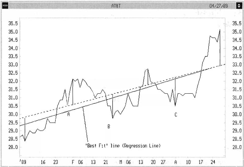
If you look at Figure 1.6, I’ve shown the closing prices as a solid jagged line. Then I’ve drawn a visually selected line that fits the data well (dotted line). On a sample of days, I’ve used vertical lines to illustrate the difference between the closing price and the position of the dotted line. If we measure each vertical line and square these numbers, we can add the squares together to express how far off the line is from all points. The line which minimizes the sum of the squares is the one with the “Least Squares.” This line is called the “Best Fit” line-or, in my terminology, the Regression Line. One of its nice properties is that it is objectively created and is not influenced by your emotions about the security. How do you find the line that has the minimum sum of the squares? To find a minimum variation, we usually look to calculus. This is no exception, and the “Least Squares” method requires that we solve a differential equation.
Without the aid of modern security charting software, this would be impractically tedious. Thankfully, with the touch of your mouse to two points, modern charting programs (such as Metastock©) will draw the Regression Line in seconds. See Figure 1.7 for a comparison between the visual line (dotted) and the Regression Line (solid). In most cases, it is best to then extend this line forward in time. Instruct your software to extend the same line one period farther at the end of each day, hour or week, depending on your personal investing time scale. This is the beginning of charting the Regression Channel.
BASIC UNDERSTANDING: THE REGRESSION LINE
What have we accomplished so far? Well, we’re halfway to heaven. We have a simple, quick method of establishing the direction of price with time, and if we extend the line we can easily see whether prices stick close or veer away. However, we have to go farther to solve all our needs. If prices veer away, how far must they go before we consider that a trend has ended? How do we decide where to start the Regression Line, since if we start it earlier it may change the direction of the line? How do we know where to start the line?
EXPANDING THE METHOD
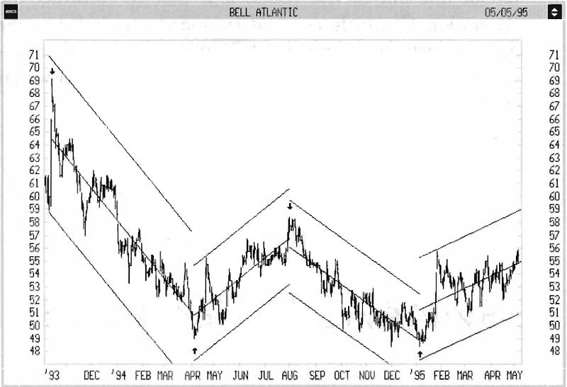
The answer to these questions lies in creating a Regression Channel. After the Regression Line is drawn, have your computer project a second line parallel to the Regression Line. 1 Instead of passing this line through the center of the data, send the line just above or below the highest high or lowest low that is farthest from the Regression Line. T his is called the Regression Channel Extreme. This line will be either the Regression Channel Bottom or the Regression Channel Top (see Figure 1.8).
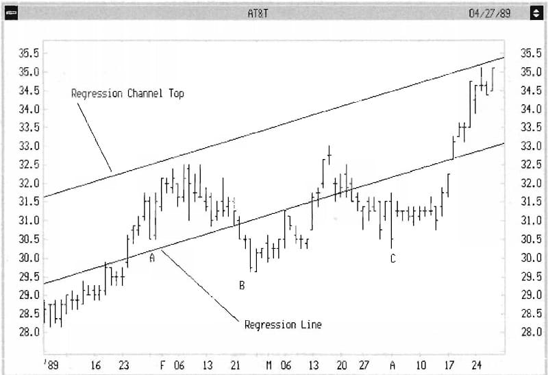
Then, from whichever side of the Regression Line chis is, move your cursor to che opposite side and go an equal distance vertically from the Regression Line. From that point, draw a second parallel line (see Figure 1.9). Finally, have your computer project these lines to the right. All of the charts in chis book represent daily or weekly data. The Regression Channel is equally valid for any time frame, such as hourly data. I tend w be a long-term investor, but the same techniques work in day-trading.
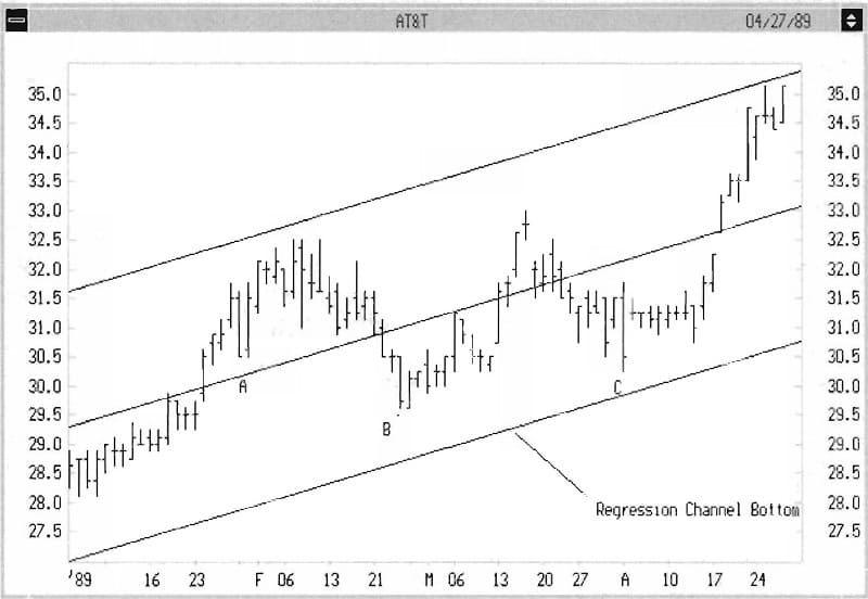
The center of the Regression Channel is the Regression Line. The entire vertical width of the Channel is twice the Regression Channel Extreme, called the Regression Channel Range. If you have done this correctly, you will see two things:
1. All the price data is enclosed by the Regression Channel.
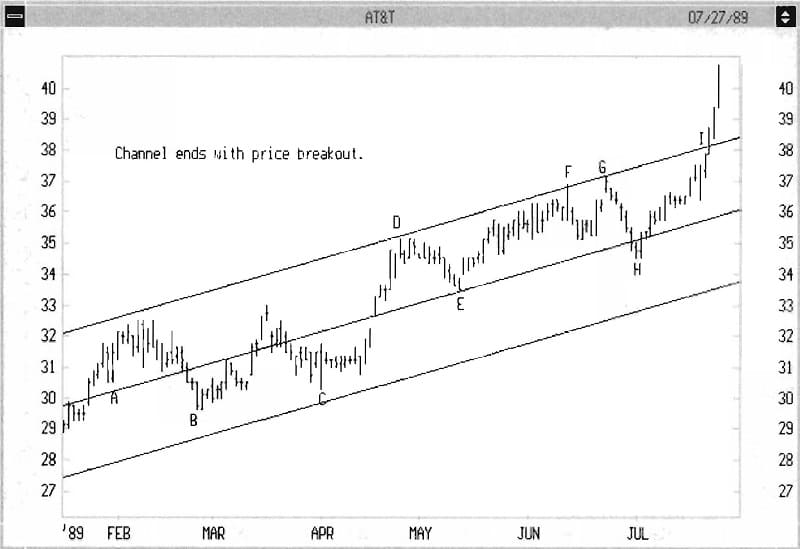
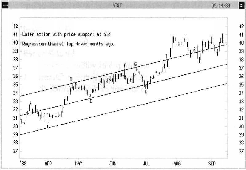
2. In most cases prices will rebound off the outer lines in a remarkably precise way, often for months, until the Channel ends. You will easily be able to tell when it ends because prices will eventually and unmistakably exceed the Regression Channel Range. Even after prices are out of the Channel, they may continue to react to the projection of that Channel for months or even years! See Figures 1.10-1.12 for examples of these points.
STARTING A REGRESSION CHANNEL
We have yet to answer the second question posed above: How do you pick the right date for initiating a Regression Channel? First, let’s take a look at why this is so important. In Figures 1.13a and 1.13b, we compare a Regression Line started at two different points for the same security. One is relatively steep, one relatively flat. Which one is right? Clearly Figure 1.13a gives us a sense that it is “right.” From a mathematical point of view Figure 1.13b is accurate, too, but it doesn’t describe anything useful. You feel Figure l.13a is correct because of your ability to recognize patterns. A computer might conclude that both are equally “right.” The practical question is: how was Figure l.13a chosen?
The answer is evident in Figure 1.14. Begin each analysis by going back for at least one previous swing point. I’ve marked the days I used for starting points with arrows. How does one identify a swing point? In common usage, a swing point is an important high or low that seems to start a price pattern. It’s usually easy to identify in hindsight, and I will give you several methods in this chapter and the next. It is often not easy to know at the time if a high or low will become a swing point.
If you have been carefully creating one Regression Channel after another (Serial Channels), the last low before a Channel Break in a downtrend is often the swing point (and the opposite is an uptrend). That is the first choice in most cases. For practice, begin with a security chart with easily identified peaks and valleys. After a while, confusing-looking charts become more organized when you simply draw the Regression Channels for a period of time. A trial-and-error process is honestly the best way to start.
- Part of book: Trading the Regression Channel: Defining and Predicting Stock Price Trends By Gilbert Raff