Trading Articles
Double Bottom Reversals and Capitulation Price Structure
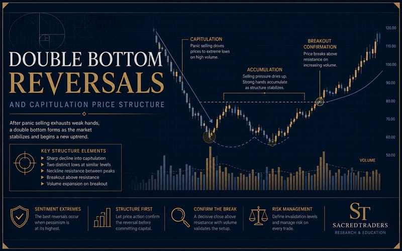
Profiting from bottom fishing is notoriously difficult, but this setup may help. Buy low, sell high. How many times have you tried to do that and lost money? Here’s a trading setup for buying stocks making new yearly lows. A shorter phrase for that is bottom fishing. The technique I’ll describe here is not perfect. You can still lose money, perhaps a lot of it, but the setup gives you an indication of how often bottom fishing works. Perhaps you will have ideas on how to improve the setup.
Ugly Double Bottom
I’ll begin with a chart pattern I call an ugly double bottom. In Figure 1 you see an example of this at points AB. In a traditional double bottom, price makes a valley, bounces, and forms a second valley at or near the price of the first one. In the case of an ugly double bottom, you are looking for a second, higher valley.
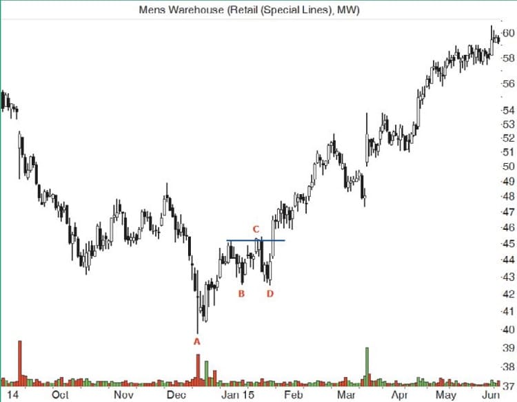
In this example, price makes a new yearly low at A, bounces to the horizontal blue line, and forms a higher bottom at B. When I first tested this pattern several years ago, I set a minimum price difference between bottoms of 5%. This example shows bottom B 7% above A. The ugly double bottom confirms as a valid chart pattern when price closes above the top of the pattern. That occurs at C in Figure 1, although it may be hard to see on the chart. Notice how price drops to D and then recovers. Testing shows that a stop placed below B is not ideal, but it will cut losses almost in half. The tradeoff is a drop of 20 percentage points in the win/loss ratio. I prefer a stop below A. I’ll discuss testing results later in this article.
Trading Setup
The setup described here is easy enough to follow. Look for an ugly double bottom when the stock makes a new yearly low. Here are the steps.
- Only look for stocks during a bull market.
- Find a stock making a new yearly low.
- Locate an ugly double bottom where the first bottom sets the yearly low.
- Place an order to buy the stock on or after the pattern confirms.
- Place a stop-loss order a penny below the first bottom.
- Use your favorite sell signal to exit the trade.
Step 1: Only bottom fish in a bull market. In a bear market, price tends to keep going down and it busts ugly double bottoms. Testing results reinforce that belief. The median trade in a bull market gained 32%, but in a bear market it lost 20%.
Step 2: Using the yearly chart, look for price to set a new low for the year at the first bottom of the ugly double bottom. I did not test variations with the first bottom higher in the price range, so that is something you can explore.
Step 3: The second bottom should be between 5% and 20% above the first one. The larger the difference between bottoms, the larger the potential loss, but the number of winning trades increases. I tested a 5% to 25% range and found that the sweet spot is 10% and above.
Step 4: The pattern confirms when price closes above the top of the pattern. That means buying at the open the next day. However, I often use a buy stop placed a penny above the top of the chart pattern to get me into a trade. Using a close above the top helps avoid one-day price spikes that would otherwise trigger a premature entry.
Step 5: Placing stops. I tested two stop locations—a penny below the first bottom and a penny below the second—triggered on a close at or below that price. Neither stop locations work well in my opinion. I will discuss stop placement later in this article.
Step 6: Apply a sell signal. I tested moving averages from 10 to 250 days, trailing stops from 5% to 25% below a high-water mark, and a target price exit based on the height of the chart pattern.
Advanced Books and Courses on Price Action Trading


Testing
I used 59 stocks for in-sample data and 425 for out-of-sample data starting January 2000 (yes, in the middle of the bear market whose trades I discarded but logged anyway) to June 2015. Not all stocks covered the entire range.
To find ugly double bottoms automatically, I looked for the lowest low within a sliding window of five trading days wide. That means finding the lowest low from five days before to five days after the bottom (11 days total) and then looking for the next adjacent bottom.
I used in-sample data to determine the best stop location, how far the bottoms should be from one another (price scale), best exit technique, and so on. Then I applied the setup to the larger group of stocks and also ran some of the tests going back as far as 1990. I didn’t see any performance difference between in-sample and out-of-sample data that would change the setup.
If you were to trade the setup perfectly, it wins 87% of the time, making an average of 48% from winning trades.
Perfect Traders
The first question bottom fishers will want answered is how often will trades be stopped out? If you were to trade the setup perfectly (using ugly double bottoms with bottoms 5% to 20% apart), it wins 87% of the time, making an average of 48% from winning trades, but incurring an average loss of 17% on losing trades. Overall, you could make an average of 40% per trade.
To find those statistics, I used a stop-loss order placed a penny below the bottom of the chart pattern, triggered on a close at or below the stop price, and sold at the open the next day. Otherwise, the stock sold when it reached the ultimate high. The ultimate high is the highest peak before price closes at least 20% below that peak. This is not the same as a trailing stop set 20% below a high-water mark. The exit sells at the highest peak before the stock tumbles, so it is unrealistic.
The 20% price swing is what many use to distinguish a bull market from a bear market. I simply applied that mechanism to stocks. I used 867 perfect trades, so don’t expect your results to duplicate it in actual trading. For a more realistic exit signal, I selected selling when price reached a target. The target was a multiple of the height of the ugly double bottom added to the top of it.
Results
The table shown in Figure 2 illustrates how performance varied depending on the height of the target and stop placement. These are out-of-sample results using ugly double bottoms with bottoms between 5% and 20% apart (narrower than the 5% to 25% test range). Consider the 1x height for bottom 1. I placed a stop one penny below the first bottom of the chart pattern to limit losses (again, triggered only at close and sold at the open the next day). For the target exit, I computed the height of the chart pattern, added the height to the top of it, and then placed a sell stop at that price.
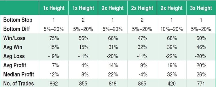
Trades won 75% of the time. Winning trades made 15% but losers lost 19%. The combined average of winning and losing trades was a gain of 7% (average) or a median of 12%. There were 862 trades. Since you are buying at the top of the pattern and getting stopped out at the bottom of it, the loss is large, about 20% for stops placed below bottom 1. If you use bottom 2 as the stop location (a penny below it), the loss drops from 19% to 11%. However, the win/loss ratio drops to 56%, so fewer trades work. The overall profit drops from 7% to 4%, too.
I narrowed the price difference between the two bottoms in the ugly double bottom from 5% to 10% (second column from the right). The results are shown in the table in Figure 2. The win/loss ratio climbs marginally from 66% to 68%. Losses increase from 20% to 22% but the average and median profits rise dramatically, 14% to 19% and 22% to 32%, respectively. If I were to trade this setup, the 10% to 20% range with a 2x height would be my choice.
The table shows that as the price target gets further away, profits increase but losses stay about the same. That makes sense because the loss size is determined by how tall the pattern is (with a stop below the first bottom). If you raise the stop-loss location, then you will have more losing trades and you will be stopped out of potentially winning trades, decreasing profit.
Tall patterns help assure, but not guarantee, that the stock has changed trend.
Here’s An Example
The chart in Figure 3 shows an example of how the ugly double bottom setup works, using what I call the preferred setup. The preferred setup has bottoms at least 10% apart but no more than 20%, and entry triggers using a buy stop placed a penny above the top of the chart pattern. Price makes a new yearly low at A, at 57.55, in a bull market. At B, 64.91, the stock makes a higher bottom. The difference between those two bottoms is 13%, falling within the 10% to 20% range.
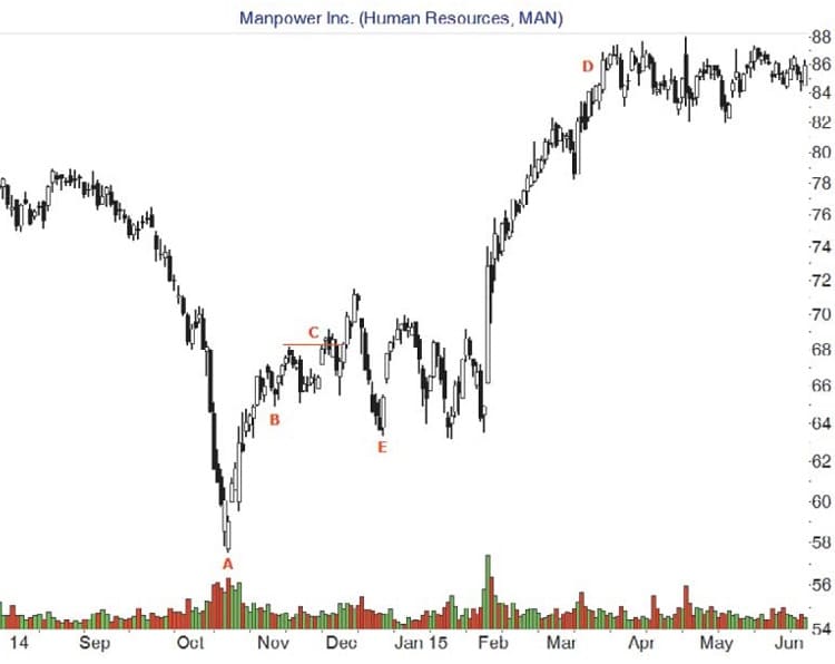
A buy stop placed a penny above the top of the pattern (67.21) starts the trade at C. The exit price target is twice the height of the ugly double bottom, or 2 x (67.21 – 57.55) = 19.32. Add the height to the top of the pattern (or the buy price) to get a target of 86.53.
As the chart shows, the stock makes a strong recovery and soars to D, where it sold for a 29% gain (not including commissions and fees). If the trade failed, it would have meant a potential loss of almost 15%. Notice that a stop placed below B, the second bottom, would have triggered on the drop to E.
That’s A Wrap
The ugly double bottom setup is flawed because the stop is placed below the bottom of the chart pattern. This is necessary because stocks making new lows tend to make lower lows. Tall patterns help assure, but not guarantee, that the stock has changed trend. When the trend changes from down to up, bottom fishers can profit from the rise.
Since the potential loss is large, this setup is best for investors, those willing to buy and hold a stock for the long term. They are willing to risk money in the short term to boost profits over the long term. Swing and position traders may also benefit from this setup, too. Although I used the height of the chart pattern as the exit tool, you may wish to use your own stop-loss and exit mechanisms to perfect this setup for the markets you trade.
- Thomas Bulkowski (who may be reached via email at [email protected]) is a private investor and trader with more than 30 years of market experience and considered by some to be a leading expert on chart patterns. He is the author of several books including Getting Started In Chart Patterns and the Evolution Of A Trader trilogy. His website and blog, www.thepatternsite.com, have more than 600 articles of free information dedicated to price pattern research.