
Trading Trendline Breaks: Signals, Methods, and Testing
Trendlines are common technical analysis charting tools, but there are a number of ways to implement them in your trading. Here’s an in-depth look at trendlines. Previously (Part 1), I discussed how trendlines are plotted, emphasizing that logarithmic trendlines are more effective than linear ones. This time, I’ll discuss how to trade breaks in trendlines as well as the system I apply to my trading. A long-term investor using monthly data could act upon a number of trendlines in Figure 1.
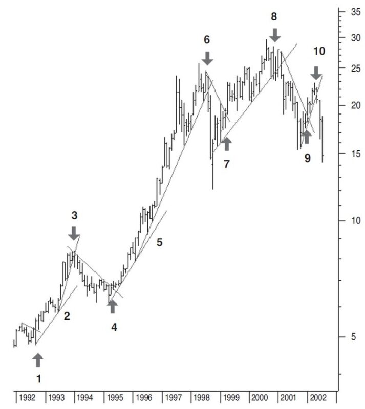
Assuming you can trade this stock both long and short:
- At the end of 1992 the closing price breaks through the downtrend line. This is a buy signal.
- After a first reaction, the price moves up again during the second half of 1993. This is a clear second pivot point for drawing a longer-term uptrend line. Note from this point on that the price is accelerating and with time, moving farther away from the uptrend line. The best thing to do when this kind of move develops is to follow the new move with a new trendline, as shown.
- Beginning in 1994 the price drops below the uptrend line. It’s time to close the long position and open a short one. The idea is to buy the stock back at a later date for a lower price so you can make a profit.
- In the second quarter of 1995, the price rises above the downtrend line. This is a signal to close the short position and open a new long one.
- Note that at a certain point in time, the price moves farther away from the trendline again. You can start a new, sharper-moving uptrend line.
- In the third quarter of 1998, the prices drop below the uptrend line. You should sell the stock and open a new short position. In just two months, the price drops dramatically. When you see this kind of movement, it would be good to change from a monthly chart to a weekly or even daily one. With these kinds of moves you must take profits in the short term. As soon as there is a trendline break on the weekly or daily charts, you must take the profit. You would then wait for the downtrend line to be broken before taking any new action.
- The downtrend line is broken in the second quarter of 1999. If you haven’t done so already, you should close your short position and buy the stock again for a new, long one. After a big move down in a short time period, it will usually be difficult to draw a new trendline from the lowest point reached. The new uptrend line will have to start with one of the following bars or previous bars.
- Beginning in 2001, the prices fall through the uptrend line. This means you close your long position and open a new, short position. Again, the sharp price drop means that you have to draw a faster declining downtrend line.
- Prices move above the downtrend line beginning in 2002, so you close the short position and open a new, long one.
- This uptrend line is broken in the second quarter of 2002. So you sell the stock and open a new short position. Again, the price drop is big and fast, which means it is time to take a profit again.
Would trading the trendline breaks as shown in Figure 1 have been profitable? The results of trading long and short positions each time the trendline was broken at the end of the month are displayed in Figure 2.
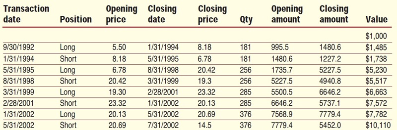
A starting equity of $1,000 would have become $10,110 after about 10 years. This is 10 times the starting capital or a compound interest rate of more than 25% per year, which is not bad for looking at just one chart once a month.
PRICE AND TRENDLINE EVOLUTION
A trendline drawn at the start of a new price trend will show three possible future scenarios:
- No change — the price continues to move along the trendline until it breaks the trendline.
- Price moves far away from the trendline — you need to draw a new steeper trend-line.
- Price breaks the trend moderately and continues temporarily — with a trendline much less steep or even flat.
No change: If there’s no change, the trendline stays intact during the whole move up or down. When the trendline is broken, it is the start of a new trend in that specific time period. The blue trendline (1) in Figure 3 shows this. Prices stay above this uptrend line, which was only broken after about four months. There was a one-day break with a low price, but the close on that day was at the trendline. The trend reversal was later confirmed by the red diamond pattern at the top.
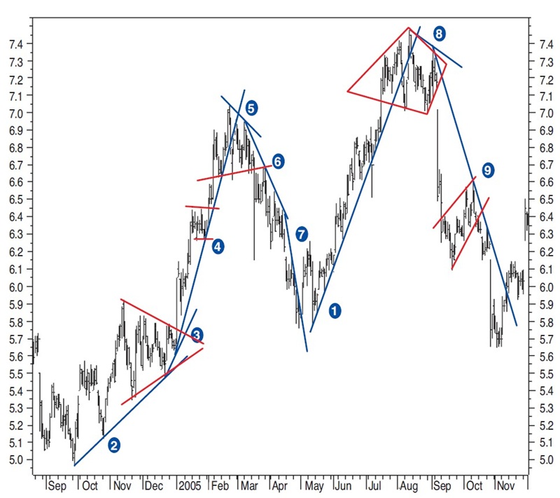
Accelerating: If prices accelerate, they tend to do so in a three-step process. The trend is broken after the third time when the trend shows a very sharp move. In Figure 3, the uptrend line (2) is drawn at the start of a new uptrend. Price continues above this trendline and finds support on this line. After a triangle continuation pattern, the price moves up much sharper. The new sharper uptrend line (3) can be seen, but from this trendline, the price continues to move even farther away.
At (4), the uptrend line is redrawn a third time. The start of the new acceleration is often announced by a continuation chart pattern. This you can see with the triangle at (3). At (4) you see a rectangle continuation pattern. A break in the trend is frequently announced by a reversal pattern, such as the head & shoulders reversal pattern (5) at the top. Downtrend lines (5), (6), and (7) show the price and trendline acceleration in a downtrend. The head & shoulders pattern at (5) and the diamond pattern at (8) announce a change in trend. The ascending wedge pattern at (9) is an example of a continuation pattern in a downtrend.
Slowing down: A longer-term uptrend starting with a sharp move up will slow down. Shorter time reactions against this main trend will slow the up move. A longer-term price channel will often be formed such as the one you see in Figure 4. At (1) you see the start of a new sharp uptrend. After breaking this trendline, the price falls back only slightly and moves flat. A rectangle pattern (2) and the breakout gap after a descending triangle are the start for a farther price move up (3). Here you could draw a lesser steep uptrend line now (not shown).
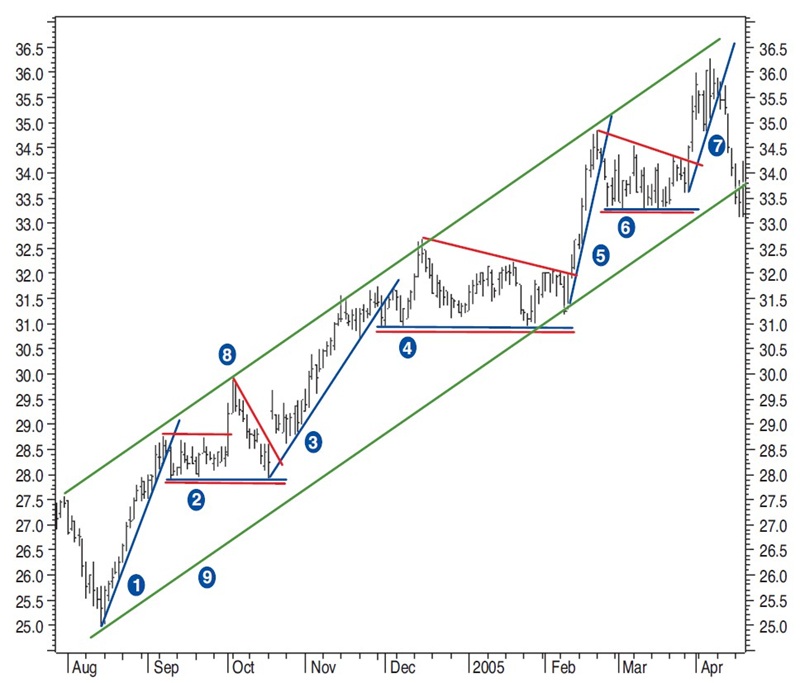
At (8) it is possible to draw what I refer to as an inverse trendline, or a trendline drawn between ascending tops instead of bottoms in an uptrend (more about this later). Price touches this line three times. Extending this line and creating a parallel line starting at the low point of the uptrend gives a longer-term price channel, confirmed much later.
The trendline (3) is broken after the price touched the upper side of the price channel again. The price continues flat (4), finds support at the lower side of the price channel, and breaks out of a descending triangle pattern to continue the move up (5). Again, you could draw a less steep uptrend line, which is actually the lower trendline of the previously drawn price channel. The moves (4), (5) are nicely copied to the moves (6) and (7), after which the price drops out of the price channel. This means you can expect a new downtrend (or a bigger, flatter channel).
TRENDLINE DEFINITIONS
Technical analysis is built on the assumption that prices trend. A trendline is a straight line that connects two or more price points and then extends into the future to act as a line of support or resistance.
Uptrend line: An uptrend line has a positive slope and is formed by connecting two or more low points. Uptrend lines act as support. As long as prices remain above the trendline, the uptrend is intact. A break below the uptrend line indicates a change in trend for the period being considered. You sell the stock when the closing price closes below the uptrend line.
Downtrend line: A downtrend line has a negative slope and is formed by connecting two or more high points. Downtrend lines act as resistance. As long as prices remain below the downtrend line, the downtrend is intact. A break above the downtrend line indicates a change of trend for the period being considered. You buy the stock when the closing price closes above the downtrend line.
EXTREMES
There will always be extremes and exceptions when it comes to using trendlines. The first is when there has been a big move up or down in a short period of time. When that happens it becomes difficult to draw a new trendline from the highest or lowest point. In the chart you will see a very sharp V pattern, or that the last up or down move was very big, eventually with a bigger gap. The move that follows will not be as steep as the previous trend 99%of the time. In these circumstances the new downtrend or uptrend line will have to start with one of the following or previous bars.
Something else to keep your eye on is the price change of the stock over time. A stock that only makes moves of 20% or less over longer periods of time (greater than six months) must be treated differently from a stock making 50% and more over the same period.
For example, trading in bigger-moving stocks can be quite profitable in shorter periods because price changes are big enough from one pivot to the next. This would not be the case for stocks that are making moderate price moves. For a moderately moving stock, you will have to use a less steep slope to catch moves over a longer period to make a profit. Therefore, it would be better to switch to a longer time frame when you are looking at charts. For example, if you are looking at daily charts you should switch to a weekly chart.
Advanced Books and Courses on Price Action Trading



SPECIAL TRENDLINES
Inverse trendline: Sometimes it may seem difficult to draw normal trendlines. In Figure 5, there is a rather flat blue downtrend line (1). At the end of April, you can draw a sharper trendline (2). However, as the trend moves farther down at (3), the trend flattens again and gets flatter after the move (4). In such a scenario, it is difficult to draw a trendline or price channel that would help estimate future price targets.
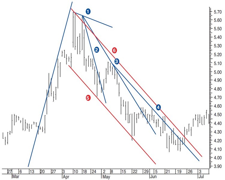
This is where the inverse trendline comes in handy. The price dip at the end of April and a previous low from the beginning of April are good reference points for drawing the inverse thick red trendline (5). In a descending trend, the inverse trendline is drawn from price bottoms. From the highest top, you can draw a line parallel to the inverse trendline, creating the other side of what could be a price channel (6). As you can see, both the inverse trendline and the parallel lines are touched by prices farther out. The channel lines prove to be good reference points for making trading decisions.
Top-bottom centerline: This kind of trendline can be used as a reference for action-reaction lines. A parallel line with the top-bottom centerline through a previous high or low point is the action reference. Usually, the present and past trendlines will have similar price inclines.
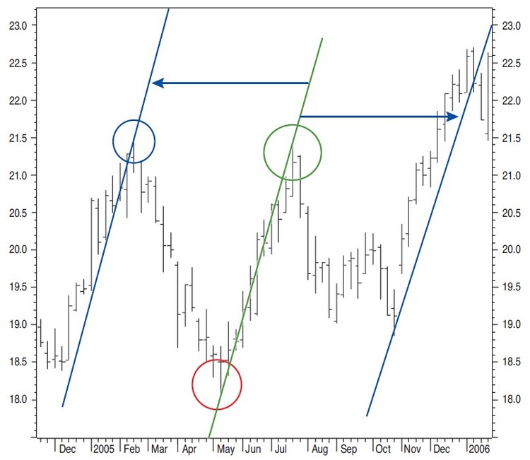
The thick green line in Figure 6 is what I refer to as the top-bottom centerline. It is drawn between a bottom pivot point and a top pivot point. From here on, you can make a second parallel line; this is the reaction line that is projected to the future. The distance is equal to that between the centerline and the action line. Note how prices turn at the reaction line and how they start moving up with about the same inclination as the top-bottom centerline.
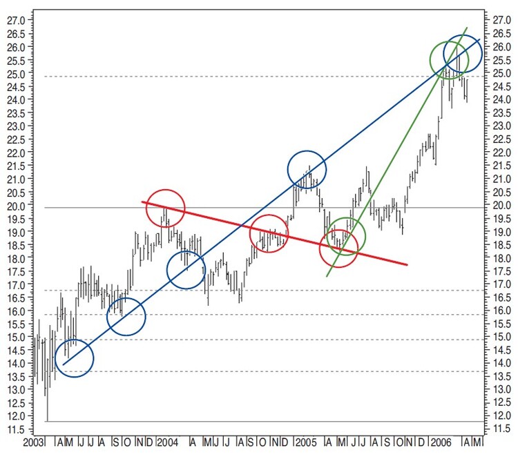
Multireversal line: A multireversal line touches bottoms as well as tops of the prices. The blue, red, and green lines on Figure 7 are multireversal lines. These lines complement price targets since they can be used as reference for future price support and resistance. Note how the blue and green multireversal lines are close to the $25 target given by a Fibonacci projection (dashed horizontal line). It gives a good time estimate as to when this first Fibonacci target could be reached.
TEST RESULTS ON TRADING TRENDLINE BREAKS
It’s always a good idea to test this kind of trading over a larger time period on a larger number of stocks to determine if this method is profitable. To do this manually would take ages, but I don’t know of any program that can draw trendlines on a chart the way I would draw them by hand. But keeping in mind the rules on accelerating trends, slowing down trends, and extremes, I have come up with the simulation for the system-tester in MetaStock. It comes pretty close to the way I look at trendlines for medium-term trading. It is meant to be used as a simulation for medium-term trendline breaks in the past only.
In the third and final part of this series, I will apply this system test to specific stocks and discuss the results.
- Sylvain Vervoort is a retired electronics engineer who has been using technical analysis for more than 30 years. He is an independent trader, writer, publisher (in Dutch), and educator in technical analysis and options.