Trading Articles
Today’s K-Wave And Beyond By Koos van der Merwe
Trying to make sense of the markets is always a challenge. Here’s an updated look at the Kondratieff wave article. When Nikolai Kondratieff developed his wave theory, he had never heard of technical analysis. He had also never met Ralph Elliott of Elliott wave theory fame, a man who lived in the same generation that he did, a man who expressed in a book he had written about Latin America: “There is a reason for everything and it is one’s duty to discover it.”
In 1946, Ralph Elliott published Nature’s Law: The Secret Of The Universe, and sold the first 1,000 copies quickly to financial analysts. I have often wondered whether he had read about Nicolai Kondratieff and his cyclical theory, which came to international attention in Kondratieff’s 1925 book, The Major Economic Cycles (also translated as Long Wave Cycle). Tragically, Kondratieff’s conclusions were seen as a criticism of Josef Stalin’s intentions for the Soviet economy, causing him to be sentenced to the Soviet gulag and ultimately executed in 1938.
Joseph Schumpeter in his 1939 book Business Cycles was the first to use the term “Kondratieff waves,” which means that Ralph Elliott could have been aware of them. However, there is no evidence that he ever tied his wave counts to the K-wave.
USING WAVES
But in all my long-term analyses, I do tie the K-wave and the Elliott wave counts together, because I believe that the K-wave identifies major lows and highs in any Elliott wave count. In my last other article on the K-wave, I explained the theory, and I have repeated the K-wave chart here in Figure 1 for you to study. In that article, I also showed how a chart of the Standard & Poor’s 500 met the cyclical turning points as suggested by the K-wave, allowing an approximate year for error. I presented an Elliott wave chart of the S&P 500 showing that a final C-wave was in the cards, with the K-wave suggesting the low in 2012.
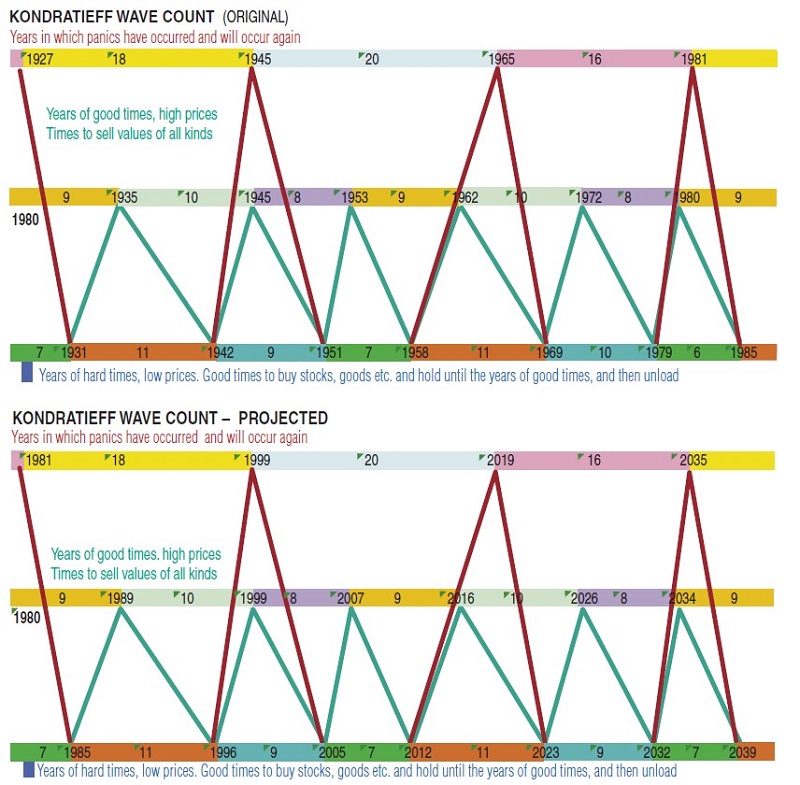
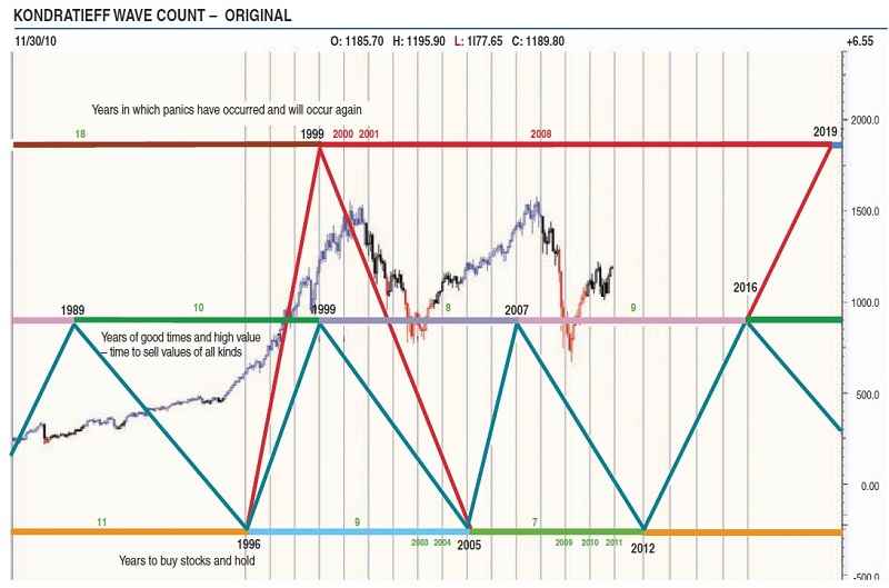
Figure 2 is the chart updated as of November 3, 2010. I concluded that article by noting that Alan Greenspan, the former Federal Reserve chairman, stated that the United States was in a recession and it would be a mild one, but that it would last a long time.
In my article, I noted that my Elliott wave chart predictions of the November 2008 were correct. However, the bottom turning-point dates were earlier than the ones predicted by the K-wave. This may have been because Kondratieff was an economist, and his forecast was designed to predict economic expansion, recession, and depression, not the movement of the stock market. It is my belief that in today’s world, allowances must be made not only for electronic trading but also the proliferation of hedge funds. If Kondratieff were alive today, would he change his forecast and charts? We can only speculate.
Suggested Books and Courses About Market Cycles
I still firmly believe in the Kondratieff wave theory, and the outcome of the recent US elections, in which the Republicans took control of the US House of Representatives, suggests that the US economic recovery could now be in a stalemate if the Republicans in Congress challenge President Obama’s policies. This is why I see a slow recovery in my charts for the coming six years, if not longer.
History, however, has always taught me that it is far easier to conclude a reason for an event after the event than before the event. To quote movie mogul Samuel Goldwyn, “It is always difficult to forecast, especially the future.”
Figure 1 is my standard Kondratieff wave chart going all the way back to 1927, when Nikolai Kondratieff first wrote about it. I have projected it into the future to 2039. Figure 2 is a standard monthly chart of the S&P 500, with the K-wave overlaid. Note how the K-wave called for the major correction in 1999, noted as “Years in which panics have occurred and will occur again.” It also triggered the “Years of good times and high values sell,” which is unusual because the last time the two synchronized was in 1945, although they were only a year out in 1980–81. The S&P 500 took a nosedive with the collapse of technology stocks a year later, as we all remember in March 2000.
The chart shows that the K-wave called for a bottom in 2005, but as you can see, the index triggered a low in 2003, then rose into a high in July 2007 before falling to a bottom in March 2009. As I have stated previously, rapid bear market collapses are caused by computerized short selling by traders and hedge funds. As an example, we saw a scary collapse, the largest daily decline in the history of the US stock market, in a matter of 10 minutes between 2:40 pm and 2:50 pm ET on Thursday, May 6, 2010, something Kondratieff could never have foreseen.
BUT WHAT CAN YOU EXPECT FOR THE FUTURE?
The chart suggests that we can expect a minor top in 2016, years of good times and high values, with a year of panic only occurring in 2019. The correction in 2016 may not be as dramatic as the 1999 correction when both cycles occurred at the same time, but it would still be a time to get out of the market and go to cash.
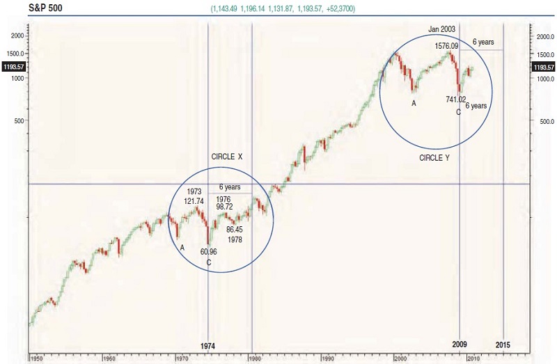
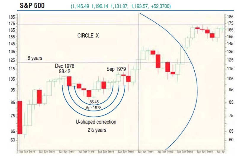
I must now refer you to Figure 3, a semilogarithmic monthly chart of the S&P 500. The two areas you should watch are circles X and Y. Both show major collapses that occurred, something you would not observe on a normal chart, but are very much there when you look at a semilogarithmic chart. The first circle, circle X, shows the low A with a lower low of C. The high reached was 121.74 in 1973, with the low at C being 60.96 in 1974. This is a fall of 49.93% — pretty nasty.
Suggested Books and Courses About Elliott Waves Method
The market collapse shown in the second circle, from 1576.09 in 2008 to 741.02 in 2009, is a 52.98% drop, which is even worse. Note how close, percentage-wise, both corrections are. In circle X, it took six years for the S&P 500 to reach the high of 121.74, the high reached in 1973 before the correction. Assuming that the same will occur now — and let’s face it, the patterns in the circles look pretty similar — it could take six years for the S&P 500 to reach 1576.09, the high of January 2008. If the trend of circle X is followed, the index will move sideways from now on until 2015 in a U-shaped formation, a pattern that Nouriel Roubini, the New York University professor who predicted the global financial crisis, is forecasting. I cannot disagree with him, as much as I would like to. The drop from 98.42 in 1976 to 86.45 in 1978 was a 12.16% correction. Figure 4 shows this U-shaped correction clearly.
What this means is that we could see a 12.16% correction, or a figure close to this, over the next two years, once a high has been confirmed. And here I must refer you to my Elliott wave count in Figure 5. A weekly Elliott wave count of the S&P 500 suggests that the wave count is currently in a wave 3 of wave III. This bullish rise is confirmed by the relative strength index (RSI), which is not yet in the sell zone. Do note the low of March 6 was a final wave C, the end of the bear trend, and that the S&P 500 is and has been in a major bull trend, with wave I and wave II complete. Elliott wave theory has taught us that wave III must be equal to the length of wave I, which means that it should reach a high in five waves of 1568.61 as shown.
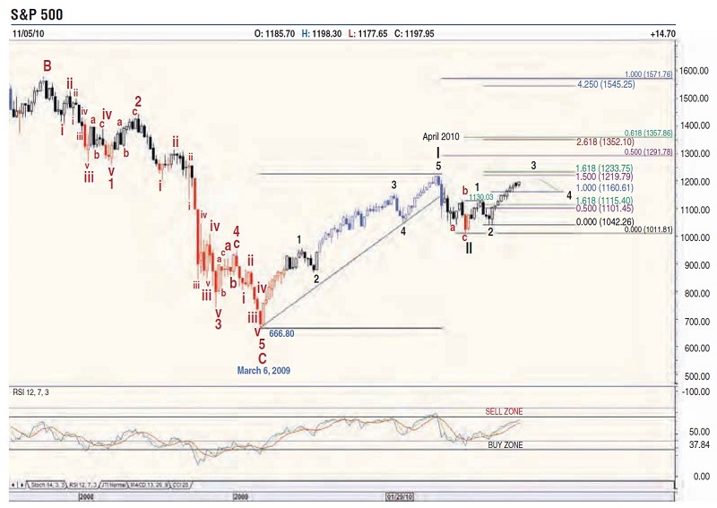
Wave 3 of wave III, on the other hand, should reach a high of 1219.79 or 1233.75 to equal wave 1 of wave III. Wave 2 of wave III is a simple wave correction, which means that wave 4 of wave III should be a complicated correction, which could take some time to complete. This would confirm the stagnant U-shaped pattern, allowing the 12% drop. There should be more upside before the correction to complete wave 5 of wave III, probably until the RSI confirms a sell signal.
LET THE GOOD TIMES ROLL
A look at Figure 1 shows that the economy/market should only start recovering in 2012. Allowing for a margin of error of one to one and a half years, the market could start recovering in 2011 and as late as 2013, although the chart in Figure 2, a monthly chart of the S&P 500 with the K-wave superimposed, does show that bottoms are reached before the K-wave bottoms shown. However, a U-shaped pattern, in a major bullish trend, might turn exactly on the 2012 K-wave low.
Whatever the daily or weekly trend of the S&P 500 may be, the Kondratieff wave is calling for a rise into 2016 and 2019. Figure 2 has shown us that the tops have been pleasantly accurate in their projections, so no matter how the market shapes over the coming year, you should use every correction to add to the portfolio of stocks you would like to own. Spread your risk by buying small quantities of many stocks and make a note in your trading journal to be cautious as 2016 approaches, and move totally to cash as 2019 approaches. Finally, the question of inflation always comes to mind. In the 1970s, the foundation was laid for the high inflation of the 1970s and early 1980s. This inflation was eventually overcome by the strategies of Paul Volcker, who was appointed to the chair of the Federal Reserve Board in 1979. He holds a place in President Obama’s cabinet today, perhaps appointed to keep a watchful eye on “Helicopter” Ben Bernanke’s policy to restart the US economy. His strategy? Clamp down the money supply.
And thus, the inflation fire that was set alight during the U-shaped correction of the 1970s should not be lit during the U-shaped correction I am anticipating over the coming years. Paul Volcker’s watchful eye may, however, slow the market recovery, tying it surely to the K-wave count. Nikolai Kondratieff, an economist, was immortalized by a wave theory still in force today. Bravo!
Koos van der Merwe has been a technician since 1969. He worked as a futures trader and as a technical analyst with a stock brokerage firm in Johannesburg, South Africa. Currently, he acts as a consultant for a fee of $1, a charge he believes is necessary because free advice usually does not carry much weight.