Trading Articles
Situational Trading By Anthony Trongone

How do you know the markets are beginning to recover? During periods of downslides, many cautious investors remain on the sidelines until signs of recovery emerge. Fortunately, trading activity can spot the beginning of a recovery. Sometimes, however, it can be a challenge; in the past several years, a variety of trending landscapes have presented themselves, making that hunt something of a trial.
V-Shaped Pattern
Sometimes we do ourselves a disservice by including all the different trading patterns that have popped up into the same study. The days not specific to a particular pattern will water down our results. For instance, take the average of six random trading days: (2 + 2 + 2 + 11 + 14 + 17) = average 8
But 8 is not an accurate reflection of the integrity of these numbers. The average does not place sufficient emphasis on the extreme scores, nor does it consider the order of sequence. For this article, I will limit my analysis to those days that come together to form a V-shaped pattern. The orange circles in the price chart in Figure 1 identify several of these steep corrections with abrupt recoveries. The analysis of the trading days shown, 1,284 days (January 1, 2004, to February 14, 2009), resulted in 10 qualifiers for this V pattern; the average decline was 16.40%, lasting 22 trading days. On the right side of this formation, I am using an eight-day recovery as my benchmark; the average return for these eight trading days was 4.39%.
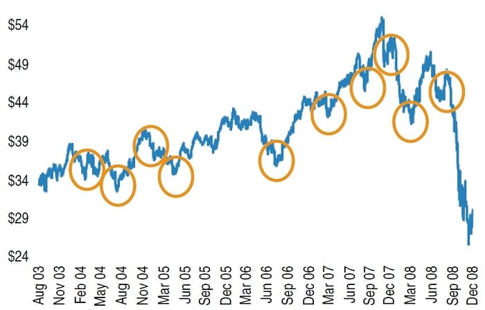
If all 1,284 trading days were used in this analysis, doing so would render the predictive analysis less effective. The golden circles in the line chart represent the current trading environment. If you confine your analysis to those 10 patterns that form the shape of a V, you can improve your understanding of this pattern. I describe this analysis as if these patterns are likely to repeat. However, seven of these V patterns occurred during a bullish backdrop, so be careful extrapolating these results into a different setting. Before examining the right side, let’s begin with an examination of the left side of this pattern.
One piece of advice you will hear time and again is “Don’t try to pick market bottoms.” If you tend to react emotionally without any knowledge of when bottoms are most likely to turn around, the advice is good; nevertheless, in this study, when the QQQQs did hit rock-bottom, the average return for those who held on to a long position for the next eight trading days was 4.39%. Considering the magnitude of these upturns, it is worth exploring the mechanics of this sequence.
For anyone contemplating this contrarian strategy, your timing must be perfect. Pulling the trigger prematurely and suffering the losses as a result can cause you to become too conservative. This tentativeness too often leads to your becoming a spectator and you end up watching on the sidelines as the market rebounds, but without you. You can replicate these results with a free download of historical prices using any popular browser. This article works within the confines of these existing variables, which you can conveniently access; further, it allows you to download these prices into an Excel worksheet. (Check finance.yahoo.com)
Defining A Correction
First of all, I refer to a correction as the left side (downside) of this V formation; conversely, the recovery is the right side (upside). The duration of a correction can be somewhat subjec-tive; not all technicians will agree on the same definition. For the purposes of this article, my operational definition of a correction comes after the following three requirements are satisfied: (1) a loss of 1% or more on the first day of the correction; (2) over the entire correction, the loss is at least 7%; and (3) the correction continues for eight or more trading days.
Days Before A Correction
In the eight days preceding a correction, trading activity lightens, such that eight days > five days > three days. The average volume for the eight, five, and three days was 123 million, 118 million, and 113 million shares, respectively.
Suggested Books and Courses About Chart Patterns


Early Days Of Correction
On the day of the correction, we are starting with an average first-day decline of 1.73%. In the first three days, the loss continued to build; it grew to twice the first day’s slide (3.53%). In comparing the eight days before the correction with the first three days of the correction, average trading volume jumped 15.6%.
(first 3 Days into the correction – 8 Days precorrection)/8 Days precorrection)
Start Of A Correction
This is where it all happens; this is the decisive moment to make adjustments. The average volume in the first three days of a correction was stronger (a 20.7% increase) in comparison to the three days before the correction. These first three days leading the downturn were able to provide more volume on eight of these 10 occasions.
(first 3 Days of correction – 3 Days precorrection)/ 3 Days precorrection)
Final Three Days
The last three days of the correction had a 19.6% increase over the average for the entire correction. More remarkably, the average volume in the final three days, for all 10 examples, handily beat the average over the entire correction. So we have our pattern set as: first 3 Days < average for length of correction < last 3 Days
When you move away from the middle, an interesting comparison reveals itself between the extremes of this correction. The percentage difference between the three days was 47.4%, with the final three days leading the way by averaging 210 million shares in comparison to 142 million shares for the first three days. Besides being the largest margin difference, this pattern held together on nine occasions.
Definition Of A Recovery
Of course, a few of these downturns are subjective. And what actually represents a recovery? For the purposes of this article, a recovery is a sustainable rally — that is, it produces at a minimum an advance of 1.50% over the next eight trading days.
Harbinger Of A Recovery
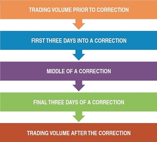
Next, we focus on the recovery (the right side of the V). The beginning of a recovery is not always quantifiable. It takes a sharp eye to notice any discernable pattern. Nevertheless, one theme does surface time and again over these 10 occurrences: As the downturn lingers, there was an increase in daily trading volume. Trading activity appears to strengthen going into the final three days of a correction, but after peaking, it slowly starts to contract. The three-day average after the correction is 179 million shares, five days is 167 million shares, and eight days is 156 million. From the perspective of trading volume, there are five stages of a V-shaped pattern (Figure 2).
Anatomy Of A Correction
Although these patterns are not foolproof, the ability to detect this phenomenon can provide you with a definite edge. In the bar chart in Figure 3, you can visualize some of the general rules, as it shows the average volume for the three components of these trading days. Prior to a nasty slide, activity begins slowing down. As the QQQQs lose ground, daily activity picks up, especially in the final three days of the correction. In the third phase, the right-side rally begins with less activity, but as the recovery lengthens, volume begins to fade.
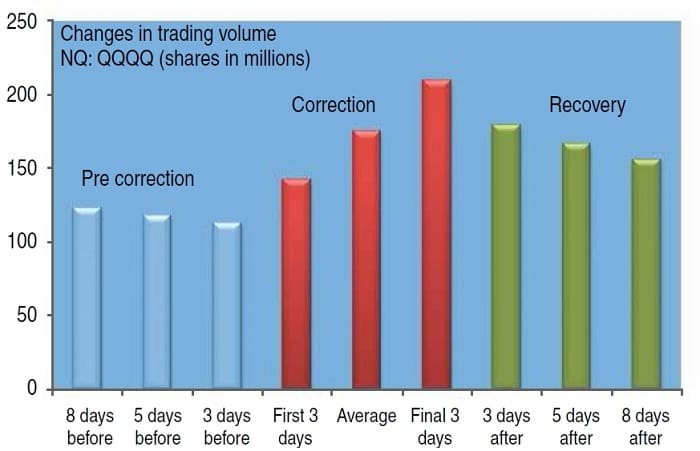
Besides recording the duration of these setbacks, this bar chart shows the intensity of the free-falling market. Clearly, the duration of a correction appears to vary. Apparently, these declines do not immediately lose their downside momentum. Further, a longer downturn does not necessarily produce a more substantive loss. Several commonalities, however, were consistent for all 10 V-shaped formations.
Gaining An EDge
Using consecutive trading days to produce the results of your analysis can obfuscate your findings. This is generally the case when you are studying a particular trading pattern. If you include trading days that do not pertain to the technical pattern under examination, that could dilute your analysis. Consequently, it is more instructive to confine your investigation to those days responsible for the formation, continuation, and termination of this technical pattern.
The first three days of a meltdown are normally very turbulent. Although after the opening-day selloff, market participants usually come to the rescue the following day, it generally is a single-day bounce. In this instance, after three days, the average loss was 3.573%. In reviewing the 10 repetitions of this pattern, the loss escalates with an average decline of 16.40%, as the longevity of 22 trading days reveals.
When the market finally begins a correction, it sticks around for a few days. This brings irrational trading to the surface. Common-sense strategies are tossed out the window and emotionally driven trading takes over as investors go on a buying frenzy. But does the rally fizzle? In looking at the next eight days — that is, nine to 16 days after the correction — does the right arm of this V formation keep rising, or does it start to flatten?
With a turnaround of eight days, it was still difficult to get solid footing: In the next eight days, the Qs fell 2.22%. Although this was a small average decline, its support was shaky as prices wavered from its mean score (the standard deviation was 3.73%). Sometimes, these infrequent patterns trump all other technical analysis indicators. On a short-term basis, their unconventional behavior dominates the mindset of traders. When this occurs, it can produce waves of intense buying or selling. This may explain why your favorite indicators are no longer working; therefore, when these patterns begin to surface, knowing how they operate will strengthen your trading knowledge, which in turn will give you the prevailing edge.
Anthony Trongone is the director of Executive Mba programs in China for Centenary College and is the professor of business studies.