Trading Articles
Getting Clear With Short-Term Swings By Ron Black
Does an indicator that works on all time frames, requires no calculation, and has no delay sound too good to be true? It’s not. The technician’s unending task is to find a signal in a sea of data. Price patterns can be choppy, chaotic, and wiggly. Sometimes the technician tries to smooth the upward and downward surges in price action in order to make the price movement easier to interpret. But this smoothing can reduce his or her indicators’ sensitivity to the immediate direction of the price.
The Clear method, a new technique for identifying the direction of short-term price swings, identifies the direction of the current price swing and the precise day when price direction changes. It works on all time frames, requires no calculation, and has no delay. It is applicable to all stocks, commodities, and indexes. The Clear method is unique because, unlike most technical indicators, it does not use the opening price or the closing price. Instead, it uses the range (length) of the price bar. It is effective because it borrows from a basic statistical concept: if two distributions do not overlap, they can be considered different. (A note to our statistician friends: this paper is not intended to examine the subtleties of sampling errors, sample size, covariance, confidence intervals, or any other statistical description. I am merely adapting a statistical concept for the purpose of analyzing price action.)
DISTRIBUTIONS
Let’s begin with a short description of distributions. What if someone asked you, “How fast do cars go on the freeway?” You are analytical. You want to find the answer. You rent a radar gun and a tripod, set the equipment up on an overpass, and record the speed of every vehicle that passes beneath the overpass for the next hour. Obviously, you would get many different values for the speeds of the different vehicles that traveled under the overpass.
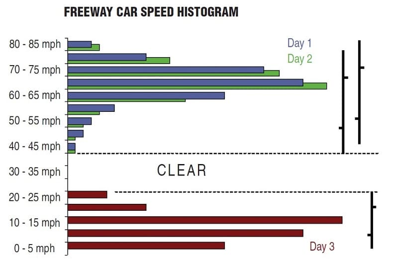
Distributions are often displayed on histograms. An example of a histogram for the speeds of the cars on our freeway are displayed as the blue histogram in the upper left part of Figure 1. The vertical axis shows the range of different speeds of the vehicles. The horizontal axis shows the percentage of vehicles traveling at that speed. We say these different values are distributed because there is not just one value. The measurements vary; there are many different values.
Why do we get so many different values? Because there are so many different factors that affect how fast a given vehicle is going — the speed of the surrounding traffic, the traffic density, the weight of the vehicle, the mood of the driver, the amount of caffeine in the driver’s bloodstream, the type of vehicle, prevailing weather conditions, slope of the road, and so forth. All the factors are randomly acting on the vehicles at the same time, so different vehicles are affected in different ways. These random factors cause the variation in the speeds of each vehicle. The distance from the smallest to the largest value in the distribution is referred to as the “range.” The range of the first day’s measurements, as shown in the blue histogram, is from 45 to 80 mph. This range is shown in the first price bar in the top right corner of Figure 1.
Now let’s repeat our experiment for an hour on the next day. Day 2’s data is shown in the green distribution in the upper left corner of Figure 1. The green histogram is about the same shape as the previous day’s histogram. The range of the green histogram is from 50 to 85 miles per hour (mph). This range is shown in the second bar in the upper right corner of Figure 1. Compared with day 1, no meaningful change in speed has taken place. We know this because the ranges of the two distributions overlap. Even though the distributions are not exactly the same, no meaningful change has taken place.
We will know, however, that a change has taken place when the two distributions do not overlap — when one distribution is “clear” of the other. This is shown in the distribution of measurements for day 3, in the maroon distribution in the lower left portion of Figure 1. The distribution for day 3 is significantly different from the previous two days. The speeds range from zero to 30 mph, and this range is clear of the previous two days’ ranges.
When you see the data for day 3, it is clear that something is different. What could have happened to cause such a change in the data? You decide to look for yourself. You go to the overpass and look down at the traffic. There is construction underway and the three-lane-wide freeway is now reduced to one lane, thus producing the greatly reduced speeds shown in day 3’s histogram. When one or more of the causal factors has gone through a major change, we see that change as a significantly different histogram. Let’s recap two important concepts that are the basis of the clear method:
- When two distributions overlap, it is most likely that no change has taken place.
- When two distributions do not overlap (when one is clear of the other), it is very likely that something has changed.
NATURE OF PRICE
Just as many factors affect the speed of cars on the freeway, many factors affect the price of a stock or commodity. These factors are constantly changing, and these changes are reflected in the undulating nature of prices. In fact, no one knows exactly what a stock or commodity is worth at any given moment. The range of the daily price bar shows the distribution of hundreds, thousands, and sometimes millions of price transactions. There is no exact value. The range of the distribution is as precise a measure of value as we can get. All we can know for sure is that no one is willing to pay more than the highest price of the day, and no one is willing to sell for less than the lowest price of the day. We know that within that range, various parties appear to have various ideas about the true value of the stock. (In this article, I refer to the price bar as a daily bar for the sake of convenience. The Clear method works on all time frames.)
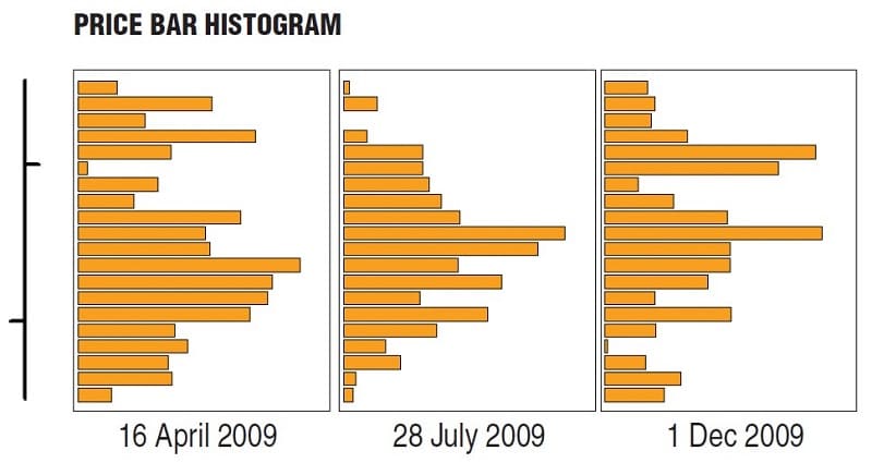
Price bars are just simplified histograms. Figure 2 shows three histograms for IBM from April, July, and December 2009. These dates were chosen because on all three dates, the price bar appeared like the price bar on the left in Figure 2, with the open about 25% of the way up from the low and the close about 25% of the way down from the high.
Suggested Books and Courses About Price Patterns

Even though the price bars are very similar, their histograms are not. On April 16, 2009, most of the price action was in the lower portion of the distribution. On July 28, 2009, most of the price action was near the middle of the distribution. And on December 1, 2009, most of the price action was in the upper portion of the distribution. It is extremely difficult — perhaps impossible — to tell from the price bar what the actual distribution of prices really looked like. But we can easily tell from the price bar what the bar’s range is.
INTERPRETING PRICE MOVEMENT
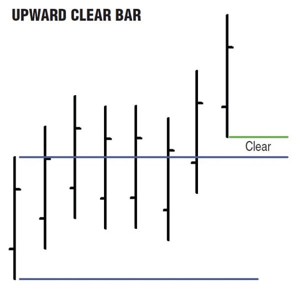
Now, let’s apply these concepts to interpreting price movement. Prices are considered to be unchanged until we get a bar that is clear, either in the upward or downward direction. Figure 3 shows an example of an upward clear. Using the first bar as a reference, we can see that the next six bars’ distributions overlap the first bar’s distribution, so even though the bars are not exactly the same as the reference bar, they show no change in price. The seventh price bar is clear in the upward direction because its low is above the reference to the bar’s high. This is the first bar that shows an upward change in price.
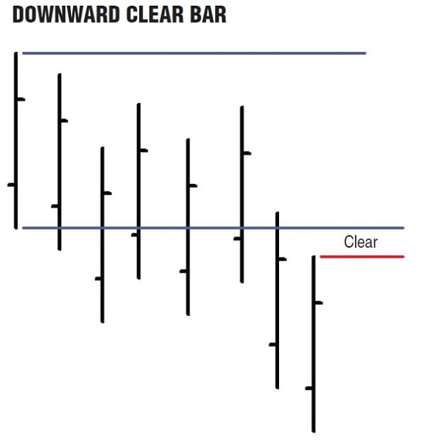
Figure 4 shows an example of a downward clear. Using the first bar as a reference, we can see the next six bars’ distributions overlap the first bar’s distribution. The seventh bar is clear in the downward direction because its high is below the reference bar’s low. This is the first bar that shows a downward change in price. How do we know which price bars to compare to identify price direction? We follow the highest low (HL) and the lowest high (LH). Figure 5 shows the price action for General Electric (GE) from mid-October to mid-December 2008. The first bar in Figure 5 is October 20, 2008. Prices are in a down swing. (We can begin with any bar as shown in Figures 3 and 4 to get the initial price direction. You can initially assume the price is on an up swing or a down swing. It does not matter.)
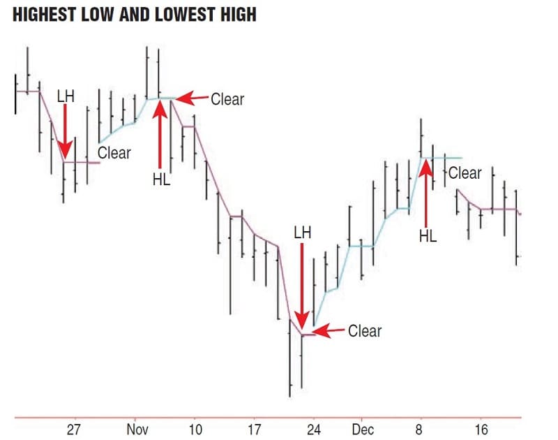
During the down swing, we follow each bar’s high downward until we find the lowest high of the down swing, which occurs on October 24, 2008. The next two bars straddle the level of the lowest high, so no change in price took place on those two days. On the next bar (with the cyan line below it) the price “clears” the lowest high, because the low on that day is above the lowest high. This is the first bar of the new up swing.
During the up swing, we follow the price bar’s lows. During this particular up swing, each day produces a new highest low. On November 5, 2008, we see the highest low of the up swing. On the following day, the price gaps down, the high is below the highest low. This clears to the downside and begins a new down swing. The down swing continues for 11 days, establishing a new lowest high almost every day. On November 21, 2008, we see the lowest high of the down swing. The next day’s low is above the lowest high and we begin a new up swing.
The up swing continues for 11 more days. On December 8, 2008, we see the highest low of the up swing. The next two days straddle the level of the highest low, so no change in price occurred. On the next trading day, December 11, 2008, the high is below the level of the highest low and a new down swing commences.During up swings we follow the lows, looking for the highest low. During down swings, we follow the highs, looking for the lowest high.
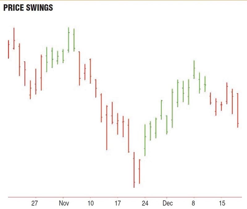
Figure 6 shows the same price pattern for GE with the up swings in green and the down swings in red. The TradeStation code for drawing the swing line (shown in Figure 5) is displayed here, “EasyLanguage Code For Displaying The Swing Line.”
NO CALCULATION, NO DELAY
A precise picture of the short-term price swings is basic to understanding the market direction. The Clear method is an effective way to identify and visualize short-term price swings. The method benefits the individual trader because it is simple, objective, requires no calculation, and has no delay.
Ron Black has been actively trading stocks and futures for more than 15 years. He has written statistical macros for Microsoft Excel and numerous indicators and strategies for TradeStation.