Trading Articles
Chart Formation Breakouts Using Cycles, Volatility and ADX
Understanding the building blocks of classical chart patterns can improve your analysis and trading results. Here’s how. Anyone who has studied or traded with classical chart patterns for several years knows the unmistakable feeling when a good pattern develops. The better patterns tend to stand out from the marginal ones, regardless of their shape or classification. This led me to realize that it was the similarities between chart patterns that were important, rather than the differences as defined by pattern names such as head-and-shoulders, triangle, and so on.
It became apparent that a model was needed to bridge the gap between the minutiae of classical chart pattern definitions and the common features shared by chart patterns in general. Specifically, the model’s goals are to:
- Offset the lack of classical chart pattern specificity by providing a less subjective though still not entirely fixed criterion for identifying patterns.
- Serve as a notional benchmark for distinguishing valid chart pattern behavior from other types of market behavior, such as trending and exhaustion behavior.
- Minimize the risk of an implied directional bias by excluding the use of traditional “bull,” “bear,” or pattern shape terminology.
- Enhance the timing of trading decisions by more narrowly defining the specific behavior that coincides with chart pattern breakouts.
INTERESTING VERSUS IMPORTANT
While the terms formation and pattern are nearly surrogates, they are also just different enough to make a point. Pattern implies something that is proposed to imitate, whereas formation implies an arrangement of things acting as a unit or a process by which one unit is formed from others. Thus, I use the phrase chart formation to shift the emphasis away from the “gee-whiz” pattern and shape aspects of classical chart patterns, and toward the more important process or unit aspect of the chart formation itself. My rationale is simple: No one gets rich from distinguishing, say, the subtle differences between a complex cup-and-handle and an irregular inverted head-and-shoulders pattern. However, focusing on specific market situations that lead to reliable price breakouts and trends makes us money.
Among newcomers and the uninitiated, there is a tendency to think about chart patterns in terms of curiously intricate names and ability to predict the course of market prices. The fault probably lies more with classical chart pattern definitions, which tend to emphasize stylistic shapes and are often categorized according to a directional bias. In reality, classical charting has always been less about price forecasting than it has been about trading and tactics.
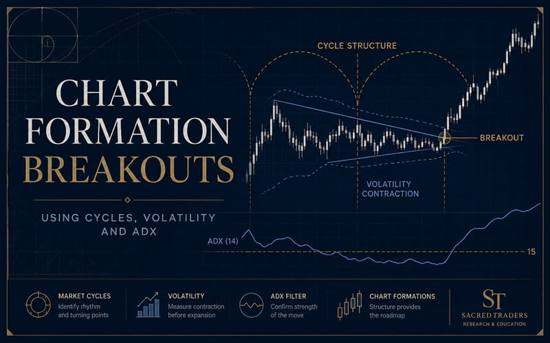
To address these issues, I rely on a more compact and user-friendly approach that breaks chart formations into two components: the cyclic or structure component, and the volatility component.
KEEPING AN EYE ON TIME
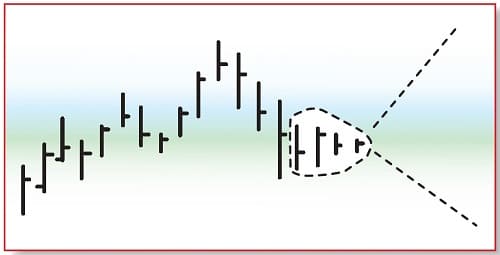
The resolution of a successful chart formation can be defined as a breakout that follows through to a price target indicated by the formation’s vertical width. As prices exit the formation and begin trending, they cover a greater distance (measured in points or dollars) per unit of time than during the development phase. The breakout of a chart formation can thus be described as a transition from a period of inefficient price movement to an efficient one.
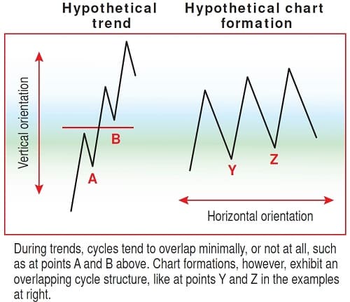
It is during the inefficient period that we begin anticipating the eventual breakout. Rather than attempting to categorize and decipher the multitude of possible shapes generated during the inefficient phase, I find it more useful to focus on general characteristics. From my experience, these characteristics include a series of well-defined cycles with similar length or periodicity, and a high degree of cycle overlap (Figures 1 and 2). These characteristics also serve to distinguish chart formations from price trends.
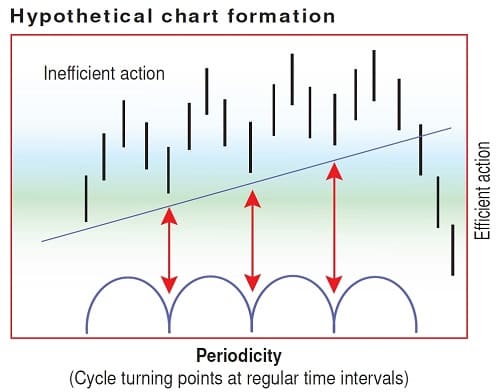
Amplitude (cycle height measured in points and dollars) is the “emotional” aspect of price activity, as people are more apt to respond to changes in price than to the passing of time. Amplitude is also the primary means by which classical chart patterns derive their shape. For example, think of the differ-ences in cycle amplitude as reflected in the profile of a classic triangle or a head-and-shoulders pattern. However, periodicity (cycle length measured in time) is less susceptible to influence by external factors such as news events, sentiment, and emotion, and thus more useful for building a model of generic chart formation behavior.
These conditions serve as the starting point for anticipating the development of a chart formation. Remember, when placing trendlines, the idea is not to impose your will on the formation. The best formations actually require the least amount of imagination when it comes to placing trendlines.
VOLATILITY: SAME PHENOMENON, DIFFERENT DAY
One principle of price behavior that has been continuously repeated in the literature of technical analysis over the past 100 years is that of volatility contraction/expansion, particularly the idea of volatility contraction preceding large range moves (Figure 3). As you will see, the understanding of this concept helps anticipate the timing of chart formation breakouts. To start, let’s review the history of this concept as it has been observed and used by other analysts and traders.
Dow theory, with roots going back to the late 1800s, incorporates the idea of volatility contraction through the concept of the line, which denotes a market fluctuating in a narrow, extended range. Lines are viewed as a period of market equilibrium, where buying and selling pressures are roughly equal. According to Dow theory, lines often act as precursors to significant trend moves.
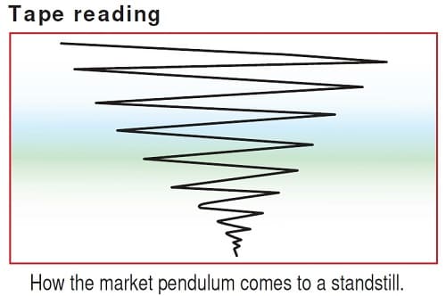
Richard Wyckoff discussed the volatility phenomenon in his 1910 classic, Studies In Tape Reading, where he wrote:
Dullness in the market … means that the forces capable of influencing it in either an upward or a downward direction have temporarily come to a balance … when prices are stationary, we know that from this point there will be a pronounced swing in one direction or another.
In 1932, Richard Schabacker, considered to be the founder of classical charting, referred to the volatility contraction/expansion phenomenon when he spoke of the “…tendency for volume to decline during the period of formation of a technical area pattern” and “… shrinkage in activity is especially conspicuous as the formation nears completion, just before a breakout occurs.”
In the late 1980s and early 1990s, trader Toby Crabel wrote a number of articles for STOCKS & COMMODITIES dealing with the volatility contraction/expansion phenomenon. Crabel used the daily range of individual bars to isolate changes in volatility. Also around the same time, John Bollinger introduced his volatility-based Bollinger Bands indicator. Bollinger noted that when the width of the bands narrowed considerably, a sharp expansion in price volatility often follows.
Advanced Books and Courses on Technical Analysis

In 1993, Martin J. Pring in Pring On Market Momentum and Alexander Elder in Trading For A Living both discussed how the onset of a trend move is often signaled when the average directional index (ADX) emerges from low levels. The ADX, as I will show in the following section, turns out to be a superior proxy for price volatility when timing chart formation breakouts. Observations by Laurence Connors and Blake Hayward led to the introduction in 1995 of a method for isolating declines in short-term historical volatility relative to long-term volatility levels. Countless other techniques, observations, and trading systems have been built on the volatility contraction/expansion principle over the years.
I extended this line of analysis in early 1997, when I wrote an article for STOCKS & COMMODITIES that attempted to draw a connection between the volatility phenomenon — a concept already well documented over the previous 100 years — and one of technical analysis’ most controversial subjects, classical chart patterns.
COMBINING CYCLE STRUCTURE AND AVERAGE DIRECTIONAL INDEX
Next, I will show how the volatility contraction/expansion principle can be combined with cycle structure to identify and trade chart formations. I will concentrate my analysis on the dollar index (DXY), a trade-weighted geometric average of six major world currencies.
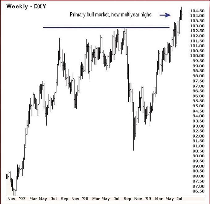
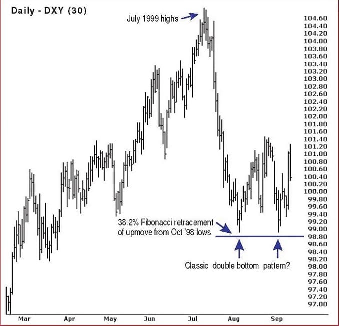
In July 1999, the dollar was in a confirmed primary bull market, making new, multiyear highs (Figure 5). However, if you look at Figure 6, you will see that by September 1999 the market had corrected and was finding support around the 98–99 level, close to a 38.2% Fibonacci retracement of the October 1998 to July 1999 advance. You could have even argued the market was tracing out a classic double bottom reversal pattern. Or was it?
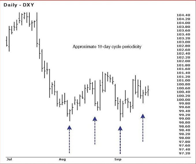
Since I’ve trained my eye to look for general characteristics rather than specific patterns or shapes, the first thing I noticed about this chart is the series of well-defined and periodic time cycles of approximately 10 days in length. In addition, the formation exhibits a high degree of cycle overlap and a horizontal orientation, as depicted in Figure 7.
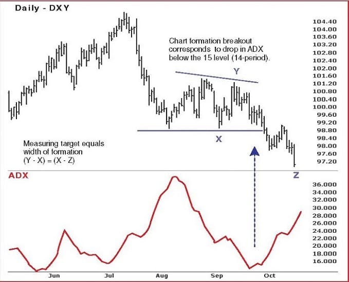
During the formation’s development process, you can see that volatility as measured by the 14-period ADX has been steadily declining. From my research, I have found that the most consistent and reliable chart formation breakouts occur when ADX has declined to a level of 15 or less.
In Figure 8, the dollar breaks decisively below the lower boundary of its chart formation, coinciding with an ADX level below 15. This is followed by the successful resolution of the chart formation to its target at 97.00.
LONG-TERM APPLICABILITY
A model of generic chart formation behavior is useful in that it can be applied to different markets and different time frames. Here’s how the model was applied to weekly charts of the CBOT corn market. During the final stages of the 1990s bull market in stocks, most commodities were in steep, if not monumental, downtrends. However, between late 2001 and early 2003, commodity prices shot up. I first began publicly promoting the idea of a new commodity bull market in May 2002. At that time I was recommending purchases of corn, wheat, and grains in general, which were trading at 20- and 30-year lows. I recall being asked: “What do you see?” and “Why are you bullish?”
My reasoning was that after 10 years of diverging trends, hard assets were cheap relative to financial assets. It was not hard to imagine that some of the money leaving the equity market would find its way into commodities. Further, it takes a relatively small amount of money to move the commodity markets compared with the stock market. With commodity prices at historically low levels, the larger risk was not of further price declines, but of price increases. I could also see that the market was preparing itself for an efficient price move based on my analysis of the weekly chart formation.
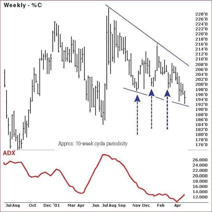
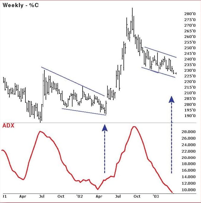
My bias was bullish due to macro factors, but the chart formation model drove my tactics. As can be seen in the weekly, unadjusted CBOT corn price series in Figure 9, the chart formation displayed all the characteristics outlined by the model, presaging a sharp, efficient price move, as shown in Figure 10.
In mid-2003, you can see from Figure 10 that the corn market appears to be setting up for another sharp move. My long-term bias for corn — as well as all commodities — remains bullish.
CONCLUSION
Simply put, chart formations are market factors. They have been studied and traded for as long as people have been following price charts, and they continue to enjoy a following among professionals and nonprofessionals alike. Viewing chart formations through the lens of the chart formation model helps us take advantage of these opportunities without the need to differentiate the full spectrum of classical chart patterns. The model also acts as a technical X-ray machine, permitting us to gauge with better precision the moment when prices are most likely to break out and start trending.
Six years have passed since I wrote “Identifying Significant Chart Formations” for S&C. During this time, it has been gratifying to see the ideas introduced there adopted by other traders and technicians.
- Daniel L. Chesler, a Commodity Trading Advisor (CTA) and Chartered Market Technician (CMT), provides technical market research to institutional traders and risk managers.