Trading Articles
Currency Congestions By Brian Twomey

This little-known chart setup can be applied effectively on currency charts. Some market participants believe that currency markets are trending all the time and picking that one indicator that signals the buy or sell will make you profitable instantly because of the fast nature of these markets. But currency markets are actually more ranging than they are trending. What happens to that one trend that falls prey to a range trade? Did that currency pair fail to break out at the top or bottom of its range? Were you prepared for the failure? A little-known chart setup called congestion, or currency congestion counts, may be just what you need.
CURRENCY CONGESTION COUNTS
Currency congestion can easily be defined as the location on a chart where the currency pair gets stuck in a place where defined ranges become smaller and smaller. It is a place where opening and closing prices are almost the same, where up candles are preceded by down candles and down candles are preceded by up candles. Congestion can last for days and even weeks at a time, causing traders frustration, time, and uncertainty when it comes to direction. Moreover, as time means money gained or lost, you are left wondering where the next move will be, if you will be profitable, and how long it will take.
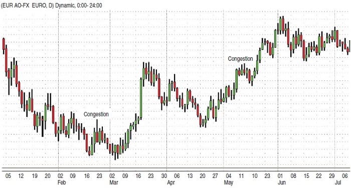
To determine if a currency pair is in the congestion zone — better known as the fulcrum — count your daily candles and determine where highs and lows are the same price or almost the same. The number of candles within the small range is your currency congestion count or chart count. This is known as the congestion zone. On the daily chart of the euro/US dollar (EUR/USD) in Figure 1, you can see a congestion take place in the four candlesticks from December 20 to December 24, 2009.
Congestion occurs in two areas. One is after a trend, or a long advance or decline. This is normally a period of consolidation, but uncertainty further hinders the next direction. Yet consolidation and congestion are quite different. Consolidation is nothing more than a short rest for a pair as it gains steam for the next leg up or down. A congestion, on the other hand, doesn’t have a leg. It is just stuck.
The second form of congestion occurs because of economic uncertainty or uncertainty in interest rates or economic activity either in one particular nation or an economic dilemma facing the entire world. If one pair is in congestion, it does not mean all pairs are in congestion. The EUR/USD and British pound/US dollar (GBP/USD) can easily become congested as much as pairs such as the US dollar/Swiss franc (USD/CHF) and US dollar/Japanese yen (USD/JPY). Crosses such as the British pound/Swiss franc (GBP/CHF), euro/Swiss franc (EUR/CHF), and British pound/Australian dollar (GBP/AUD) can easily find themselves in congestions. All markets, fast or slow, fall prey to periods of congestion.
IDENTIFYING CONGESTIONS
Alexander H. Wheelan wrote about the point & figure technique in 1954, in which prices were charted on graph paper using Xs and Os to represent opening and closing prices. Trends were found drawing trendlines at 45-degree angles. When prices were found to be in congestion, they were referred to as fulcrums, inverted fulcrums, compound fulcrums, and the like. A fulcrum is the center that represents the balance of prices. Some may argue that fulcrums are reversal patterns. We know about reversals using today’s candles by measuring support and resistance patterns within the congestion zones.
A horizontal line is drawn in the middle of the congestion zone. Where prices closed in relation to that line would signal the next direction. Using today’s candlestick patterns, you would perform the same functions to determine the next direction. Lines should be drawn in the middle of the fulcrum and you should wait for two consecutive closes above or below that line. To keep the fulcrum in check, you can also draw the horizontal line through a candle. Using today’s candlestick patterns, you would perform the same functions to determine the next direction. Lines should be drawn directly to the middle of the fulcrum and wait for two consecutive closes above or below that line. This horizontal line may be drawn directly through a candle as well to keep the fulcrum in check.
Suggested Books and Courses About Forex Trading
Chances are this breakout may be sufficient to find the new direction and earn a profit. Using point & figure charting to find winning trades and working out problems of congestion have been a tedious practice. As a result, the bar chart was invented. Bar charts are simple lines where opening and closing prices are denoted by hash marks. Congestions on bar charts occur when prices close on four bars within the confines of a range of a single price bar. The single price bar may be a measuring bar. So you need at least four bars to be considered congestion. Any range extensions are still considered congestion because prices fall within the zone. This simply adds to the overall congestion count. Bar charts made the analysis of charting easier than point & figure charts because it gave rise to trendlines and the ability to find more winning trades and work out dilemmas of congestion.
The book Success In Commodities: The Congestion Phase System by Eugene Nofri and Jeanette Nofri Steinberg opened the door to the study of congestion and congestion counts. Congestion was based on closing prices and Nofri and Steinberg defined it as “if a high or low is not broken and followed by two closes in the opposite direction, market congestion exists. Price may break congestion but find itself back within two or three days.”
This is a new congestion zone using new highs and lows as the foundation. Next, plot seven days’ closing prices to ensure stabilization in congestion zones. Nofri and Steinberg used 32 chart examples to highlight trend patterns in congestion zones. Based on this two-day closing price principle, the Nofris traded commodities (grains) on the assumption that when prices close lower or higher for the second day in a row, you buy or sell it on the close, expecting prices to close higher or lower on the third day; the trade closes on the third day.
In many respects, Success In Commodities was a historic breakthrough. It gave us a clearer understanding of congestion and congestion counts, introduced modern daytraders to a better understanding of support and resistance and introduced the radical idea that the trend may not necessarily be your friend. What this book gave us was a new concept called the range trade. These concepts opened the door to further academic studies and new models based on these practices.
The first academic studies were based on this radical concept of measuring close to close ratios. Later, such studies as the Parkinson estimator, Garman and Klass, and older models such as GARCH began investigating price volatility based on a market’s highs, lows, opens, and closes. The common theme of these studies was that range trading could be and was extremely profitable. Even with the advent of candlestick patterns equipped with an understanding of congestion based on historical standards and the understanding of charts and chart patterns, traders still fall prey to this market phenomenon. So there are questions left unanswered: How did we get to congestion, and what can we do about it?
HOW YOU CAN TRADE CONGESTION
Because ranges get smaller and smaller as prices move toward congestion, the early warning sign of this phenomenon is what is referred to as the stalled candlestick pattern. Usually after a long advance or decline, an upward pattern that looks like a bullish three white soldiers pattern develops. The problem materializes when the third candle upward in a three white soldiers pattern fails. The opposite occurs in a three black crows pattern downward where the third candle fails, where a new high or low is not made in either pattern and represents indecision.
These are fakeout patterns because you would think that a downward or upward spiral would continue, but it does not. Instead, congestion occurs and ranges get smaller so if you bought or sold into these positions, you would be stuck for a temporary period. After a stalled pattern, what usually occurs next is a symmetrical triangle. This confirms the congestion because ranges are very narrow as the symmetrical triangle gets smaller. The only answer is to wait for the two opposing lines of the triangle to meet at a point and follow the breakout up or down. For those periods of congestion where trading ranges occur, draw horizontal lines through the fulcrum as well as marking out highs and lows of the range with an upper line of support and lower line of resistance.
Now trade the range while waiting for a breakout. This is known as the box pattern. To complete this scenario, determine the range of the period of congestion. Subtract the high from the low. This difference between the high and low will give you some idea as to how far prices will go up or down after a breakout occurs. You may think of this pattern as the rectangle where the horizontal lines represent support and resistance and the vertical lines are a measure of the range.
There is no better way to find a breakout than by using the average directional movement index (ADX) and directional movement index (DMI). Low ADX numbers will alert traders to an imminent breakout, especially if congestion lasted for a long period. Low ADX readings will alert traders further to the strength of the imminent breakout. DMI simply confirms the direction of the breakout. A positive cross above signals a breakout to the upside, while a downward cross is the signal to the downside.
Another aspect to congestion is pivot point analysis, an effective and popular tool for any market. A pivot point is simply a strong point of support or resistance used to test one moment of time in the market. Simply add the high, low, and close and divide by three to determine where that point is located. These lines are solid points of support and resistance and can best measure congestion zones as well as trading ranges. The chances are high that congestions will form within a 50% Fibonacci zone simply because 50% zones are marked by previous long advances or declines. If you measure the advance or decline by an A-B move, the C aspect of that corrective move usually marks congestion, the 50%, or indecision of the market. Yet figuring out where the C move will go will help determine where the D or breakout phase will take place while congestions occur. Swing traders may want to go a step further by predicting turning points for the D move based on Fibonacci days such as 13, 21, 34, 55, or 89 days in the future.
Be careful of bid and ask prices. This is an early warning sign to congestion because bounces of bid or ask prices can inflate the range by the average spread. This will ensure further congestion. Some may argue that breakouts will follow the previous direction before congestion occurred. This answer is not an absolute and can’t be relied upon for a profitable trade, especially if congestion lasted for long periods. Fundamentals of the market may have changed during these long congestion periods. The last aspect of congestion is to factor standard deviation to find where prices may travel out of the congestion zone:
- Compute the mean of prices.
- Compute deviation by subtracting the mean from each value.
- Square each deviation.
- Add the squared deviations.
- Divide by one less than the sample size.
- Take the square root. The square root is the variance where the spread of prices is measured. This again is one moment in time, but it may hint at a breakout up or down based on the variance. The variance simply tells you if prices distributed more to the upside or downside.
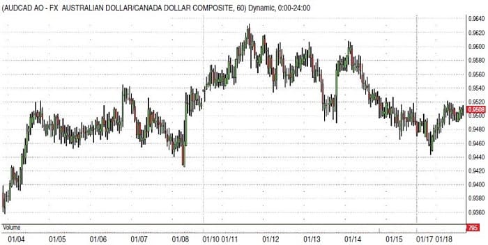
If congestions last for a long period of time, the breakout will be strong with a violent thrust up or down. This could mean a very profitable situation. In the currency markets, many pairs exist that are natural to the range trade, not necessarily congestion. AUD/CAD, EUR/GBP, and the EUR/CHF are prime examples. During April, the EUR/CHF ranged approximately 290 pips all month. From the 60-minute chart of AUD/CAD in Figure 2, you will see that on any given day this cross has barely 50-pip ranges. The charts are trying to tip you off about these profitable situations in advance. It is just a matter of you taking advantage of the message.
Brian Twomey is a currency trader and adjunct professor of political science at Gardner-Webb University.