Trading Articles
Chart Analog Scenarios By Sam Whitehill
Technical analysis is based on the theory that history will repeat itself. What is not so obvious, however, is that these historical repetitions may happen not just over a few months but over a few decades. This is where chart analogs can be of great value. Chart analogs compare a market’s price action over two different periods of time to discern similar technical patterns that may repeat. Analogs, which are easy to create, have been significantly useful with comparisons such as the 1929 versus 1987 stock market crashes.
DEFINING CHART ANALOGS
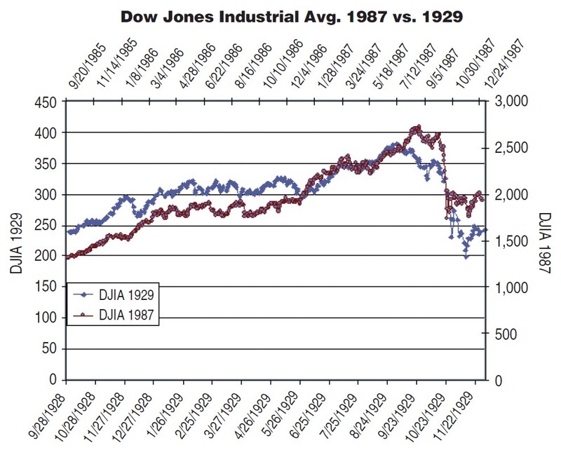
As noted in Edwin LeFèvre’s Reminiscences Of A Stock Operator, “Nowhere does history indulge in repetitions so often or so uniformly as in Wall Street.” Indeed, many stock chart patterns spanning significant time periods repeat throughout history. The most famous example of this is the 1987 US stock market crash having had so many similarities to the market crash of 1929. The correlation of the price action between these two crashes is remarkably high.
Such comparisons are referred to as chart analogs, as they compare a current market’s price action (or one period in time) to a different past period of price action that is significantly correlated. The main purpose of chart analogs is to forecast future prices based on history repeating itself. These forecasts are of particular interest near market tops and bottoms.
Chart analogs do not get as much credit or coverage as they deserve. This is especially true given how easy and quick they are to use. Similar to all technical tools, however, chart analogs are fallible and can break down. Nevertheless, they are a valuable tool in building future market scenarios.
CLASSIC CHART ANALOGS
First, consider the classic analog between the 1929 and 1987 US stock market crashes (Figure 1). The price action between these two periods is very highly correlated (that is, greater than 90%). You may remember the interview with trader Paul Tudor Jones in the book The Market Wizards in which he explained how he used just such a chart analog to help forecast the crash of 1987.
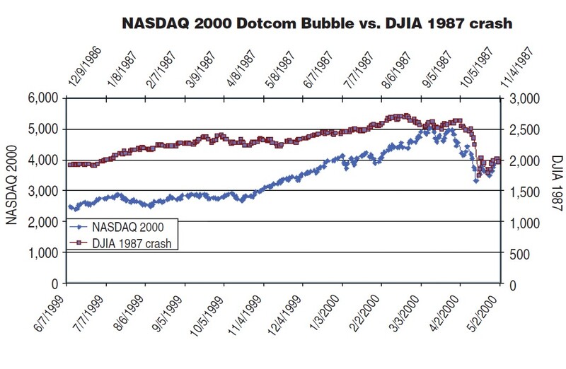
Another example of a compelling chart analog appears in the 2000 crash of the NASDAQ after the dotcom bubble. In this case, you could compare this crash to that of 1929 or 1987, and find similar patterns. Figure 2 shows the NASDAQ 2000 crash compared to that of the 1987 Dow Jones Industrial Average (DJIA) crash.
CHOOSING A PERIOD IN THE PAST
There will likely be more than one period in the past that resembles the current price action of a particular market segment. Practically speaking, it is fast and easy to compare two different periods of a market’s price action. Historical data can be downloaded for free from such sites as finance.yahoo.com. Moreover, running correlation statistics between even a few years of daily closing prices can be done quickly by using the correlation function (CORREL) in Microsoft Excel. The price history can be plotted on a chart to examine the visual similarities.
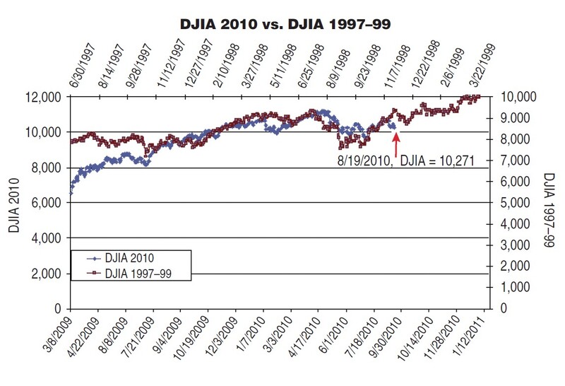
In addition to using a highly correlated period from the past, you will probably want to look at the global circumstances (that is, economic and political conditions) during different historical periods to see how they compared to those in the current time. For example, examine the Djia from March 2009 to August 2010 compared with the summer of 1997 to early 1999. Not only do the charts resemble each other, but the economic circumstances are similar as well. Further, the Russian financial crisis of 1998 can be compared to the current sovereign and banking risks in Europe of 2010. The charts of these two periods are similar, as shown in Figure 3.
Suggested Books and Courses About Chart Patterns

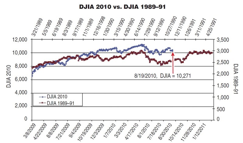
An alternative analog of the 2009–10 DJIA can be compared to that of late 1989 to early 1991. Again, these two eras are economically similar. While 2009–10 was preceded by a banking and real estate crisis, the 1989–91 era was marked by the savings & loan crisis as well as the recession of 1990–91 (Figure 4).
USE WITH CARE
As with all technical tools, chart analogs are not perfect. There will likely be more than one period in the past that appears to match the current period. Choosing which historical period to compare to the present is not a trivial matter. Nor is how long a time segment (three months, one year, and so on) to compare to the past an easy choice. Comparing too short a time period will likely lead to just noise, while too long a period may eliminate many valuable instances. Moreover, at some point, every chart analog will break down to the extent that the past no longer repeats or matches the current price action. Identifying a true breakdown of the correlation between past and present price action is difficult because of deviations that may be interpreted as either insignificant or as valid signals of a genuine breakdown in the chart analog.
BUILD SCENARIOS, NOT JUST FORECASTS
Despite the drawbacks, chart analogs may be better used in building scenarios rather than making outright market forecasts. This allows you to look at several highly correlated and similar historical periods between the past and present without becoming too myopic. Technical analysis relies in part on patterns repeating themselves, and chart analogs can be thought of as simply a longer time frame version of this repetition.
Sam Whitehill has six years’ experience in the financial industry, including daytrading at a proprietary trading firm and risk management at an investment bank. He holds a bachelor’s degree from the University of Virginia’s McIntire School of Commerce.