Trading Articles
An Anchored VWAP Channel For Congested Markets By Andrew Coles

This indicator combines channel and envelope methodologies to accurately identify price reversals. Physicist Paul Levine based his MIDAS (market interpretation/data analysis system) approach to technical analysis on a mathematical modification of the volume weighted average price (VWAP). Behind this modification is a well-thoughtout philosophy of what drives market prices. This philosophy can be reduced to five basic tenets:
- The underlying order of price behavior is a fractal hierarchy of support and resistance levels.
- This interplay between support and resistance is a coaction between accumulation and distribution.
- This coaction, when considered quantitatively from raw price and volume data, reveals a mathematical symmetry between support and resistance.
- This mathematical symmetry can be used to predict market tops and bottoms in advance.
- Price and volume data — the volume weighted average price — subsequent to a reversal in trend, and thus to a major change in market (trader) sentiment, is key to this process of chart prediction.
THE PROBLEM
While there is no obvious flaw in the logic that binds these five principles, there is one weakness in the final tenet involving what follows the end of a trend and a significant change in market sentiment. In his lectures, Levine repeatedly identified the ends of trends with significant trend reversals. Yet this need not be the case; the end of a trend will more likely herald a resting phase in market activity.
Technicians describe resting phases as sideways moving (congested) markets defined by horizontal support and resistance boundaries. These phases are sub-defined in terms of various patterns, the most common being flags, pennants, triangles, and rectangles. According to most observers, markets trend only 25% of the time. Consequently, the ends of trends — and the attendant change in trader sentiment — only lead to a genuine trend reversal in perhaps one in four chart patterns.
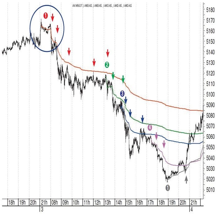
In Figure 1 you see a textbook example of what Levine’s fifth tenet takes for granted. Here we have a significant trend reversal with the first (red) MIDAS resistance curve launched from it. Then, as the trend develops, the swing highs (the smaller changes in sentiment subsumed in a larger bearish psychology) are captured by MIDAS curves and/or are ideal launch points for further Midas resistance curves. The trend ends at the gray “1” and a new Midas support curve is launched to support the start of the new trend (gray arrow). Now contrast Figure 1 with Figure 2. Here we have an uptrend ending at 8:46 am on July 23, 2009, marked by the green arrow. Thereafter, the market goes into a sideways corrective phase for five and a half hours before creating a final low at 2:28 pm and beginning a new aggressive uptrend.
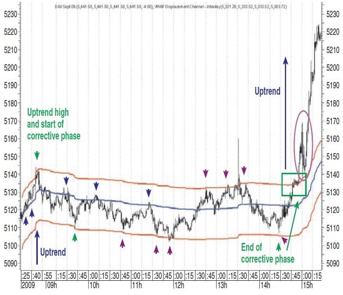
Note that the standard MIDAS curve launched at 8:26 am acts as initial support to the rising trend (blue arrows) but as soon as it is over, the curve moves into the corrective price range. It is true that the curve then begins acting as a credible resistance curve as the three blue down arrows indicate. However, its actual centered position within the broader price range is highlighted by the upper and lower red boundary curves, which we shall examine in a moment. In order to be continuously effective, MIDAS curves require the end of a trend to usher in the start of another trend instead of a corrective phase. When this doesn’t occur, MIDAS curves struggle to locate swing highs and lows in sideways markets.
VWAP DISPLACEMENT CHANNEL AND SIDEWAYS MARKETS
Paul Levine believed that his MIDAS curves worked because the price and volume readings marking the start of the change in trend (and in market sentiment) are intimately linked with subsequent changes in price and volume readings. But what additional associations are there between these price and volume data when they are adjusted in certain critical ways for sideways-moving markets? Several methods have emerged for containing a price series when it is moving sideways, and it will be helpful to begin with a few definitions before discussing a VWAP-based solution for sideways markets:
- Trading bands. Trading bands surround a price series by being created above and below a measure of central tendency. Typically, this would be a moving average or linear regression line. The bands are constructed by a variety of techniques. Bollinger bands, for example, use standard deviation, while standard error bands use standard error. The resulting bands increase and decrease their proximity to the central tendency continuously based on changing volatility.
- Envelopes. Envelopes move at a fixed displacement from a measure of central tendency such as a moving average. For example, the moving average envelope projects an upper and lower boundary by adding and subtracting a fixed percentage (usually 3% to 4%) to a moving average. Unlike trading bands, the boundaries cannot deviate from the central tendency because there is nothing in their calculation that allows them to respond to changing volatility. The boundaries duplicate the central tendency calculation.
- Channels. Price channels usually incorporate some measure of central tendency such as a moving average or a linear regression line. However, they differ from the first two insofar as the outer boundaries are fixed at upper and lower price extremities. For example, the standard deviation channel uses a linear regression channel and then creates the fixed upper and lower boundaries by identifying the initial highs and lows of the price movement and projecting two lines forward from these initial highs and lows. There is again nothing in the construction of the boundaries that allows them to change according to changing volatility. Unlike envelope boundaries, which are typically nonlinear, channel boundaries are a form of a linear trendline above and below the central tendency.
As I was searching for a method to contain a price series using Levine’s MIDAS, I came up with interesting results by melding the channel and envelope methodologies. What these results reveal is that there are more widespread connections between support and resistance levels than the fractal nature of MIDAS de1nonstrates. We can be introduced to the channel by re-examining Figure 2 and the red boundary curves. The upper red boundary has been fitted to the first i1nmediate Swing high of the corrective phase (that is, uptrend high) marked with the green arrow at a displacement from the standard MIDAS curve of 0.23%, while the lower curve has been fitted to a swing low that occurs an hour later (lower green arrow) at a displacement of 0.33%.
Suggested Books and Courses About Price Patterns


Once the boundary curves have been fitted to these initial swing highs and lows on either side of the standard (blue) MIDAS curve, we can see from the subsequent dark magenta arrows how effectively the channel contains price in terms of the upper and lower boundaries. It also supports the last low (labeled “end of corrective phase”) marking the beginning of an aggressive uptrend. On the way up, price pauses briefly against the upper red boundary inside the green box before it breaks out. Typically, there is then a throwback (magenta oval) to this upper nonlinear boundary line before the trend continues.
CHANNEL APPLICATION METHODOLOGY
Let’s expand on the methodology I just outlined. Here in two quick steps is the procedure for applying the MIDAS displacement channel:
- On a standard MIDAS curve moving to the middle of a sideways (congested) price movement, the upper boundary is fixed to the first swing high after (or at) the launch point and the lower to the first swing low. This fixing methodology is similar to the MIDAS top-finder/bottom-finder curves in that the indicator is also anchored to the trend by fixing it to the first significant pullback.
- Inspired by the price envelope methodology, this fixing of two upper and lower curves is carried out by a percent displacement from the original MIDAS curve. Percent displacements are user-adjusted until there is a visual fit to the first relevant swing high and low after the launch point of the MIDAS curve.
TRADING IMPLICATIONS FOR THE CHANNEL
Any indication that price is reversing against the upper or lower band will imply that it will move back at least as far as to the standard MIDAS curve or else to the opposite band. If price breaks out, this is usually a significant occurrence because it indicates a resumption of or change in trend. As indicated in Figure 2, when price does break out, the outer boundary will often reverse its support/ resistance role.
ADDITIONAL FORECASTING IMPLICATIONS
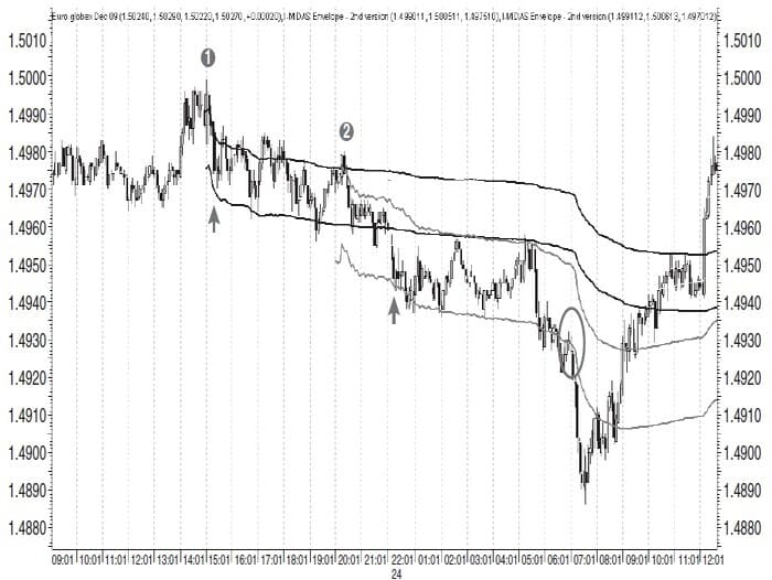
Figure 3, a five-minute chart of the Xetra DAX December 2009 futures, contains two channels marked by (1) and (2). The first larger one is fitted at the black arrows at 0.43% and 0.07%, while the second smaller one is fitted at the black arrows at 0.8% and 0.13% (the standard MIDAS curve is blanked out in both instances because it is playing no effective role). Figure 3 shows that the curves of the channel can often go on to play significant roles in capturing subsequent swing highs and lows.
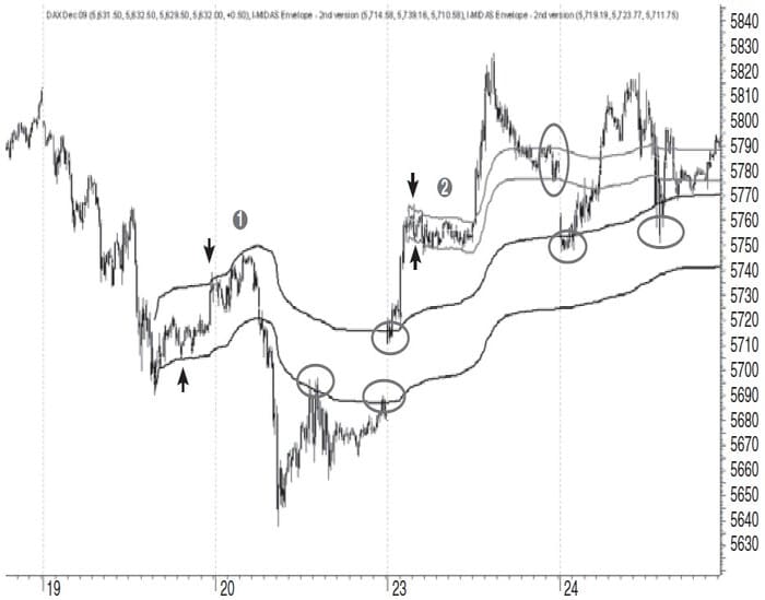
The gray circles highlight this on two occasions during November 20, 2009. On November 23, the market gaps up to the upper channel boundary band and finds key support on it twice on November 24, with the second support being porous†. Likewise, the second channel created in relation to the smaller congestion on November 23 also captures the closing price level on the same trading day. On November 24, price gaps down to the upper curve of the first channel and also finds further support there later in the trading day, albeit with one of the bounces being porous.
CAPTURING SWING HIGHS AND LOWS
A MIDAS critic might make the lesser complaint that just as a standard MIDAS support/resistance curve fails to identify swing highs and lows in non-trending markets, it fails to capture the swing highs in rising trends and swing lows in falling trends. This would be a fair assessment. Where the end of a trend leads to a genuine trend reversal as we have seen in Figure 1, the standard MIDAS S/R curves do a great job of capturing the swing lows in uptrends and swing highs in downtrends. Yet it would also be helpful to have a curve that captures both sides of an uptrend and a downtrend.
Figure 4 is a five-minute chart of the German EUREX Bund December 2009 futures. It’s a busy chart extending over 14 trading days from November 11 to November 30, 2009, and of critical importance for anyone day-trading the Bund futures. To appreciate the significance of what the channel captures, we need to break the chart down into segments according to what is accomplished by each channel:
- The first channel (black curves) is launched at the point on the chart labeled (1) on the far left of the chart. Because the standard MIDAS curve moved to the center of the range, it is blanked out. The upper curve is fitted at the gray arrow at 0.25% while the lower one is fitted to the first swing low at 0.17%. Between them, they go on to capture all of the subsequent swing highs and lows in the price range, albeit with some price porosity.
- The second channel (gray curves) is launched on November 16 when price breaks through the upper band of the first channel. The second channel’s lower band is redundant (as lower bands often are in uptrends), but the upper band is fitted at the gray arrow at a displacement of 0.34%. The standard MIDAS curve of a channel is retained in an uptrend. Here it conjoins with the upper band of the first channel and goes on to capture several swing lows of the uptrend until it displaces downward from price on November 19. During this time, however, the upper curve of the second channel continues to resist price between November 16 and November 20.
- The third channel (dotted black curves) is launched on November 20 because price began to displace upward from the second channel on the previous day. Here again the lower curve is blanked out and the standard curve and upper curve remain on the chart. The upper curve is fitted at the gray arrow at a displacement of 0.20%. Thereafter, it again captures all of the intraday highs for the next three days, while the standard MIDAS curve captures the intraday low of November 25 as price begins an accelerated trend requiring the application of a top-finder.
- Finally, a fourth channel (gray curves) is launched from the swing low on November 27 in the upper right of the chart. The upper curve is fitted at the gray arrow at a displacement of 0.23% and captures the two swing highs of November 30.
These results produced from the upper curves of the three channels are impressive and would be of real interest to a day-trader, since they capture the intraday swing highs every day for 10 straight days, albeit with a small amount of porosity. Figure 5 is an intraday downtrend in the CME Euro Globex FX December 2009 futures. The first channel (black curves) is launched at point (1) and fitted to the swing low at the gray arrow at a displacement of 0.10%. This time, the upper curve is blanked out.
There is a lot of porosity with the standard curve, but the lower one does a good job of containing the trend. The second channel is launched at point (2) when price breaks below the lower band of the first channel. It’s then fitted at the gray arrow at a displacement of 0.14%. The standard MIDAS curve conjoins with the lower curve of the first channel for a period of time. The lower curve captures the swing lows effectively. When price breaks down, there’s a brief throwback (circled) before the downtrend resumes.
APPLYING CHANNELS TO POROUS PRICE MOVES
“Porosity” and “elasticity” are terms Paul Levine used to describe case s where price penetrated a MIDAS support/resistance curve before responding to it. The problem with this phenomenon is that price can penetrate an S/R curve more deeply, so it is sometimes difficult to conclude whether we have a real case of porosity because the percentage seems too great. This can obviously affect trading confidence. The problem can be avoided in an uptrend by using the lower (support) band. In a downtrend, it can be eliminated by using the upper (resistance) band.
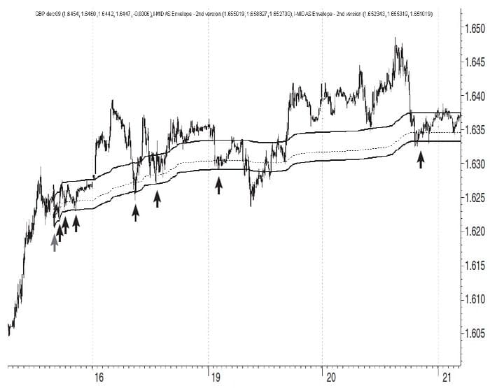
Figure 6 is a five-minute chart of the CME Globex GBP FX December 2009 futures with a gradually rising trend over three trading days. The two outer black curves comprise the channel; the inner dotted line is a standard MIDAS support curve. Price is porous in relation to the standard curve from the very first bar highlighted by the gray arrow on the left. At this first bar, the lower support curve of the channel is fitted at 0.08%. Subsequently over the next few days, price is porous in relation to the standard curve on another seven occasions highlighted by the black arrows. All of them are captured by the marginally displaced lower curve of the channel.
Figure 7 is another five-minute chart of the CME Globex Euro FX December 2009 futures contract, this time highlighting porosity in a downtrend. As can be seen, price is porous in relation to the standard MIDAS resistance curve (dotted black line) from the outset, so the upper curve of the channel is fitted to the first sign of porosity at the gray arrow at a displacement of 0.10%. I also retained the lower curve on the chart fitted at the lower gray arrow at a displacement of 0.22%.
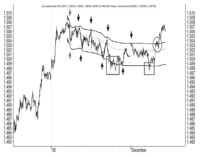
After the upper curve is fitted to the first porous pullback, it captures all of the remaining swing highs in the downtrend before price hesitates and then breaks out at the gray oval on the far right side. In the case of the lower band, it can be seen in the gray boxes that price can produce porous pivot areas even in relation to the channel curves. This in turn could be eliminated by producing a variation of the channel with two outer curves instead of one.
UNIQUE FEATURES
MIDAS offers a number of unique features that are unlike most other boundary indicators. The channel requires a launch point reflective of a change in underlying market psychology. Only the Raff regression channel incorporates a fixed launch point. Unlike other boundary indicators, the channel incorporates volume. Unlike other boundary indicators, the channel bands are adjusted individually, not in parallel, so there may be a significant difference in the distance between the central curve and the upper channel and the same curve and the lower one. Unlike some boundary indicators — such as the Donchian channel, Raff regression channel, and standard deviation channel — the bands of the channel are nonlinear.
Finally, unlike all other band indicators, the displacement of both of its bands is under constant review: adjustments are made at its launch point and then subsequently, whenever there is a new swing high or low, which marks either a wider or a narrow price extreme. This adjustability has definite price forecasting implications.
UK-based Andrew Coles holds a master’s degree and a doctorate in the history of science. He has a diploma in technical analysis from STAUK and from the International Federation of Technical Analysts (IFTA).
(Also Get METASTOCK CODE FOR THE MIDAS DISPLACEMENT CHANNEL)