Trading Articles
How Good Is Your Data? By Sunny J. Harris
All data is equal — at least that’s what we think. Is all data equal? If truth be told, I never gave it much thought. I have been using one vendor nearly exclusively for about 20 years. My fills are good enough. My closing prices seem to match what I see on television or find online. As long as the profits roll in, there has been no reason to question the data. But then I was told by another vendor that my vendor’s data is off by just enough to generate a side income, through the slippage from actual price to the price I am presented. My curiosity was piqued, and so I decided to investigate. First, I set up a spreadsheet and compared the two vendors. To keep it simple, I considered only the past five years of data. My data experiment ran from June 30, 2005, to June 29, 2010.
RUNNING EXPERIMENTS
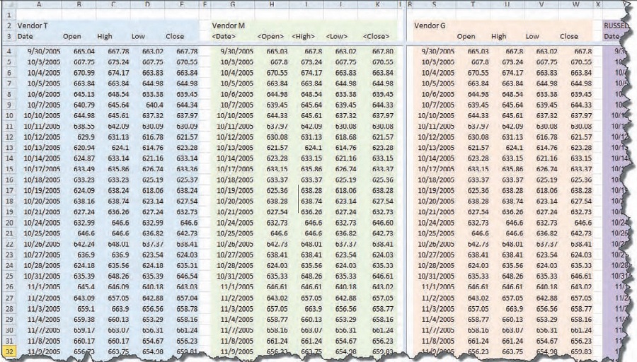
I began by exporting the data for a single symbol from each software application to a comma-separated value (CSV) text file. The instrument I chose was the Russell 2000 index, which has different symbols in different software, like RUT, $RUT, and RU2000. I selected the Russell 2000 because of its high liquidity, ease of use, and it is something little guys like us can trade.
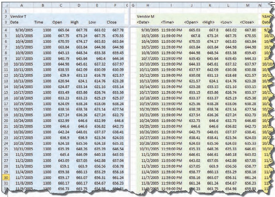
Figure 1 shows the beginning of the spreadsheet, with the data of the two vendors (T and M) in the columns. At first glance it appeared that everything was in order, with small discrepancies here and there. The differences in the data, where there is one, seem to be out in the hundredths place, like 600.01 vs. 600.02. That wouldn’t make much difference over time, with some errors to the positive and the negative. It seems like it should be a wash.
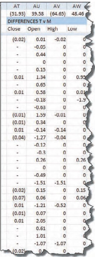
Next, I put columns in the spreadsheet to calculate the differences between the open, high, low, and close (OHLC) of each vendor. Part of that spreadsheet is shown in Figure 2. At the top of each column, in the first row of data, is the result of calculating the sum of all the differences between the two vendors’ OHLC data. I wouldn’t have been surprised if each component had been consistently lower or higher than the other. But these summation numbers show that the data is all over the map. The closes are 52 points lower, the opens are 40 points higher, the highs are 65 points lower, and the lows are 48 points higher. The spread between the numbers is alternating positive and negative. Could it be — as one vendor suggested — that there is enough of a spread in there for vendor T to cash in on the spread alone?
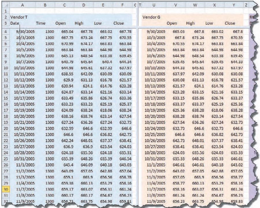
With this information, I wanted to compare the data I had come up with to another well-known vendor to see whether their data matched either vendor T or vendor M. So I went back to the Export facility in software G to create another set of columns in the spreadsheet. I hoped that the data from vendor G would match one or the other of the first two vendors and I would come up with an answer.
Figure 3 shows the data from vendor T and vendor G, the new set for comparison. Again, I gave the data a cursory glance, but nothing seemed amiss. The variations are again out in the hundredths place.
I found small discrepancies that led to large numbers when summed over time (Figure 4). On its own, an error of 0.01 doesn’t seem like much. But when you add that up over five years of data, it is 1,257 trading days and an accumulated error of $12.57. Remember, each point is worth $100 on the RUT.
This is where it starts looking scary. Multiplying $12.57 x 100 gives you $1,257. That’s over $1,000 out of the trader’s pocket. It isn’t huge, but if you are the vendor and you have 20,000 clients at $1,000 each, that comes to $20 million. That is $20 million over five years. Now I was beginning to understand what that vendor was talking about.
Still, I couldn’t go anywhere with this bit of information. This situation was akin to having a clock shop where each clock tells time a bit off from every other clock in the shop. There’s no way to tell what time it really is. Which clock is telling the right time?
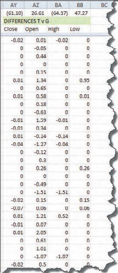
This situation demands that I compare the data from vendor G to vendor T and also to vendor M. I’m not sure what I would find out if none of it matched, but if one matched one other, then I’ll know something about the veracity of the vendor’s data that didn’t match. Here’s the spreadsheet I have for three vendors’ data so far (see Figure 5). Back to the differences spreadsheet, I inserted columns for calculating the new spreads: vendors T versus G; T versus M; and G versus M. That setup will be compared against the other and maybe I’ll get some clarity. The differences section of the spreadsheet can be seen in Figure 6.
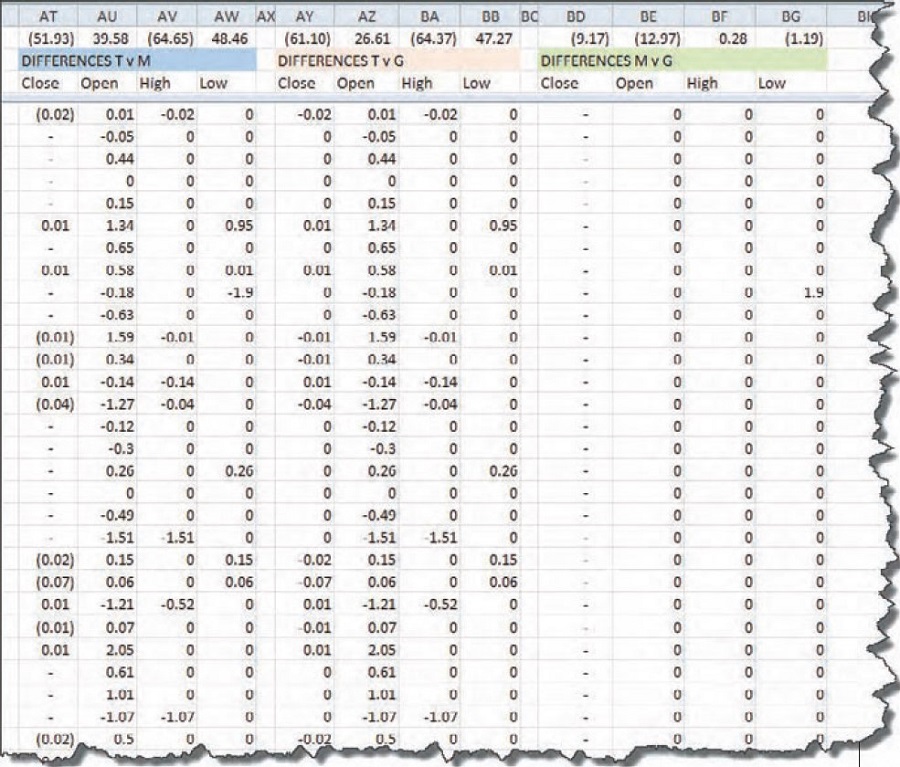
Aha! Look at the zeroes in columns BD through BG. Reading the description in row B over those columns (shaded green), I see that the zeroes show up when comparing vendors M to G. Still, looking at the numbers over the header “Differences M v G,” we see that despite all the zeroes there are discrepancies along the way, giving us (9.17) among the closing values. As I scanned the columns of this spreadsheet comparison, I found that on September 17, 2008, there was a difference of (8.83) between the close of M and the close of G. That was where most of the error comes in.
How could these vendors have such differences among their data? Isn’t the close the close, no matter who vends it? Next, I called the Russell 2000 exchange and got the data from them. Now that data should be correct, right? It’s their own index, so they should know. But they only had closing prices for the first part of my experiment (September 30, 2005, through June, 22, 2007). Closes will have to do for comparing data vendors versus the Russell 2000 itself. Their closing prices are accurate down to six decimal places, while the others only have two digits after the decimal.
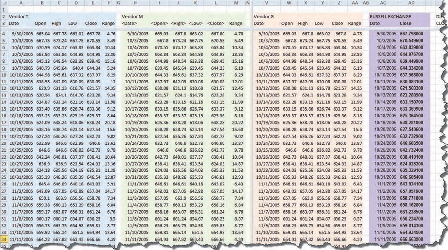
Adding yet another set of columns to the spreadsheet, I placed the RU2000 from the exchange in place. While I was at it, I introduced another column with the calculation for the range of each day. As I looked at the data, I wondered whether the errors worked themselves out by having the same range for the day, even if the open and close were different. That’s why there’s a column labeled “Range.” Figure 7 shows three data vendors and the Russell 2000 exchange data side by side.
The more columns I added, the more difficult it is for you to read. So for those interested in the details found in these spreadsheets, visit www.MoneyMentor.com/Articles.html, where you can see enlargements of these figures.
When you compare the closes of the Russell index to the closes of vendors G, T, or M, there are slight discrepancies. I decided to add another data vendor, one who does not connect a brokerage firm to the data (as far as I know). Yahoo! makes its data available for free, and because it is such a popular data source, it should have pretty clean data. As I looked closer at the data, I saw that some vendors were using the first opened trade for the open value, and some were using the opening range of the first few minutes. The same applied to the close, in that some use the value at the bell and some use the range as all the last few orders trickle in. In Figure 8, I overlaid two sets of data. You can see where the orange tick is at a different location than the green tick. Orange stands for the Russell 2000 data from the exchange, while the underlying blue and green are from vendor T.
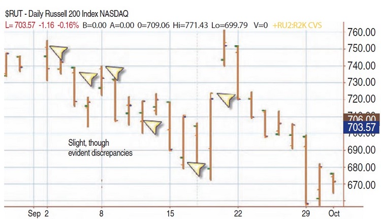
Looking at the chart provided a clearer picture. You can see right from the first bar on this chart that the open tick (to the left) has an orange one and a green one, only slightly different, but different nonetheless. On the third bar from the left there is some difference between the two opens, though the closes are equal. Similarly on the fifth bar, you can visualize the discrepancy across the chart. The differences are subtle, but they are there.
As for my own trading, I entered and exited on market orders. Or I let a stop take me out. In neither case was it crucial that I placed orders on the open of the bar, even on the close of the bar. However — and this is a big however — when writing and testing system ideas, many, if not most, coders specify things like:
- IF condition1 THEN BUY next bar on the OPEN;
- IF condition2 THEN SELL on CLOSE;
If I tested such code against these five datasets I would get different results, different profits and losses, depending on the data vendor or software vendor. So which results are correct? The correct data is the set that gives the same results as actual trades entered into the market would yield. And that brings us to the heart of the matter. Do you want to put your money into the markets in a reversal system like, say, the moving average convergence/divergence (MACD), just to see whether the trades it comes up with replicate the trades the hypothetical system generates? Of course not, and neither do I. So we are at an impasse.
Suggested Books and Courses About Investment
I’ll come back to the impasse in a minute, but for now let’s get back to the data comparisons. From Figure 6 you can see that vendors M and G are very close in the data they provide. Most of the cells in the spreadsheet contain zeroes; there is no difference in the data point from vendor G and the data point from M. You can see a spreadsheet of the differences between all vendors on my website.
PUTTING IT ALL TOGETHER
It is clear that there are many differences between data vendors. The close is not the close all the world around, and there is no way to evaluate which is better. The better data is the data that most closely approximates what you would experience in actual trading scenarios. The problem is, I don’t know how to run that experiment. I could set up an automated system in each software, where it would enter each trade in the markets on its own. Then, after letting the systems run for a year or so, we could compare the results of each trading experiment to evaluate the accuracy of the underlying data. Other than that, it is a matter of personal experience.
SYSTEM TESTING
The data between these five sources varies, sometimes widely. What if the data is different? It matters when you are entering trades in the markets, especially if you’re trading at a very fast pace. It doesn’t matter so much if you are off a penny in a trade that lasts for a year, or a month, or even a week. But if you are scalping for pennies, then the data you are making your decisions with needs to be exactly the same as the actual trades happening in the real market.
Running experiments down to the pennies is not within the scope of this article. I have limited the scope of these tests to daily charts over the past five years of data. This will illustrate the differences between the data sources when applied to hypothetical trading. I will run the same experiment on all five sets of data. For vendors T, G, and M, the data is supplied by the vendor, so they go hand in hand. For vendor R, there is no software associated with the exchange, so I am going to import the data from a CSV text file into T’s software and run the tests from there. The same applies to the data from Y: the data will be imported from a CSV file into T’s software and tested from there. I will then view the results of the tests by looking at the performance reports correlated to each dataset.
In order to set up the experiment, it is necessary to hold constant as many variables as possible, so that you compare apples to apples and get meaningful results. Here are the constraints I employed:
- Trade only one contract
- Constrain the data to the time frame October 13, 2005, to October 13, 2010
- Do not allow pyramiding
- Limit the input values to 12, 26, 9
- Enter at the market, not on the open or close of the signal bar
With these values in mind, I ran one test and compared the results. At the beginning, I got wildly different answers. Because of the different philosophies of the software vendors, it was challenging finding the locations of the settings of things like trading one contract versus trading 100 contracts at a time. But with diligence, I got them all set up identically. If you were to look at the charts of the data from each vendor, from a visual perspective the results look similar. To inspect the data more closely, I broke it down into a tabular format. I am not going to display all of the statistics, only the most important to the analysis (Figure 9).
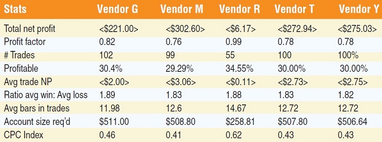
Statistically, there is little difference among the four vendors, as far as performance data goes. What stands out, however, is the difference between the collections of the vendors against the data from the exchange itself. Vendor R — the exchange — has the best performance overall and is the one dataset different from the others.
I’m not going to get into all the results of the experiments. For the purposes of this article, I am not trying to find whether the MACD system works, rather attempting to uncover discrepancies among the data available for analyzing and trading. Admittedly, this is one set of data on the Russell 2000, and one set of parameters for only the MACD reversal system. It is not a comprehensive test, and by any means not a full analysis. But it is useful for answering the question posed by one vendor when touting the accuracy of their data. The outcome is not dramatic. All the data vendors present a losing outcome for the standard MACD strategy.
The only one close to positive is the data from the exchange; the rest are all negative by the same amount. It would be interesting to run comprehensive tests over a variety of time frames, optimizing the parameters and using other types of orders besides just buying at the market. But it would be an extensive test with thousands of outcomes.
THE BOTTOM LINE
The trades entered into real-time markets will vary far more than the data for the trades in this simple experiment. Over approximately 100 trades, there is only a few dollars’ variation. In real-life trading, your fills will have wider ranges as markets move faster or slower, and the range between bids and asks widen and narrow. In real-life trading, by trading just one share, you can easily lose double the amounts shown in just a few minutes, depending on how quickly your order is entered in a fast-moving market.
Backtesting is not meant to provide precise replication of what would happen in the real markets. It is meant to give you an overall impression of whether your concepts are viable. The markets never again do the exact same thing they did before. They may echo similar patterns, but they don’t duplicate them precisely. You can do all the testing in the world, but when it comes down to entering real trades, the markets will hand you something unexpected.
Larry Williams said something that has always stuck with me: “It takes time to make profits.” Making a few dollars at a time to make $100 a day is against my trading philosophy. I believe in mathematical analysis of patterns and detection of setups that are likely to predict important pivot points and turns in the markets. In the end, all five of these data sources are perfectly adequate for testing and for trading. It’s all relative.
A trader, author, computer programmer, and mathematician, Sunny Harris has been trading since 1981. The first printing of her first book, Trading 101: How To Trade Like A Pro, sold out in two weeks, and continues to be a financial best-seller, and her second book, Trading 102: Getting Down To Business, also achieved record sales. In early 2000, Harris released Electronic Day Trading 101, followed by Getting Started In Trading in 2001.