Trading Articles
Automated Techniques For Intraday Traders By Andrew Coles
Find out how you can automate several time-based techniques to apply to intraday charts. In the first part of this series, we discuss the Fibonacci bar-counting technique and the Lucas number series. It’s fair to say that technical analysis has made its biggest strides in relation to price-based forecasting rather than time-based studies. Moreover, when time-based techniques are developed, they are applied to higher time frame charts. The result is that the intraday trading context has seen little exposure to time-based forecasting techniques comparable to higher time frame approaches such as the delta system, the spiral calendar, and Ermanometry.
Beyond this, a major problem in applying time-based techniques intraday is that unless they can be automated, their application demands a great deal from a trader. With a variety of screens and indicators, a daytrader’s attention is more than occupied: the last thing he needs are calculations running through his head. For higher time frames, which are forgiving of a more leisurely pace, these issues are not a concern.
In these articles, I want to do two things: first, to automate several time-based techniques so that they can be applied to intraday charts; and second, to assess their effectiveness intraday in relation to price-based technical analysis. Time-based techniques to be considered this time include the Fibonacci bar-counting technique and the Lucas number series.
FIBONACCI BAR COUNTING
The Fibonacci bar-counting technique is based on the Fibonacci number series. The numbers in the sequence are derived from the seed values zero and 1 and from the formula Fn+1 = Fn-1 + Fn. As the sequence progresses, the ratio of a number to the one before it gets closer and closer to the golden ratio, which is 1.618. Here I’ve programmed the sequence inclusive of 5, 8, 13, 21, 34, 55, 89, 144, 233, 377, 610, 987, 1597, 2584, 4181, and 6765. The bar-counting technique that derives from this sequence is well-established on higher time frame charts, especially in Elliott wave circles. John Murphy describes the technique thus:
Fibonacci time targets are found by counting forward from significant tops and bottoms. On a daily chart, the analyst counts forward the number of trading days from an important turning point with the expectation that future tops or bottoms will occur on Fibonacci days – that is, on the 13th, 21st, 34th, 55th, or 89th trading day in the future. The same technique can be used on weekly, monthly, or even yearly charts.
What about intraday bar counting? Even if it does work, it’s a tiresome procedure for a daytrader, especially when Elliott wave practitioners argue for better results when more than one bar count is taken from alternative pivots to produce coextensive time targets. It would be better if we could mechanize such a system (see, “MetaStock For Intraday Application Of Fibonacci Series”).
Figure 1 is a five-minute chart of the Xetra DAX December 2010 futures. The needle-like projections on the chart are MetaStock’s firing off a “true” condition when a bar is reached that corresponds to a number in the Fibonacci sequence. Elliotticians will usually allow a variance of -1/+1 bar in response to signals.
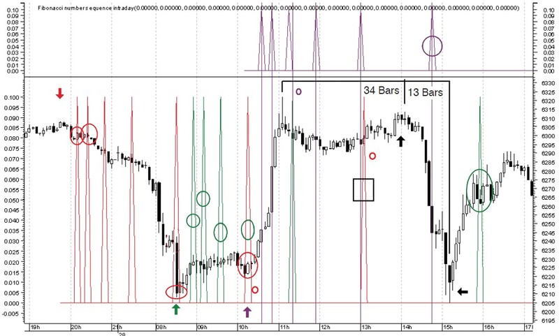
Now, Figure 1 contains three Fibonacci number sequences: the first (red) is launched from the swing high at the red arrow, the second (green) from the swing low at the green arrow, and the third (purple) is launched from the purple arrow in a distinct pane to separate overlaps. Let’s break the chart down:
- The red sequence ranges from bar 5 to bar 89 (seven Fibonacci numbers); four of these seven numbers are associated with price turning points or minor fluctuations, as the red circles high-light, including the major bottom at the green arrow.
- The green sequence ranges from bar 5 to bar 55 (six Fibonacci numbers). The fourth, fifth, and sixth Fibonacci numbers (21, 34, and 55) overlap with the red series at the two red “O”s and the purple series at the purple “O.” Of the six Fibonacci bars, five bars are associated with price turning points or minor fluctuations, including the one at the purple “O,” which is three bars off a major swing high.
- The visible purple sequence ranges from bars 5 to 55 (six Fibonacci numbers). Despite being launched from a significant pivot, it only captures a single turning point (highlighted with the purple circle in the upper pane).
- The signals I’ve highlighted with the black box are a confluence of three Fibonacci sequences, yet nothing of significance occurs on this bar.
- The large price swings highlighted by the black arrows were captured from a series launched from the previous swing high (34 bars earlier) and from another swing high (13 bars earlier). The chart would have become too crowded to show the mechanized signals.
These sequences continue plotting off the chart as they grow larger. Figure 2 highlights the subsequent results. Beyond the 13th Fibonacci number (1597), no further intraday data was available. The results showed continuing Fibonacci influence up to the 12th to 13th number in the sequence (987 and 1597, respectively).
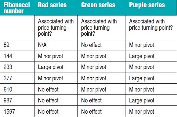
Figures 1 and 2 reveal an undeniable association between the Fibonacci number sequence plotted from a significant intraday turning point and its capacity to identify subsequent turning points. However, several issues require emphasis:
- The assumption in Elliott wave circles that a coincidence of Fibonacci numbers from other launch points has a more powerful effect in engineering price turning points doesn’t always hold true. As noted, the black rectangle highlighting the convergence of three signals isn’t associated with a significant response. I’ve also noted this to be the case in many other intraday chart environments.
- It’s easy to miss significant price turning points when certain launch point pivots are chosen over others. For example, in Figure 1 the 34-bar count and 13-bar count to very significant price turning points were missed but easily identified later on. In live charts, where price is unfolding in real time, this is significant. However, if a trader believes a turning point is occurring, he can use this mechanized system to confirm this by back-launching from various earlier pivots.
- As Figure 1 also illustrates, a time-based forecasting system plotted on a single time frame provides no information regarding the size of a move that will follow a price turning point. To trade such signals, you must apply price-based analysis to determine factors such as trend reversals, breakouts, significant overbought and oversold conditions, price confirmations and disconfirmations, and additional information such as trend strength. This is such a fundamental point that it is shown in Figure 3. Later, we’ll come to another method of predicting larger intraday price turning points.
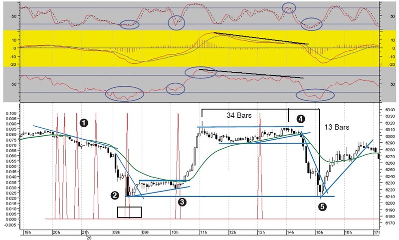
Figure 3 is the same chart with the first red series remaining. The upper panes contain the relative strength index (RSI), the moving average convergence/divergence (MACD), and stochastic, respectively. The price chart contains basic line analysis plus a 20-period moving average. Numbers (1) to (5) highlight discussion points.
From left to right, (1) illustrates a good example of where a time-based forecasting system must be subordinate to basic price-based considerations, since the first four bars in the sequence (5, 8, 13, 21) don’t produce candlestick reversal patterns or break the minor downtrend line and 20-day MA. This drives home an important point: time-based signals will be trend-following or contrarian, which means that a trader must have price-based technical systems in place to confirm an ongoing trend and warn when it is coming to an end. Otherwise, without effective price-based analysis, a time-based approach is comparable to seeing a new road direction while knowing neither destination nor distance.
In terms of immediate trade entry, it’s also crucial to have a chart style capable of confirming a price response to a time signal. Candlesticks are ideal for this purpose, though other styles can work too, including point & figure charts. Time-based systems can enhance price-based systems extremely well, as we’ll continue to confirm. At point (2) we have the 34th bar coinciding with a deeply oversold RSI; price is also deeply below the 20-day MA. Yet the reversal candlestick patterns are weak. The stronger trade comes at point (3), the 55th bar, when the RSI and the MACD are confirming price and the reversal results in a break of the moving average and resistance.
As regards point (4), despite the negative divergences on the MACD and RSI, this is also a weak signal because price has been drifting sideways and the candlestick patterns are again indeterminate. However, the signal is strengthened by price breaking below the 20-day MA and then breaking support.
Point (5) is a better immediate signal insofar as there’s a strong penetrating white candlestick that breaks a sharp downtrend line when the RSI is oversold. Price is also a long way from the 20-day MA, thus creating a plausible first price target for a hit-and-run scalp. This chart could have been enhanced further if we’d introduced floor trader pivot point analysis.
One more chart can illustrate how an effective price-based system can be enhanced by a time-based approach such as the Fibonacci series. Crucially, the price-based analysis provides information on price direction and the setup. I’ll use the MIDAS approach, which readers will be familiar with from earlier articles.
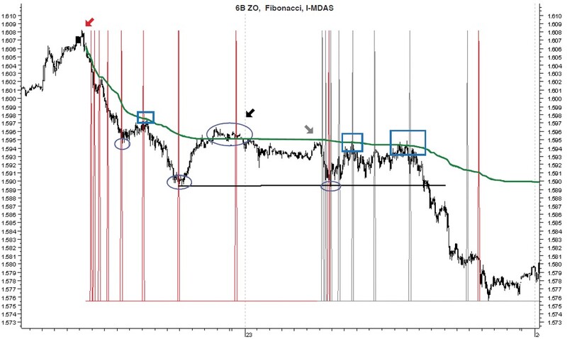
Figure 4 is a five-minute chart of British pound December 2010 futures over two trading days. A MIDAS curve (green) is launched from the red arrow at the swing high alongside the Fibonacci sequence. The circled areas highlight displaced Fibonacci turning points from the MIDAS curve, while the rectangles highlight perfect time-price axes. The black arrow pinpoints where price crosses back over the MIDAS curve at the Fibonacci signal, increasing the accuracy. The gray arrow highlights the start of the second time sequence (gray), where again there is a perfect time-price axis on two occasions, especially the second. The circled area beneath the gray arrow also highlights a time-price axis based on a conventional support line where there’s a confluence of time signals.
THE LUCAS TIME SERIES
The Lucas number series is named after the French mathematician François Eduoard Anatole Lucas (1842–91). The numbers in the series are derived from the values 2 and 1 and from applying the formula, Ln = Ln-1 + Ln-2. Like the Fibonacci, the sequence progresses and the ratio between successive numbers converges on the golden ratio, which is why the two series are related. Here I’ve programmed the sequence inclusive of 3, 4, 7, 11, 18, 29, 47, 76, 123, 199, 322, 521, 843, 1364, 2207, and 3571.
In recent years, no one has done more than Jeff Greenblatt to revive the trading interest in the Lucas series in various articles and in his book Breakthrough Strategies For Predicting Any Market. Greenblatt observes that the Fibonacci sequence is highly reliable, but where it is found wanting, the slack is always taken up by the Lucas series. Optimal time results can be expected by combining the two series.
Greenblatt stresses that signals from the F-L sequence must be confirmed by familiar candlestick reversal patterns, and he too is keen to stress that the best setups are found when there is a confluence of supporting signals from price-based analysis. For example, price-based phenomena such as MACD divergences and Fibonacci corrections are very robust price setups, yet timing is often an issue since divergences can continue for some time and it is never clear to which Fibonacci level price will correct.
The F-L sequence, with candlestick confirmations, provides an accurate information matrix when trading such setups. In his book, Greenblatt delves into F-L applications, including how they can help remove the subjectivity from Elliott wave analysis; he also looks at other setups and often finds deeper Fibonacci relationships between waves and the F-L sequence.
One of Greenblatt’s discussions focuses on the notion of price rotation, meaning that in an uptrend, price moves from low to high to low and in a downtrend, from high to low to high, creating an implicit triangular formation. He observes that most Fibonacci analysts will only track the bars from low to high and vice versa in a downtrend; however, the triangular round trip of the cycle must be included. See, “MetaStock For Intraday Application Of Lucas Series.”
Let’s illustrate the Lucas series in Figure 5, a five-minute chart of the euro December 2010 futures with three time series over two trading days. From left to right, the first (red) series is launched from the red arrow and the other two from the green and gray arrows, respectively. The blue rectangles highlight major turning points (especially the two bolded); the blue circles minor price wiggles. The terms “high to high” and “low to low” highlight Greenblatt’s notion of time rotation.
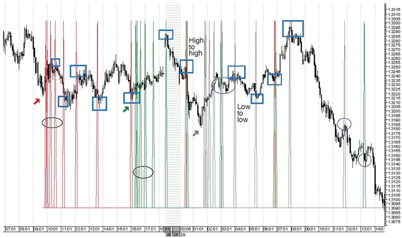
There are also contiguous signals close to being overlaps. The two black ovals highlight the start of the Lucas series (3, 4, 7, 11) where signals are compact, giving the impression that price is liable to pivot just about anywhere over the first 11 bars, especially when we factor in the +1/-1 allowance. I’ll return to this point.
Figure 5 is an impressive demonstration of the Lucas series, but as we’ve seen, Greenblatt sees that while the Fibonacci series is more reliable, where it is found wanting, the slack is once more taken up by the Lucas series. It makes sense therefore to combine the two series from the same launch point.
COMBINING THE TWO TIME SERIES
With this in mind, Figure 6 is a five-minute chart of the Bund December 2010 futures with the Fibonacci series in red and the Lucas series in green, both launched from the swing low at the black arrow. As the rectangles highlight, the major price swings are caught by the two series, with minor wiggles highlighted in the blue circles.
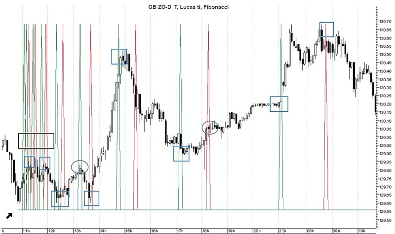
On the other hand, the black rectangle highlights a more exaggerated version of the problem highlighted earlier. Combining the two series, in the first 21 bars price can pivot anywhere, especially with the +1/-1 allowance. Personally, I find this an off-putting distraction rather than a help.
Moreover, like Figure 1, Figure 6 highlights the crucial need for additional price-based analysis to establish a road-map of (i) where price is headed and (ii) to confirm when it is heading in that direction. The latter would amount to the price-based setups I emphasized earlier and which are also a part of Greenblatt’s approach.
I want to introduce two further time-based systems that can be applied intraday alongside the ones we’ve been examining. However, to do so may seem premature in light of two issues that might be of concern to some traders, namely:
- The time series have no intrinsic means of identifying in real time when significant turning points are occurring as opposed to wiggles that are little more than noise. Such fluctuations are of little value to a daytrader.
- The first 22 or so bars of the combined F-L series are more or less susceptible to a price turning point, making their initial joint application more of a distraction than a helpful aid.
The solution to both issues is to apply the two time series to higher time frame intraday charts in relation to the trading time frame, ideally a 15-minute, 30-minute, or better a 60-minute chart, though a daily chart would also be relevant for daytrading purposes.
Suggested Books and Courses About Market Indicators
Higher time frame intraday charts present a solution because we know that even relatively minor turning points on higher time frame charts will correspond with much larger moves on lower time frame counterparts such as the one-minute, two- or three-minute, or five-minute. Moreover, even if there is a concentration of initial signals when the time series are combined, the signals will be fairly spaced out on lower time frames. For example, a distance of two bars on a 60-minute chart is the equivalent of 24 bars on a five-minute chart and 30 one-minute bars in the case of a 15-minute chart.
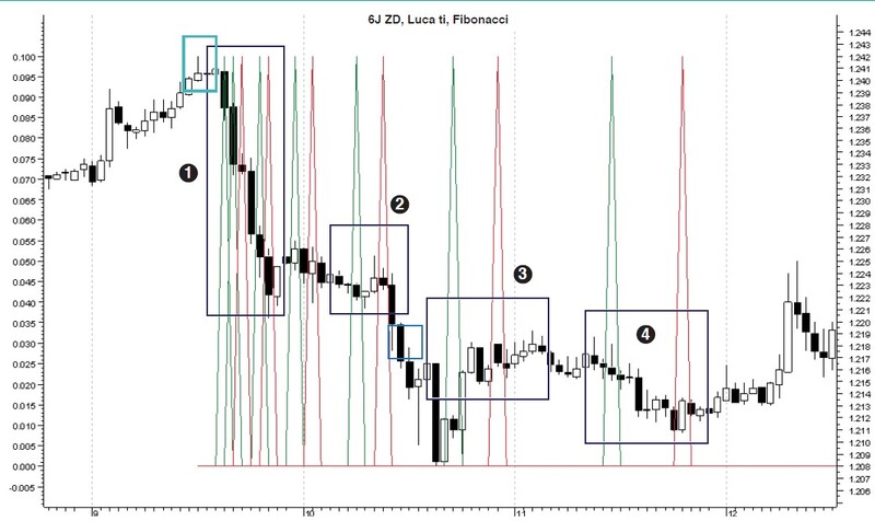
Let’s try this solution by plotting signals on a 60-minute chart and then examining their consequences on a five-minute chart. Figure 7 is a 60-minute chart of the yen December 2010 futures with a Fibonacci (red) and Lucas (green) sequence launched from the shooting star candlestick highlighted in turquoise. The zones marked (1) to (4) correspond to the areas covered in each of the subsequent three five-minute charts.
Moving from left to right, Figure 8 is a five-minute chart of the yen covering zone (1) in higher resolution. The black diamonds highlight pivots, which are now spaced much further apart. Yet the chart highlights again the need for price-based analysis, since all of the early pivots are against the trend pending a trendline break.
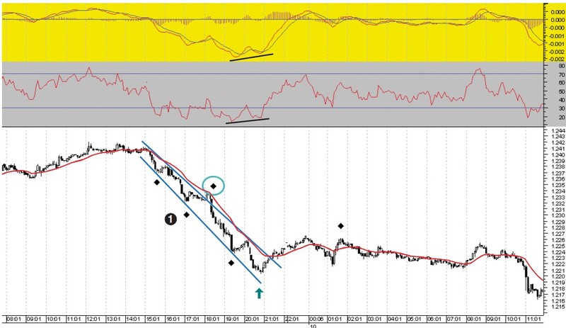
Only the diamond in the blue ring highlights a trend-continuation signal with a candlestick against the 20-day MA. Zone (1) ends at the blue up arrow, which is caught by the Fibonacci series on a positive divergence in the MACD and the RSI. Here, a contrarian signal is strengthened by the positive divergence but not confirmed until there is a break of the moving average and down trendline.
Figure 9 examines zones (2) and (3) in greater resolution. In zone (2) the three signals result in a break of the moving average, which is a powerful technical trading signal. The blue-ringed diamond highlights a signal leading to the next large move down as the MACD falls below the zero line. As we enter zone (3), the MACD and the RSI have produced large positive divergences. Our next signal is a good call as the market creates a first pullback after the bottom and breaks through the 20-day MA. The signal at the end of zone (3) is a false signal as price breaks the 20-day MA and then whipsaws.
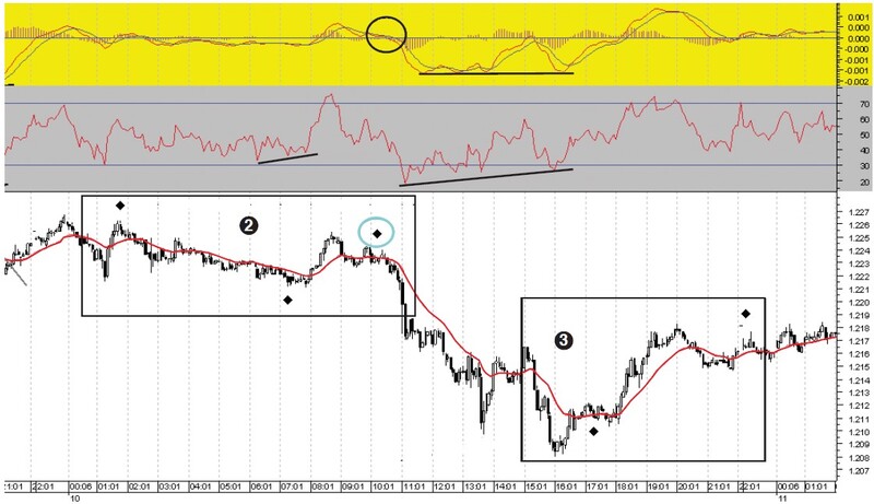
Finally, Figure 10 examines zone (4), which takes us into the next trading day. By this time the signals generated by the two series are becoming less frequent, thus managing to avoid most of the whipsawing action through the 20-day MA, which started at the end of zone (3). In zone (4) the first diamond results in the break of this whipsawing action as price moves down to complete another low accompanied by positive divergences on the MACD and RSI. The bottom is captured by the Fibonacci bar 55.
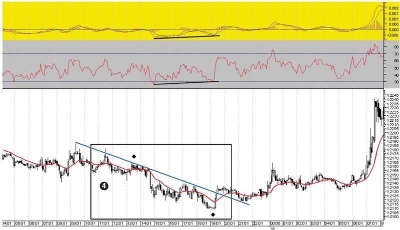
In sum, a higher time frame intraday chart in relation to a trading chart time frame such as a five-minute chart avoids the two issues raised by producing better-spaced signals that tend to be larger, thus cutting out a lot of minor noise. However, as Figures 8, 9, and 10 confirm, it is still imperative to run price-based procedures because only they will clarify the overall directional bias and provide additional price-based setups of the type outlined earlier.
In the second part of this series I will introduce you to Thomas DeMark’s TD sequential and William Erman’s Ermanometry, two additional time-based systems that you can apply to your intraday trading.
Read Second Part: TD Sequential And Ermanometry For Intraday Traders
Andrew Coles has master’s and doctoral degrees in the history of science. He has a diploma in technical analysis from Sta-UK and from the International Federation of Technical Analysts (Ifta). He is also a Certified Financial Technician (CFTe). With his colleague David Hawkins, he has written a book on the Midas system for Bloomberg Press/John Wiley.

