Trading Articles
Trading The Golden Ratio By Gareth Burgess
You can apply this technique to forex pairs to confirm price direction and anticipate when price will reach a certain point. The golden ratio to chart analysis is useful, and you should try to incorporate it within your strategy wherever possible. In this article I want to discuss one simple way of doing this. I will not go into much detail here about the origins of the ratio, except to say it has been used throughout written history and perhaps before, and that it has been found within architectural designs and construction methods of the ancient Egyptian pyramids and the Greek Parthenon and can be seen in the growth and form of many plants. So it’s been around a while.
The golden ratio is certainly a number that has significance in everyday life, even if we are not always aware of it. And just like the early architects who took the ratio from nature and applied it to their structures, we as traders can take the natural occurrences of the market and apply the same golden ratio to create our own technical plan.
It is primarily the actions of the crowd that create many of the well-known chart patterns, and as a consequence of these patterns, there can be highly emotional and distraught moments in the marketplace. As a result, the response of these emotions can be seen as reflective of human nature, a response that is heightened when faced with the prospect of a loss or gain in the financial markets. The markets are reflective of human nature, and where natural occurrences happen, so can the golden ratio appear. There are many ways to use the golden ratio in the market, and here is one of the simpler applications.
APPLYING IT
For the purposes of this article I will first demonstrate the significance of this number by plotting the ratios on a graph and then show how to use it in the financial markets. If you take the ratio of two successive numbers in the Fibonacci series (1, 1, 2, 3, 5, 8, 13, …) and divide each by the number before it, you will find the following series of numbers:
1/1 = 1, 2/1 = 2, 3/2 = 1.5, 5/3 =1.666…, 8/5 = 1.6, 13/8 = 1.625, 21/13 = 1.61538…
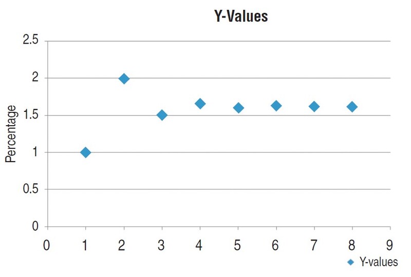
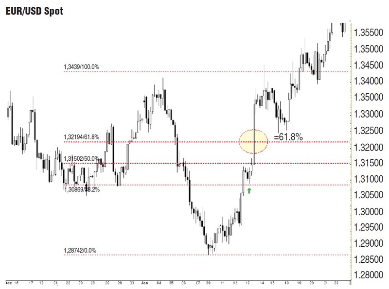
Plot these results on a graph and you can see the ratios settle at a particular value, called the golden ratio or the golden number (Figure 1). The value is approximately phi, or 1.618034. If you are familiar with Fibonacci ratios in market analysis, you will know that 61.8% is seen as a key level to determine whether the trend is corrective or a reversal. Surpassing 61.8% of the move usually signals a change in the longer-term direction — that is, it changes the bigger picture (Figure 2).
This is just one use of the golden ratio in market analysis. There are other methods, such as projecting up or down once a breakout has occurred. That method of projection can help determine potential targets and is available on many chart software packages. It is also a useful tool for maintaining confidence in a position or positions that are showing a profit.
The signal, however, that I want to discuss here not only projects a target level but involves counting forward to determine where the price action will reach a key level. This technique also involves finding a distinct and volatile pattern on the chart. In a sense, it is projecting but only to a certain level in time, one that will become significant for either support or resistance and the overall market direction.
This window of opportunity is applied to the chart and incorporated within your analysis like a pivot level used to confirm continuation of the price direction. But that’s not all. The signal I will demonstrate can also determine the expected time that the price will be seen. Though not necessarily the most important aspect of this technique, it has the advantage of knowing when to return to the market if you want to initiate a position or control a position based on the signal generated by applying this technique.
Before the golden ratio can be applied, which in itself is a very straightforward process, a certain pattern must be found within the price action. Usually, the pattern has been created by some volatility, is most often seen on the charts as a type of “V” pattern, and is known in the industry as a bullish V top or bearish V bottom. For the technical use of this pattern, however, it does not have to be seen at the top or bottom of a trend; simply appearing on the chart sparked by some market volatility or news-related event will do.
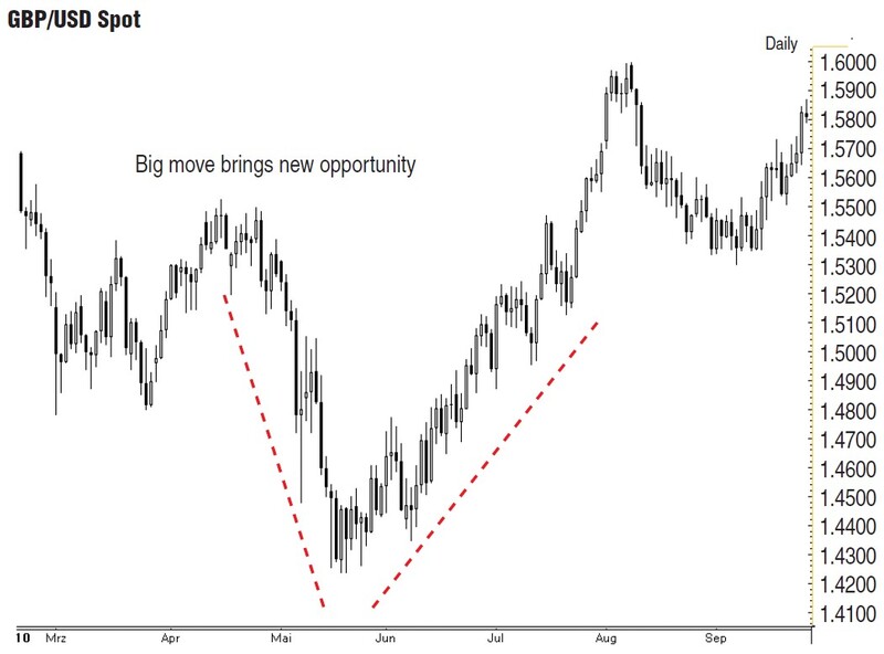
What is striking about this pattern is that the spike displays a very balanced market. It is one that I describe in my book Trading And Investing In The Forex Markets Using Chart Techniques. If you look at the candlestick chart in Figure 3, you will see that the market falls sharply, only to bottom and then turn back up. This move in the market is well displayed by standard candlesticks that lead down to a hammer candlestick, signaling a base — hammering out a base — and eventually, standard positive candlesticks lead the way back up! This market condition is suitable for entering positions without having to worry about wild market swings.
This type of pattern is also seen on different time frames, however, and this is the point you have to consider when applying the technique — the larger the time frame, the more significant the pattern. A 15-minute chart showing this V pattern will see many short-term traders get stopped out and many traders jumping in on the opportunity, especially as the price action bases out, forcing the price back up again. The longer-term time frame such as the daily chart, however, has much more than just the short-term market participants, and that is where the technique of calculating forward using the golden ratio works best.
When a large V pattern is seen on the daily chart, it is a sign the locals — that is, the short-term participants — have not been able to get control of the market. This is because traders and investors with longer-term views take control and the longer-term investors on the sidelines will be forced into making a decision. They will see the move as a potential opportunity to add to positions or enter new positions. The more the market moves, the more the participants will be attracted to the market as well as the local short-term participants, such as proprietary traders and speculators.
YOUR WINDOW OF OPPORTUNITY
The big move seen on the British pound/US dollar (Gbp/Usd) chart in Figure 3 sent many traders running for the exit, while many other traders would have viewed the lower levels as an opportunity not to be missed. After the market recovered to the point where it originally sold off, the burning question every trader and investor would have been asking is, “Does this continue to move upward?”
With the application of the golden ratio, it is possible to find a key level on the daily chart and use that day as a directional aid to help confirm a continuation in the market price action or help you develop a market entry strategy based on the daily chart support and resistance levels. The calculation is as follows:
- Take the first candlestick or bar seen as the start of the move and the final candlestick or bar of the move. The V pattern will only become clear after the move has taken place, but this is acceptable because there will be enough time to make the calculations and project forward.
- Then count the amount of days. For example, in Figure 4, there are 21 days.
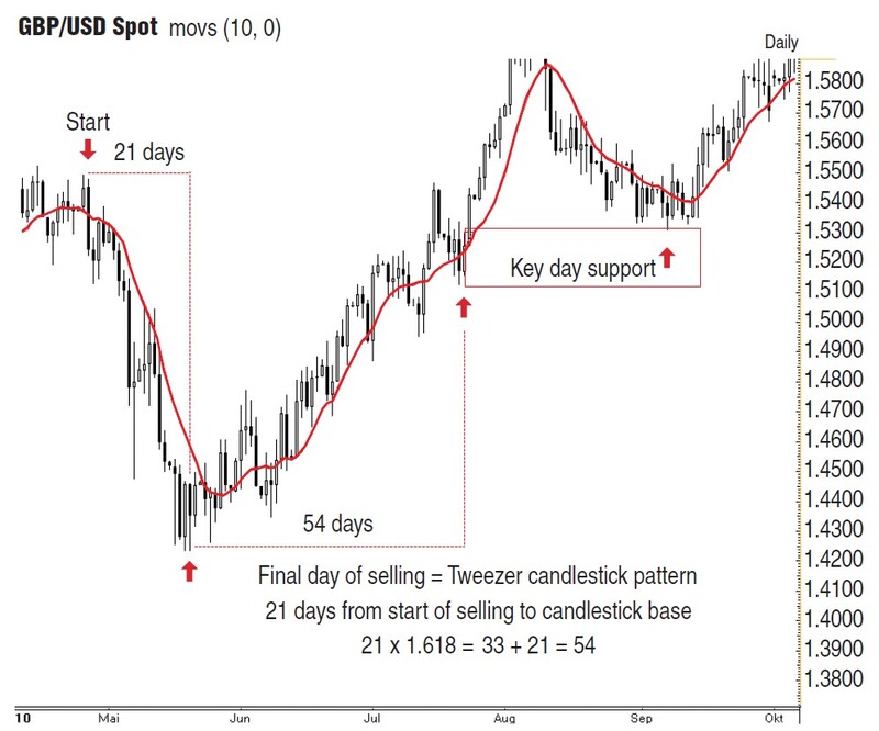
Take this number and multiply it by the golden ratio (1.618). Then add this number to the original number of days to reach a projection day.
The Fibonacci retracement is one well-known technique, and with good reason. This technique is more often than not very accurate at finding the level where the market price action will encounter important levels of supply or demand. It is these levels that often cause the market to turn about in the face of bearish or bullish news. Simply put, these are levels where the risk/reward ratio changes and the market yields a window of opportunity.
Suggested Books and Courses About Trading With Fibonacci
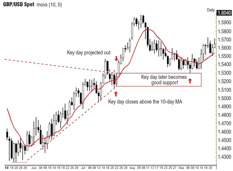
This is precisely what happens when you apply the golden ratio and find key days on the daily charts or key hours on the shorter time frame (Figure 5). Each signal is a signal in its own right because it is the result of previous buying and selling — that is, the readjustment of the market — and should only be used once, though the high or low from these key price regions may continue to be support or resistance for much longer. Chances are there will be another event where the number can be applied.
DIFFERENT TIME FRAMES
Tying the signal in with different time frames will help you avoid paralysis and should give you a great advantage on market direction, but keep in mind that the directional bias you get from this signal will have a greater effect in a trending market.
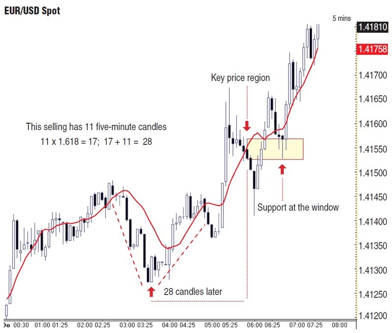
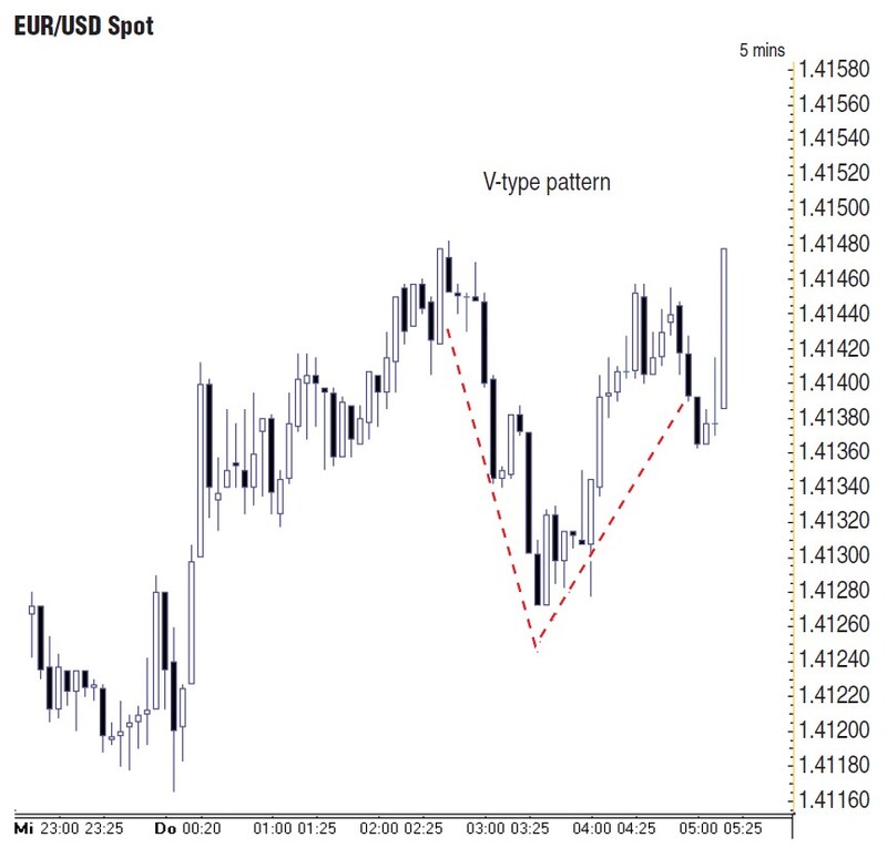
In Figure 6, there was a sharp decline in the morning of March 31, 2011. The euro sold off against the US dollar for 20 pips, which is enough of a move on the five-minute chart to try applying the golden ratio and projecting out. Remember, the bigger the move, the greater the number of positions in the market is changing, and therefore, the better the reaction will be further out when the key price level is reached.
TRADING WITH THE TREND
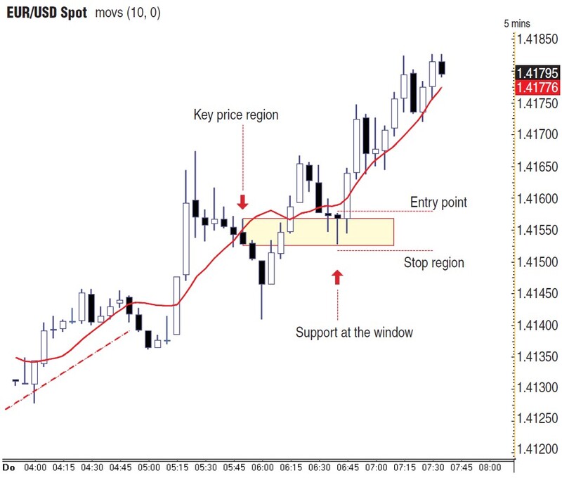
Trading the direction of the market is important when applying this technique. If the market is strong enough and currently in an established trend, the window should confirm the overall market direction, either as support or as a breakout in the direction of the market trend. See examples of support in Figures 4, 7, and 8. For example, if the market failed at those levels marked out in these figures, this could be a warning that something is not right with the trend and a neutral stance should be adopted until a signal appears, confirming the market direction. As with many other technical indicators and techniques, the trend always dominates.
TRADING PLAN
Entry strategy: The window in Figure 8 shows how the market finds support. At this point, you can determine a buy level at the top of the hammer-type candlestick that has confirmed support at the base of the window.
Smart stops: Identifying the correct stop-loss level can save you from falling into the trap of letting losses run. Chart analysis is all about finding trade op-portunities and levels to initiate trades. If those trigger points are violated and the market moves back through them, that in itself is your stop-loss.
In Figure 8, the stop can be located at the base of the window or just below it. That allows a stop-loss of some 10 pips, which is fairly tight, and which is then brought up to the trigger level, once the market moves from that level. The market should move away from the support zone, or resistance zone in the downtrend, quite quickly. If it does not, that would be a cause for concern.
Gareth Burgess has more than 10 years’ experience in applying chart techniques to investment analysis, creating technical views and strategies for corporate-level clients, and is a dedicated private investor. He is founder of the Chart Workshop (www.chart-workshop.de), a provider of technical views for investors.

