Trading Articles
Falling Off A Cliff By Teresa Fernandez
Spot a disaster stock before disaster strikes. For an investor, there is nothing worse than holding on to a stock and watching its price just keep going down. The news may be good, revenues may be growing, and the company’ s profitability may be encouraging. So what is going on? Not too long ago, investors could hold on through bull and bear markets to stocks that rewarded their loyalty by returning to their bull market highs once the bear got tired. They could hold on to those glamour or blue-chip stocks because those tradables would always come back. And as they waited patiently for their stocks to come back, investors would always count on those dividends. One way or another, they couldn’t lose.
BUT TIMES, THEY ARE CHANGING
American International Group (AIG) was such a stock. From 1984 the stock exploded to a high of $157.19 in July 1997 after splits. AIG has paid dividends from 1992 to 2008, with yields averaging 8.9% from 2000 to 2006. Then there was Citigroup (C). The merger between Citicorp, the holding company of Citibank, and Travelers Group in 1998 created a $140 billion firm with assets of almost $700 billion. Although C had not displayed spectacular performance through the years, investors could rely on their dividends, which were paid every year from 1988 to 2007, with an average yield of 1.4% over the 1988–2007 period.
And what about General Motors (GM)? Since its founding in 1908, GM grew to the world’s second-largest automobile manufacturer in terms of sales. While its stock price was so-so over the 1962–2007 period, investors could always rely on dividends; GM has been paying them since 1985 to 2007, with yields averaging 5.0%. For decades, GM was secure that their investment had nowhere to go but up. Investors were unmoving in their belief that “as goes GM, so goes the stock market.”
PRICES CAN PLUMMET
All three stocks had in common a “falling off a cliff” pattern that became apparent in their charts months before their troubles became public. The pattern has the look of a mountain that rises ever higher, then slopes lower, and suddenly drops over a period of one to eight weeks. Price action just before the cliff is on average volume, drops off on significantly higher volume, sometimes displaying the heaviest volume at the bottom of the cliff.
The sellers of the stocks are most likely investment professionals who are closer to the facts than either the media or ordinary investors. A company whose problems are not apparent will probably not speak to the media yet, but the knowledgeable company insider may be selling at this point. Professional investors who realize that a stock no longer meets their standards will first unload the stock before speaking to the media about the change in their opinion or informing clients about portfolio changes. That would explain the appearance of the pattern before a company’s problems become public.
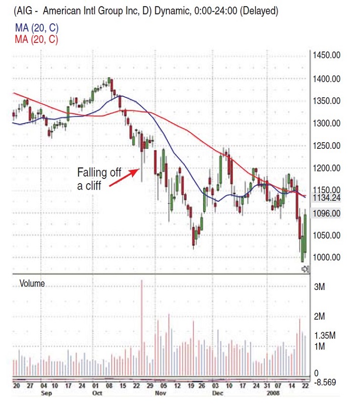
On September 16, 2008, AIG suffered a liquidity crisis following the downgrade of its credit rating. AIG’s share price had fallen more than 95% to just $1.25 from a 52-week high of $70.13. The pattern in AIG’s chart occurred on October 9 to November 21, 2007, nearly a year before its liquidity crisis became public. Figure 1 shows that AIG’s daily volume during that period was heavier than during previous months. The average daily volume during that period was 1,062,828, compared to the previous 12 months’ average daily volume of 509,327. Average volume during the last week of the pattern was even higher: 1,239,417. Those who held AIG stock should have sold on that brief move up November 23–December 10, 2007, when the average closing price was $57.36.
As the subprime mortgage crisis began to unfold, Citigroup announced on April 11, 2007, that it would eliminate about 5% of its workforce, in a restructuring designed to cut costs and bolster its long-underperforming stock. Unfortunately, the company lost nearly $10 billion during the last three months of 2007. Not surprisingly, the company cut its dividend. On January 7, 2008, Citigroup announced that it was cutting another 5% to 10% of its workforce.
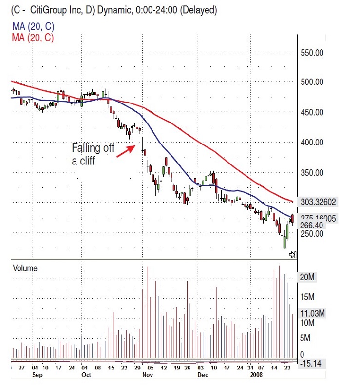
The pattern in C’s chart occurred on October 11 to November 9, 2007. Figure 2 shows that, as in the case of AIG, C’s daily volume during that period was heavier than during previous months — average daily volume was 64,854,100, compared to the previous 12 months’ average daily volume of 24,940,050. During the last week of the pattern, the average daily volume was even higher: 165,844,986. Since there was no move up after the pattern, those who held C stock should have sold sometime in January 2008, when the average closing price was $27.32.
GM was vulnerable before the automotive industry crisis of 2008–09. In 2005, the company posted a loss of $10.6 billion. GM was not doing well, causing a drop in the price from $40.06 at year-end 2004 to $19.42 at year-end 2005. Stockholders continued receiving their dividends through 2005 and 2006, but the company filed for Chapter 11 reorganization bankruptcy on June 1, 2009. As of June 8, GM was removed from the Dow Jones Industrial Average (DJIA). The stock price of GM was $1.21.

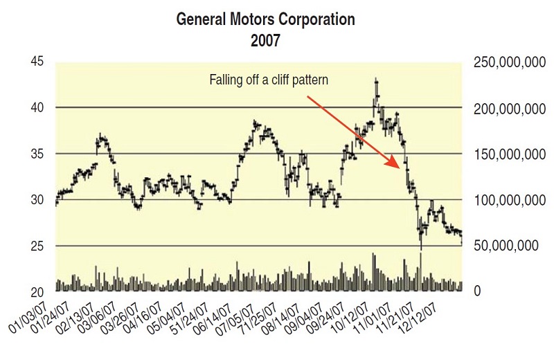
The pattern in GM stock occurred on October 11 to November 21, 2007 (Figure 3), two months before its $38.7 billion loss for 2007 was announced, almost a year before the probability of running out of cash in mid-2009. GM’s daily volume was heavier than previous months. Average daily volume was 20,476,587, compared to the previous 12 months’ average daily volume of 13,683,631. During the last week of the pattern, the average daily volume was higher as well: 23,252,000. Since there was no meaningful move up after the pattern, those who held GM stock at this time should have sold sometime in January 2008, when the average closing price was $24.49.
Suggested Books and Courses About Chart Patterns
PREVIOUS PATTERNS
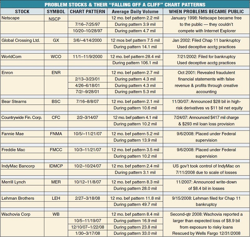
Previous disaster stocks showed the same pattern in their charts months before their troubles became public, as can be seen in Figure 4. Netscape Communications had two such patterns: July 16–July 25, 1997, and October 20–October 28, 1997. Average daily volumes for those periods were 3.9 million and 4.7 million, respectively, which was high compared to the 2.2 million of the previous 12 months. Big sellers must have known that sometime the following year, their browser would be offered free. Navigator was delisted on March 18, 1999.

Lehman Brothers’ chart had one such pattern, February 27–March 18, 2008. Average daily volume was 49.7 million, more than four times the volume of 11.8 million for the previous 12 months. Again, big sellers must have known about the losses incurred in the first half of 2008. In August 2008, Lehman announced losses of $2.8 billion in the first half of the year. They filed for Chapter 11 on September 15, 2008.
Due to the impending problems for stocks that exhibit the pattern, it makes sense to make this chart analysis part of an investment discipline. However, all disciplines worth following must have a way to get back into a stock if the signal to get out turns out to be wrong. In that case, the simplest way to do that would be to wait for the stock to trade above the 50-day moving average, and for the average to turn up.
BUT WILL THEY CLIMB BACK UP?
Looking out for the “falling off a cliff” pattern alerts ordinary investors to when professional fund managers and corporate insiders may be dumping a stock at the same time. Although we may not know why a stock is being sold at the time the pattern becomes evident in a chart, it is prudent to get out of the way of a stock falling on heavy volume, and wait until the news about the stock becomes known to the public. Most inexperienced investors will just freeze in their tracks and wait for the news, which may or may not come. The truly disciplined investor will get back in once the stock trades above the 50-day moving average and the average turns up, news or no news.
Teresa Fernandez is a private investor and technical analyst of the US financial markets. She has researched investing methods that can be used by the ordinary investor to make money in the stock market.


