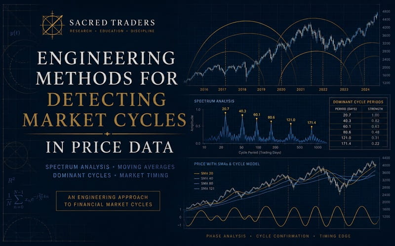
Trading Articles
Engineering Methods for Detecting Market Cycles in Price Data
Do cycles exist in markets? Here’s a look at the markets from a different angle — one that will help you realize that there is a harmony among cycles, events, and market behavior. The existence of cycles in stocks and commodities prices is considered to be an acceptable and rarely debated topic. While preparing for the Chartered Market Technician (CMT) tests, I became interested in this subject and decided not to take their existence for granted but to investigate it myself. In this article I will attempt to answer the ultimate question: Do cycles exist?
Technical analysts determine cycles in time series using the following major methods:
- Descriptive statistics
- Visual analysis of charts
- Trigonometric methods (centered simple moving average and future lines of demarcation (FLD) developed by J.M. Hurst, the focal point method by Jim Tillman, and so forth)
- Traditional indicators such as the moving average convergence/divergence (MACD), stochastic oscillator, the slope, and so on.
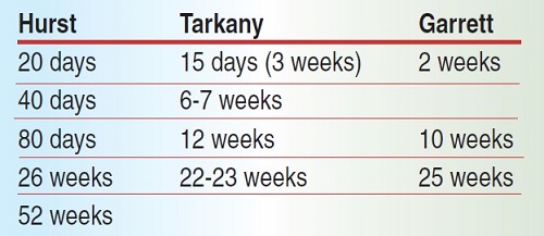
By no means are these the only methods used, but they are the most common. Different analysts found different durations for market cycles, as can be seen from Figure 1.
THE ENGINEERING TWIST
There appears to be no consensus on the durations of the cycles. So who is right and who is wrong? What cycles do we actually have if we have them at all? To answer these questions, I decided to try a scientific approach with an engineering twist. First, I employed the nullification hypothesis: There are no cycles in market price data. Yes, I denied there are cycles until proven otherwise. If my hypothesis is correct, I won’t be able to detect cycles using the mathematical methods used in electronic engineering to detect signals. If the hypothesis is incorrect, then these discrete time signal processing methods should work.
To verify this hypothesis I will use a spectrum analyzer based on the one described by MESA Software’s John Ehlers. For those who like
mathematics and engineering and are interested in learning how digital signal processing works, I recommend checking out Discrete-Time Signal Processing (Discrete-Time Signal Processing By Alan V. Oppenheim, Ronald W. Schafer) . It is not the only book out there on this topic, but it is one I have kept since my university days.
Without going into details on the internals of the spectrum analyzer, I will mention the one I built had a high-pass filter for detrending, a low-pass filter for smoothing, and bandpass for selecting the range of frequencies (cycle periods) of interest. Ehlers wrote a comprehensive article for traders on this topic. I built the analyzer software using Visual Basic for application in Excel. I did so because I did not want to get stuck with any trading platform limitations and peculiarities. The program analyzes the data and plots relative strength and duration of the detected cycle as a surface graph. The time progresses horizontally and the cycle period is plotted along the vertical axis.
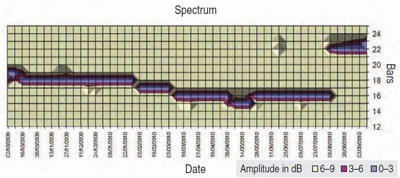
Taking the most current weekly price data for Standard & Poor’s 500 and plotting data from October 2009 to September 10, 2010, I got the graph you see in Figure 2.
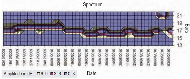
It is perfectly clear the cycle period with a duration of 16 to 17 weeks has been detected and it has been fairly stable. If we have a cycle of that duration, then it should translate into a cycle of 80 to 85 days. To test this idea I took daily bar data and ran it through the program (Figure 3). I got what I expected.
APPLYING IT TO OTHER MARKETS
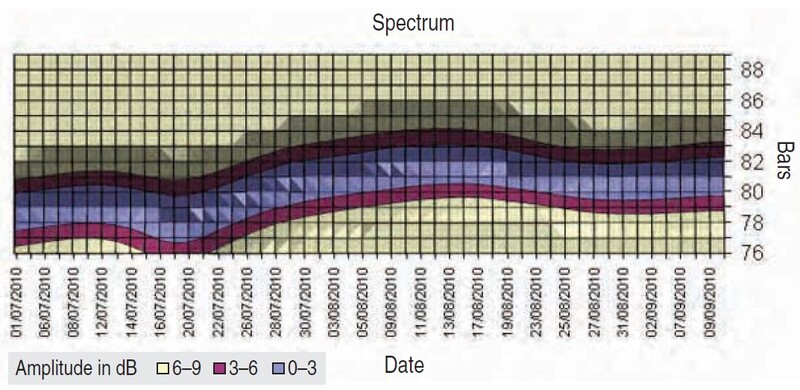
To prove that it is not only the S&P 500 that exhibits this phenomenon, I added some Canadian sizzle and scanned the weekly data of the Toronto Stock Exchange (TSX). As you can see in Figure 4, the 16-week cycle was present in the TSX as well. The analyzer determined that the larger cycle of about 22 weeks became stronger than the 16-week one at the beginning of August 2010. I interpret this to mean we can rely on existence of cycles, but we cannot rely on their strength. At certain points they weaken and get replaced by others. To make matters more complicated, even when a cycle is dominant, its period could vary. In other words, cycles are not stationary.
The TSX weekly spectrum you see in Figure 4 is a good example. The period of the same cycle was fluctuating between 18 and 15 weeks. Or perhaps I should say that the sinusoidal approximation of the cycle was interpreting the price data that way.
CAN IT BE USED TO DETECT CRISES?
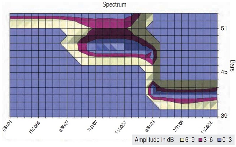
I wanted to revisit the markets prior to the mortgage crisis of 2007 and apply the same technique. There are different opinions on how we could have predicted the bear market of 2008–09 sooner. If this method worked, it could have warned us about the troubles ahead. Many cycle specialists believe that the business cycle duration is from four to six years. I scanned the monthly bars of the S&P from the end of 2003 to the end of 2007 to validate this statement (Figure 5).
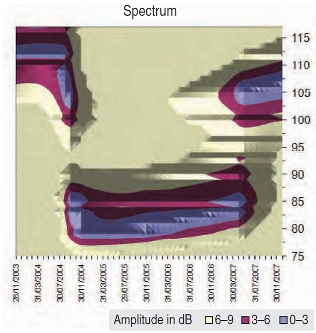
The picture is definitely more complex than expected. It seems as if there was a larger cycle that was responsible for the bull run from the second part of 2004 till mid-2007. This method has detected its period as 6.7 years. Then something happened at the beginning of 2007: Another cycle became stronger. That cycle was 106 months (8.8 years) long.
Advanced Books and Courses on Market Cycles & Timings


Since the cycle period is normally a multiple of 2 or 3, I tried scanning for a cycle with a period of three to five years to see if any new cycle popped up around the same time. By going lower in period (higher in frequency), I saw that something new was born. This new cycle was about 53.5 months, or 4.4 years long (Figure 6).
By reviewing these scans, it is possible to conclude that our trusted cycle of 6.7 years got weaker and two new cycles of 106 and 53 months got stronger. The existence of eight-year cycles has been mentioned in technical analysis literature, so our 106-month cycle seems realistic. Of course, its estimated period would vary slightly, depending on how the spectrum analyzer filters were tuned.
It would be nice to know what phase that cycle was in by the end of 2007. Naturally, out of curiosity I think it would be enlightening to establish whether the cycle was going to go up or down. There are a few ways to do so. One way is to use simple moving averages on monthly bars of the period equal to half of the one we are interested in. I will discuss that later. First, I will take a different approach. Since I assume that our signal is a sinusoid — that is,
(y(t) = A*sin(ω*t+φ))
I can exploit the fact that every sinusoid can be expressed as the sum of a sine function (in phase) and a cosine function (quadrature). When you pass the signal through the bandpass filter, you obtain its real and imaginary parts (in phase and quadrature). By knowing these two parts of the signal (sine and cosine), you find the phase of the cycle by simply inversing sine and cosine and accounting for a phase shift of low-pass and high-pass filters of the spectrum analyzer.
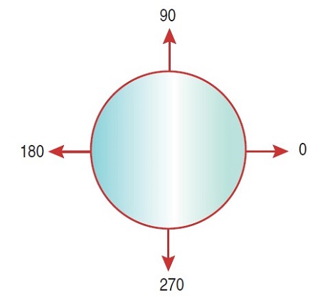
After all these calculations, you find out that the phase of the 106-month cycle was 88 degrees by the end of 2007. Taking onto account that the cycle top is 90 degrees (Figure 7), we can conclude that this 8.8-year cycle top was about to be reached or had already been reached, depending on how much smoothing was applied. Now let’s move the clock forward and see what was going on in 2008.
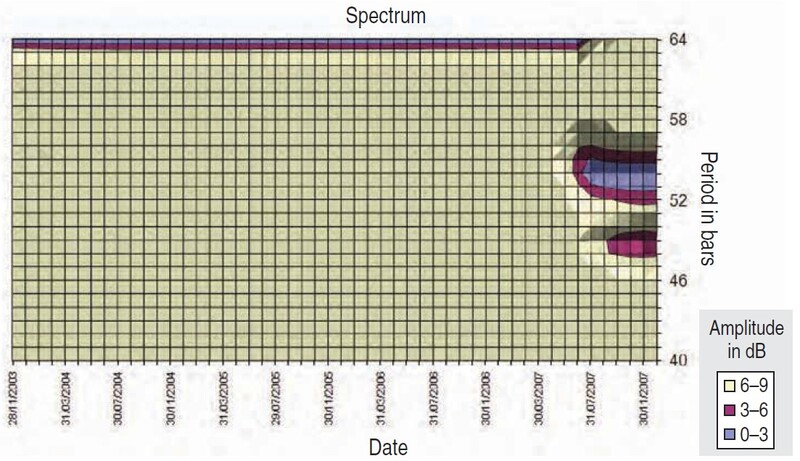
From Figure 8 you can see that the dominant cycle became even shorter: 42 months or 3.5 years. By the end of March 2008 its phase was 83 degrees. This suggested it was the last warning to exit the market if you had not done it yet. By the end of December, its phase progressed to 182 degrees.
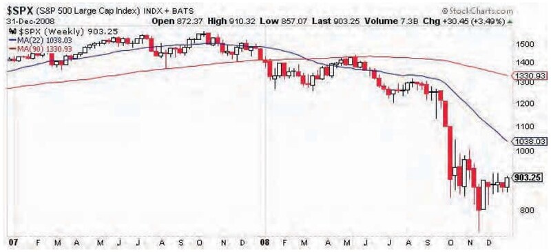
To remind you about what happened in 2007 and 2008 with the S&P 500, I included the candlestick weekly price chart (Figure 9). I also plotted simple moving averages of half and one-eighth of the cycle period. Since SMA is easy to understand, this demonstrates that any basic SMA-based systems (crossovers or prices moving above/below) would warn you about the dominant cycle going down if the period was determined correctly.
The periods I took in this example were 90 and 22 weeks:
Period = 42 months ≈ 180 weeks
SMA 1 period = Period/2 = 90 weeks
SMA 2 period = Period/8 ≈ 22 weeks
As you can see from Figure 9, the mentioned SMA methods would tell you to exit all long positions and go short if the correct period was used. I only used monthly data to identify the dominant cycle in this example. I did not go deeper into shorter cycles, momentum, and so on. Just by scratching the surface, I already got a result.
CAN IT FORECAST PRICE MOVES?
I will review what is happening at the time I am writing this article by moving our clock to the beginning of September 2010. The spectrum in Figure 10 reveals that as of the end of August 2010, the same 42-month cycle is still dominant. Its period did not really change (41.48 months), and its calculated phase is 31.2 degrees. Since I am using weekly data now up until September 10, 2010, I will calculate how this cycle looks on weekly bars. Its period is 167 weeks and its phase is 63.7 degrees. To me, this is a sign of caution even without looking into shorter cycles and momentum indicators.
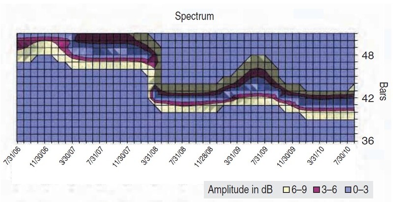
If I go below a period of 160 weeks, the spectrum analyzer will reveal another cycle with a period of 106 weeks. Though its strength is weaker than that of 42 months, it is much stronger than the 16-week cycle. If that cycle continues to strengthen, it would mean that the S&P 500’s April 2010 high was the 42-month cycle top. Otherwise, the market will resume its uptrend. For now, we can plot SMAs using this new cycle and use it as a warning line (Figure 11).
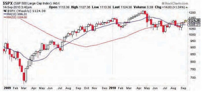
The periods used are 53 and 13 weeks as half and one-eighth of the cycle period. If you translate this into days, which you probably already have, you will see these periods are almost identical to the commonly accepted 200- and 50-day SMAs. The popularity of using these two SMAs in technical analysis is more understandable and perceptible.
DO CYCLES EXIST?
I went through this exercise to falsify the initial nullification hypnosis, which is that there are no cycles in market price data. But can we say for certain that cycles exist? Not yet. But we can declare that the statement that they don’t exist is incorrect. We also recognized that sinusoidal approximation is a good method of looking at market data to identify peaks and troughs. This approximation produces cyclical sinusoids that are not stationary. They can expand and contract in their periods, but what is more interesting is that their amplitudes become stronger or weaker at certain times.
These observations open a door to an intriguing quest to understanding markets from a different angle — an angle of harmony among cycles, events, and market behavior. This was just a peek through the keyhole, and it led to discovering why one of the most popular SMA combinations often works. I hope you are intrigued now as I am.
- Arthur Zernov is a private investor and technical analysis consultant. He has been a member of the Market Technicians Association (MTA) and the Canadian Society of Technical Analysts (CSTA) since 2009.